












User Interface Configuration Profile
User interface profiles enable you to exclude UI elements from the platform in order to simplify the appearance. This is beneficial for users who don't need to access certain components of the platform. Elements which can be excluded include:
- Navigation Elements–Assists users in moving around the platform, such as menus.
- Information Elements–Gives users information about the platform, such as the language being displayed in the interface and the current platform version.
- Functional Elements–Controls the look and feel of the interface, such as themes and settings.
Create a profile in the User Interface Configuration Profile Setup application, then apply the profile to individuals in the Users application, or within a user template in the User Quick Entry application. Learn more in Configure a User Interface Configuration Profile and Configure User Templates for quick entry.
If an environment is specified, the User Interface Configuration Profile only applies in that environment. If no environment is specified, it would apply to all environments.
User Interface Settings
User interface settings are applied to an entire environment, rather than individual users. Setting options include:
- Styles and formats–Control elements like required field indicators, lookup icons, lookup sorts, submenus, field styles for disabled fields and currency fields, and the appearance of message banners.
- Fonts–Change the default font of elements like application titles, field labels, and row titles.
- Navigation–Dictate how keyboard navigation works, as well as the behavior of the Navigation Menu and filter fields.
- Layouts–Control column width, field size display, row title alignment, and the location of system buttons.
Once user interface settings have been configured, you must apply them to an environment Environment application step, in the Tenant Environment Setup application. Learn more in User Interface Settings application and Environment application step.
Themes
Themes enable you to apply consistent visual components within the platform's user interface. Themes are configured in the Theme Builder application. Each theme has colors assigned to:
- Specific elements in the UI, such as buttons and menus.
- Statuses, like success or warning.
- List lookup options.
Learn more in Themes.
Hide application actions with user permissions
You can optionally show or hide application links, field, row, and form actions based on a user's permissions in the Tenant Environment Setup application. Learn more in Hide application actions with user permissions.
Configure a User Interface Configuration Profile
System administrators can configure a simplified Nextworld Platform user interface by creating a profile in the User Interface Configuration Profile Setup application and applying the profile to individuals in the Users application. This allows individuals with limited needs to have a simplified experience.
For example, an individual on a manufacturing shop floor may access the Nextworld Platform from a tablet and use a limited number of applications. A user interface profile can hide the unnecessary platform features.
User Interface Configuration Profile Setup
In the User Interface Configuration Profile Setup application, you must:
- Create a new profile. Name the profile something that is unique to the environment.
- Select the environment in which the profile is active. If you do not select an environment, the profile is active across all environments for the designated users.
- Select which elements you want hidden for the users.
- Optionally, select a theme for the profile.
Users
In the Users application, you must select an existing user and open the detail view. On the User Settings page, enter the name of the profile in the User Interface Configuration Profile field.
Alternately, you can apply a User Interface Configuration profile to a user template in the User Quick Entry application. Learn more in Configure User Templates for quick entry.
User Interface Configuration Profile Setup application
System administrators use the User Interface Configuration Profile Setup application to create user interface (UI) profiles for individuals within their organizations. User interface profiles enable you to simplify the UI of the platform by hiding elements like Ed, the Navigation Menu, Guided Tour, and Header and Footer elements such as Nextworld Help icons and the current date and language.
Certain users can benefit from a simplified user interface that only shows them the Nextworld Platform elements they need to access. System administrators can choose to exclude UI elements from the user interface by creating profiles. These elements are grouped by the following types:
- Navigation Elements–Assists users in moving around the platform, such as menus.
- Information Elements–Gives users information about the platform, such as the language being displayed in the interface and the current platform version.
- Functional Elements–Controls the look and feel of the interface, such as themes and settings.
If an environment is specified, the User Interface Configuration Profile only applies in that environment. If no environment is specified, it would apply to all environments.
Once the profile has been configured, it can be applied directly to a user record in the Users application, or referenced in a user template. Learn more in Configure User Templates for quick entry.
For more information on the user interface elements found in the platform, see Elements of the Nextworld interface.
User Interface Settings application
System administrators configure user interface settings to change the default user interface of platform features, such as font, field styling, and the behavior of navigation features. User interface settings are applied to an entire environment.
General Configuration
Specify the product family and product module.
Styles and Formats
Control elements like required field indicators, lookup icons, lookup sorts, save buttons, submenus, and the appearance of message banners. Additionally, you can control how field styles, such as disabled fields and currency fields, are displayed.
For save actions, you can select the default Save button shown in the form action menu, move select save actions into a submenu, or remove certain save options from the menu. If a user favorites a submenu option, it appears back in the primary form action menu.
Fonts
Change the default font of elements like application titles, field labels, and row titles.
Navigation
Dictate how keyboard navigation works, as well as the behavior of the Navigation Menu and filter fields.
Layouts
Control column width, field size display, row title alignment, and the location of system buttons.
Once user interface settings have been configured, you must apply them to an environment in the Environment application step, in the Tenant Environment Setup application. Learn more in Environment application step.
Keyboard Shortcuts
Change the default keyboard navigation for your environment. Any keyboard shortcuts configured by a user within the Keyboard Shortcuts window overrides the default environment settings.
Themes
A theme is a visual pattern that you configure to control the visual components of the platform's user interface.
For example, the following images compare two themes applied to the same application form. One theme uses blue, white, and black, while the other theme has grey, purple, and white assigned.
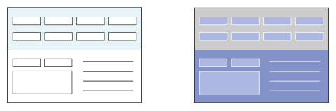
Themes are configured in the Theme Builder application. Each theme has colors assigned to:
- Specific elements in the UI, such as buttons and menus.
- Statuses, like success or warning.
- List lookup options.
Application developers and users typically use themes for personal use or global use. Create a personal theme if you are the only audience the theme is intended for. Create a global theme if the theme should be applied as the default theme across a zone.
Themes are environment specific. If you change the default theme in the User Menu, that theme is applied each time you sign into the environment you assigned it in.
Theme configuration
Configure themes using the Theme Builder application to create and modify user interface themes. Use the Environment application step inside the Tenant Environment Setup application to default a theme into an environment.
Theme Builder
If a theme doesn't already exist according to your requirements, then in the Theme Builder application you must:
- Create a theme and use the pages in the application to configure colors, images, and logos.
- Assign color codes to semantic meanings and spectrum colors.
See the Theme color types section for more information on configuring semantic and spectrum colors.
If you are using the theme for personal use, in which you are the only user who experiences the theme, apply your new theme in the User menu.
Default a theme in an environment
To make a theme default for a certain environment, in the Environment application step, you must:
- Create a new record.
- Select an environment and theme from the table lookup fields.
The theme that you choose becomes the default theme that appears when users are in that environment.
Theme color types
When configuring colors in the Theme Builder application, you can define colors as either semantic or spectrum. Semantic colors are colors that act as visual representations of a status, such as success or danger. Spectrum colors are the specific shades of a color that you choose to represent blue, red, green, and so on in the UI.
Some list lookups only have semantic colors and some only have spectrum colors. You can use both semantic and spectrum colors in the same list lookup if there are values that should have a status meaning attached to them and there are values that you just want to differentiate with color.
Spectrum colors
Spectrum colors are configured on the Spectrum Colors page in the Theme Builder application. All colors that can be represented in the UI have a color field in this page. Choose what color you want to define the light, dark, and standard versions of a color in your theme. If your chosen color is going to be used as a background color, you can also define what color text should appear against the spectrum color.
Define a spectrum color by using the field's color picker to choose a color or, if you already know what code represents the color you want, assigning a color code to the spectrum color field. For example, the spectrum color field, Blue, may have the color code #1F69FE, a shade of blue, assigned to it in a modified theme. This color becomes available as a text color or a background color in the UI:
- Spectrum Blue
- Spectrum Blue
When you create a new theme, colors are already defaulted into the spectrum color fields. In order to avoid confusion and keep colors paired with fields that logically describe them, only change the Hue Saturation Brightness (HSB) sliders of the default color. For example, the spectrum color field, Blue, may have the color code, #696969, a de-saturated shade of blue, assigned to a monochromatic theme in which all the default spectrum colors are desaturated. This color becomes available as a text color or a background color in the UI:
- Spectrum Blue
- Spectrum Blue
Semantic colors
Semantic colors are used in UI design to provide a color visual to convey a specific meaning to the user. For example, you can configure the color of success or the color of failure. A semantic color is typically presented alongside text for further clarification, but the color alone should be enough to represent a status. The ability to configure semantic colors allows application developers from across different cultural ranges to customize their own color=status relationship.
Define semantic colors by assigning a color code to represent a status. For example, the semantic color field, Warning, may have the color code #F0AD4E, a shade of yellow, assigned to it. This color becomes available as a text color or a background color in the UI:
- Warning
- Warning
Theme Builder application
Application developers use the Theme Builder application to create and modify user interface themes. Themes change the colors of different UI elements, and can optionally change the logo displayed throughout the platform.
If no logo is designated in the header of the record, the default Nextworld logo is used. Use the application pages to further define a theme.
General
Define the color for the background of the platform, as well as colors for application headers, help windows, and toolbars. Optionally, select a content item to display as a background image.
Menu Bar
Define the colors for the menu bar, navigation menu, and active favorite.
Tables
Define the colors for table headers, rows, and filters.
Semantic
Define the semantic colors for the theme. Semantic colors act as visual representations of a status, such as success or danger.
Spectrum
Define the spectrum colors for the theme. Spectrum colors are the specific shades of a color that you choose to represent blue, red, green, and so on in the UI.
Preview
The Preview component of the application allows you to see a live preview of your theme. Select elements inside of the preview to jump to the field which produces the color.
Themes best practices
These best practices ensure that themes are configured consistently throughout Nextworld.
Theme configurations are done in the Theme Builder application and are applied through the User menu.
Theme creators must consider accessibility when choosing text and background colors. There are Web Content Accessibility Guidelines (WCAG) that define minimum contrast ratios. Your company or organization may be required to meet Level AA or Level AAA contrast requirements.
When configuring the Logo field:
- Use a logo in the .svg file format. A .svg format logo appears clear at any screen resolution. The .gif, .jpg, and .png formats are also supported, but they consistently display at a lower quality.
- Choose a simpler image rather than an elaborate one. A simpler image is easier to read and is typically more recognizable than an overly detailed image.
When configuring the Focus field, choose a color that stands out from the other colors of the theme. This is the color that surrounds a selected field box. It should never be difficult for a user to distinguish a selected field from an unselected field, so the color chosen for Focus must stand out against any other chosen color.
When making spectrum color changes, you should only change the saturation of the existing color and not the actual color itself. Changing the color and not the saturation ensures that a spectrum color field always matches the color it is describing. For example, the Light Blue field should appear in a list lookup in some shade of light blue, and not, for example, a shade of yellow.
Once a color code is assigned to either a semantic or spectrum field, you should not use that color to represent any other field. This ensures that a color has either a semantic meaning or a spectrum meaning. Colors that have two meanings can cause unnecessary confusion for the user.
| Type | For example, |
|---|---|
Semantic | Assign the color code #D9534F, a shade of red, to the Danger field. If you have something that should represent a dangerous situation in the UI, you can now use this color. |
Spectrum | Assign the color code #DD4D50, a different shade of red than the one used for the semantic color, to the Red field. If you have a list lookup value that you want to differentiate from other values using color, you can now use the color red. |
When choosing color certain fields, consider matching with the color with a semantic color if the field's purpose matches the . For example, the Help Window color could match the color chosen for the Info field.