

.svg)

Applications are pattern-based. Once a user understands the different application forms, all platform applications become easy to manage and navigate.
The diagram below illustrates how information from a table is shown in an application in list form, and an application in detail form.
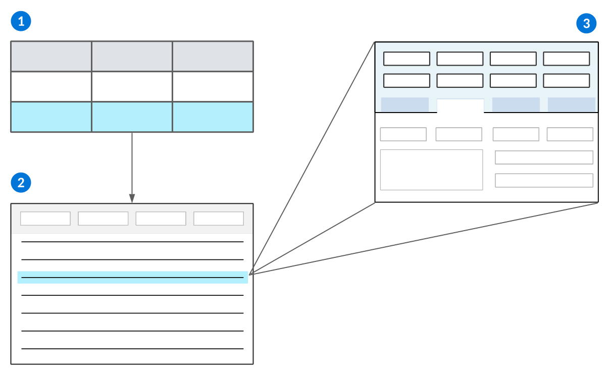
 | Tables—Every application is built over a single table. The column headers that organize the table's data become the fields where you enter information in the application. During application configuration, you can decide how you want the fields and other UI elements to be organized. Records are stored in the table, but are visible in the application in different forms. |
|---|---|
 | Application in list form—A list form displays all the records in an application, and gives you the ability to find, filter, and search for records. The filterable column headers in the list form are the same column headers found in the table. The application type and style determines if an application has a list form, or if records are organized in a different format. Learn more in Application types and styles. |
 | Application in detail form—A detail form displays the fields and values for one primary record. The detail form often shows additional table data for that record that isn't visible from the list form. |
See the topics in the Application types and styles section.
Side-by-Side View
Some application types can open and edit different applications or records in a side-by-side view. You cannot create or delete within this view. These application types include:
Standard—All application styles can open records in the side-by-side view.Advanced List—All application styles, unless they have Grouped Detail or Group By options configured, can open records in the side-by-side view.Header Detail—All application styles, including multi-detail, can open records or applications in the side-by-side view. Side-by-side view can open Header to Detail, or List to Header.Relationship—OnlyStandardstyle applications can open records in the side-by-side view.
To open the side-by-side view, select the Open Side-by-Side  button in the row action menu, or hold Option (Mac) or ALT (PC) and double select the record you want to open from the list or detail list. When the side-by-side view is open, you can still filter and page between records, but you cannot use row actions, select multiple records, or pin other pages such as the application level help or keyboard shortcuts.
Application Builder
Application developers use the Application Builder to configure applications. You can access Application Builder from the Navigation Menu, or open it as a component of the Developer Studio.
The Application Builder shows different configuration options when you create a new record versus open an existing record. For example, in new records you may only select fields which already exist in the application's table previous to saving. Once the record is saved, you can create new fields for your application.
The diagram below shows the structure of the Application Builder once an application record is created:
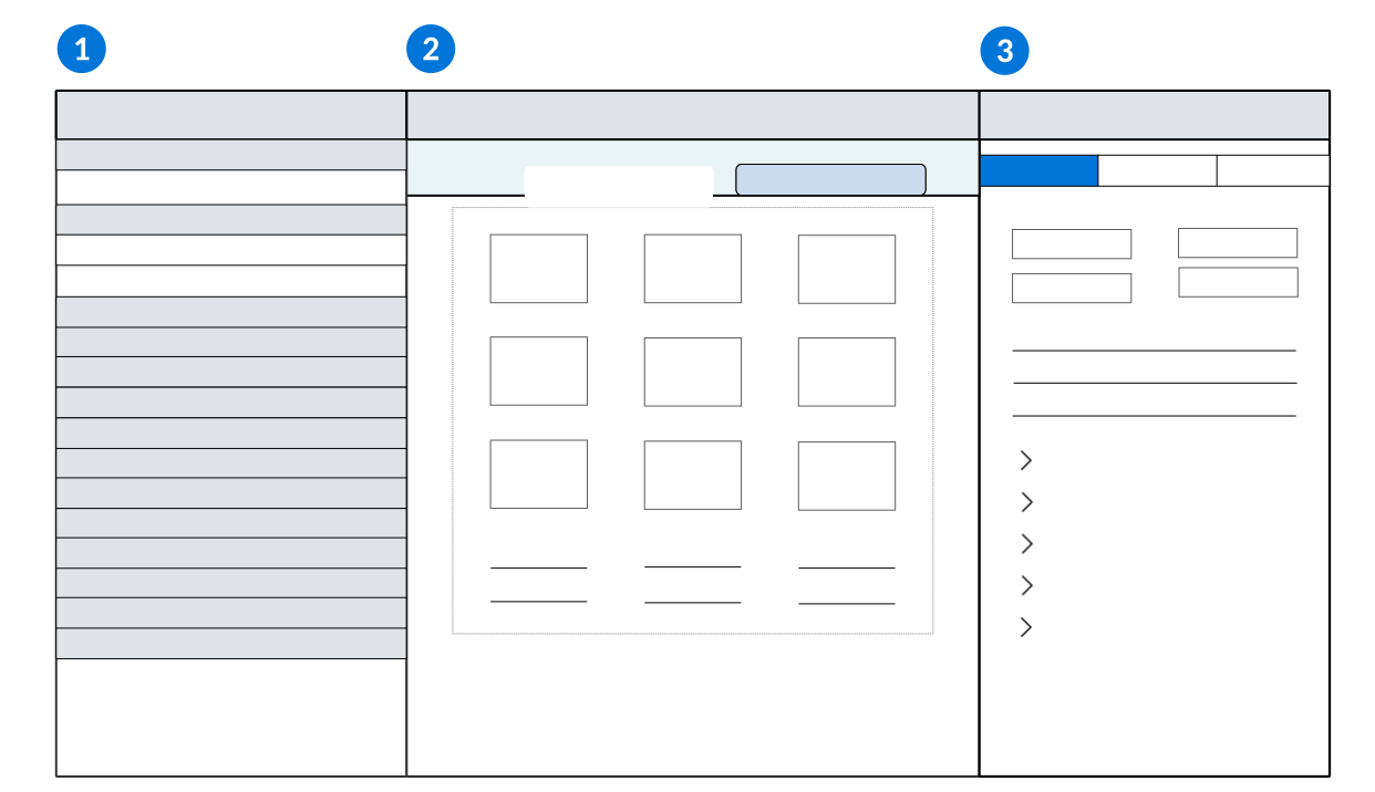
| Configuration panel—Configure components of your application. Select the form you want to configure, then expand each section to view existing configurations, or select the Create  button to add a new one. button to add a new one. For example, you can expand the Existing Fields section to see data items that exist in the application's table, or expand the New Fields section to select new data item types to configure. |
|---|---|
| Viewer panel—Select a form in the Configuration panel to edit the fields, pages, rows, and subtables for your application. You can also drag and drop fields from the Existing Fields and New Fields sections to the location you want them. When you add options such as application links and actions, the configuration fields are shown in this panel. |
| Properties panel—View the properties of the application, such as the application type, style, and name. Or, select an object in the Viewer panel to view and edit that object's properties. Once you are done configuring your application, select the Generate  button above this panel. When you receive a notification that your application has generated, select the Launch button above this panel. When you receive a notification that your application has generated, select the Launch  button. button. When you configure options such as application links and actions, this panel is hidden. |
Related topics:
- Learn more about how logic blocks can be used in application actions in Ways to initiate a logic block.
- Application types and styles
- Configure actions for an application
- Application advanced features
- Sort configuration
- List form field layout best practices
- Detail form field layout best practices
- Subtable data item best practices
- Application pages and rows best practices
Application forms
Forms are screens in an application that display different kinds of information. In an application, you generally navigate between different forms to access different types of information. For example, a List form gives a list of records in an application, while a Detail form shows fields associated with a single record.
Forms of the same type always show the same type of information, but they can have a different composition of regions, which organize and display information in the form. For example, a Detail form can have a header region that contains the most important fields for a record, and a body region that organizes the supporting fields.
List form
The list form displays all the records in an application, and gives you the ability to find, filter, and search for records. Because it provides access to all records in an application, the list form is the default entry point for most applications. Once you locate a record in the list form, you can open it to review additional details.
The list form always presents a list of records in the application. However, the regions available in a list form can vary based on the application type. For example, this diagram represents a standard list form and its regions:
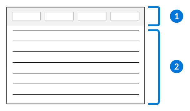
| Column headers—Represents the fields within your application. Often, column headers contain filter fields which you can use to sort and search the list. Whether columns have filter fields is determined by the environments user interface setting. Learn more in Configure UI settings across the platform. |
|---|---|
| Detail list region—This is a list of records in the application with columns representing key fields in the records. You can sort and filter the records in the list using the column header filters. Depending on the application, you may or may not be able to edit fields directly in the detail list. You can also open the detail for a record and see any additional fields that are not included in the list form. |
Tree style list forms
The list forms of a Tree style Relationship application can be configured in two possible ways, the Tree-List form or the Tree-Entity View form. If the Tree-Detail Form check box is not selected, then a Tree-List form displays showing relationship hierarchies on the left and a detail list of a record's relationships on the right displays in the generated application. If the Tree-Detail Form check box is selected, then a Tree-Entity View form displays showing relationship hierarchies on the left and an editable detail form of an entity record on the right displays in the generated application.
For example, these diagrams represent standard Tree style list forms and their regions:
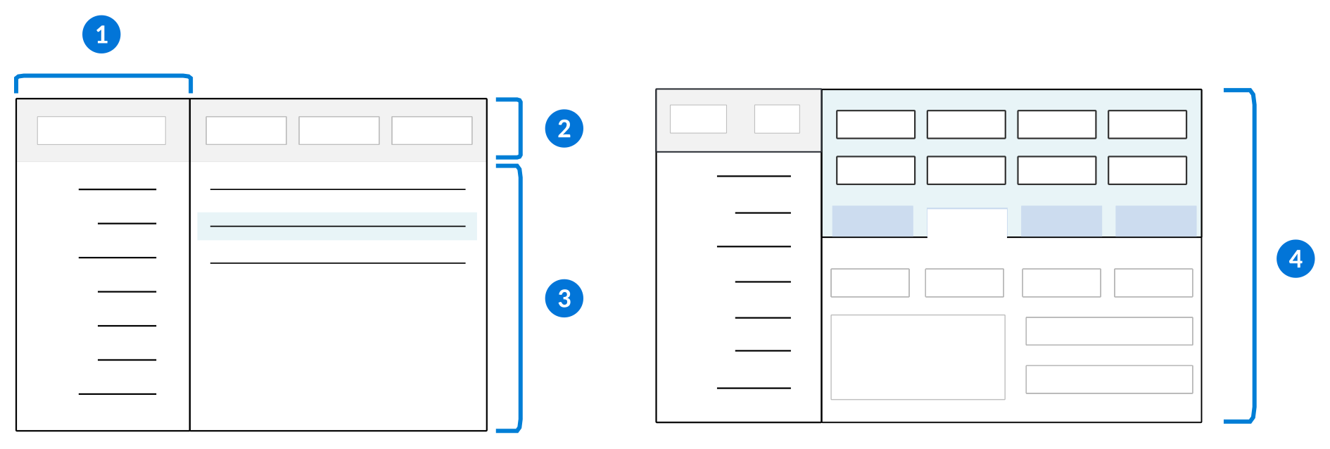
| Tree list region—This is a hierarchical representation of records in the application. When this region is available, you can expand and collapse the nodes of the tree to see the relationship between records. When you select a record in the tree, all the records immediately below it are displayed in the adjacent detail list. |
|---|---|
| Column headers—Represents the fields within your application. Often, column headers contain filter fields which you can use to sort and search the list. Learn more in Column header filters. |
| Detail list region—This is a list of records in the application with columns representing key fields in the records. You can sort and filter the records in the list using the column header filters. You can also open the detail for a record and see any additional fields that are not included in the list form. |
 | Entity detail form region—This is the detail form of an entity record from the application specified in the Entity Application field in the Relationship application configuration. You can modify and save changes in the detail form fields within the right-hand entity view without going into the full detail form. |
Advanced navigation
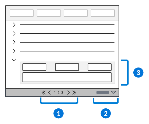
| Page navigator—Page navigation controls appear at the top and bottom of detail list regions, and offer a way to control how many rows appear on a single page. Use the page numbers and arrow buttons to load additional pages of results, and the drop-down to determine whether the list shows 15, 25, or 50 results on a page. |
|---|---|
| Column controls—The Columns menu gives you control over the order of columns in the list form. You can also use this menu to freeze columns so they remain visible as you scroll horizontally. |
| Row expansion—Some applications include additional details for a record that can be viewed from the list form by expanding the row. When available, click the row expansion icon to see these additional fields. |
Sort configuration
Configure the list form of an application to sort the values for a field or indexed field. This ensures that records are automatically sorted when the application opens based on a field's ascending or descending values.
You can create default sort orders for indexed fields in the Table Definitions application, and create default sort profiles for any sortable field in the Application Builder application. The sort profiles you create in Application Builder can also be used in the Application Setting Definitions application.
Indexed Fields - Tables
You can configure a default sort order for an indexed field. In the Table Definitions application, you must:
- Navigate to the Indexes page and create an index ID and name the field(s) that make up that index.
- Use the Sort Order field to choose which order you want the field values to be sorted in.
Learn more about what indexes are and how to use them in the Indexes section.
Sort Fields - Application Builder
Default sorts applied to applications sort fields in the order in which they were entered. For example, you could create a sort profile that has the Name field sort defined first, and a sort for the Age field defined second. Enter the Sort Name in the Sort Profile Selection field to make it the default sort for the application. When the application opens, records in the list form would be sorted alphabetically by Name first, then the Age field sort is applied.
To create a sort profile, in the Application Builder application, navigate to the Sort page where you must:
- Select the Add button to create a new sort profile in the Sort Profile subtable.
- Enter a unique SortSubTable.SortName for the sort.
- Select the Edit Sort button to configure the sort orders. Sort fields entered in the sort profile are applied in the order in which they are entered.
- Define the default sort profile you want for the application in the Sort Profile Selection field. Any additional sort profiles entered in the Sort Profile subtable are optional sorts which can be shipped and applied at the discretion of the user or developer.
Application Setting Definitions
You can use any of the sort profiles you define in the Application Builder application in the Application Setting Definitions application. Any sort profile you define in the Sort Profile Selection in Application Setting Definitions overrides the default sort profile you defined in the Sort Profile Selection field in the application configuration.
Detail form
The detail form of an application displays the fields for one primary record, but can also show information maintained in other applications depending on the application configuration. In most applications, record maintenance is done in the detail form.
The detail form can vary depending on the type of application you are in and how it was configured. The following diagram represents a detail form and its regions:
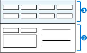
| Header region—Contains the most significant fields of the record. The header is positioned above application pages and is visible at all times. |
|---|---|
| Detail region—Contains additional fields related to the application. In many cases, fields in the detail region are organized in to pages. |
Additional regions
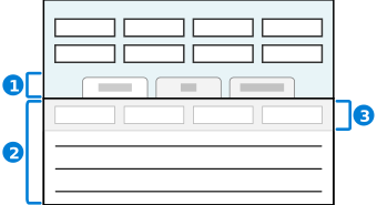
| Pages selection region—Detail forms with many fields often organize the fields into pages. Select a page to open it in the detail region.
|
|---|---|
| Detail list region—A detail form can include a subtable or list region that shows information related to the current record. Detail lists regions have many of the same navigation and control options as a list form. |
| Column headers—Use the filter fields in this row to sort and search a list. Filter fields are available at the top of most list regions in the column headers. |
Header Detail form
The header detail form shows the master header record and a detail list of all sub records that are managed by the header. In this form, you can view and maintain the header record, and can open an associated detail record.
This diagram represents the header detail form and its regions:
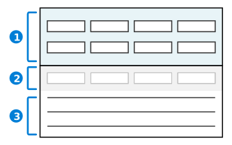
| Header region—In the header detail form, the header region includes fields that identify the primary record and common fields that are also included in the detail records. |
|---|---|
| Column headers—Use the filters fields in the column header to sort and search the list. |
| Detail list region—In the header detail form, all records in the detail list are intrinsically linked to the header record. From here, you can add additional detail records, or sort and filter existing records using the filter row. You can also open the detail for a record and see any additional fields that are not included in the list form. |
Application types and styles
Application types and styles controls how records are stored, visualized, and processed.
The application type determines how the application is organized and what features are available. For example, a Standard application type opens in the list form. When you select a record you are navigated to the detail form where you can see more information about that particular record. Alternately, Advanced List applications have a header with fields for quick filtering of the records, and you can view and edit details about a record directly from the list form.
The application style determines how the records are shown, and how the application can be used. For example, a Mini App application opens in a floating window without navigating away from your current location on the platform. Alternately, Card style applications show record details in a card format, rather than having it organized in rows within a list form.
The different types and styles give application developers the ability to create an application to fit any requirement.
The table below reviews the available application type and style combinations.
| Use the Application Type... | With the Application Style... | If you want to... | Learn more in... |
|---|---|---|---|
| Standard | Standard | Display data in a list form where you can view records or open the detail form of a record to edit. | The Standard application topic. |
| Standard | Mini App | Open a mini application over another application. You can search records without the main application closing. A mini app can be opened from the navigation menu or through an application action. Mini apps can also be used within dashboard cards. | The Mini apps topic. |
| Standard | Header | Configure as part of a Header Detail application. | The Header Detail application topic. |
| Standard | Detail | Configure as part of a Header Detail application. | The Header Detail application topic. |
| Standard | Card | Display application records within the list form as cards, instead of the traditional row format. Fields can be configured in columns and rows for each card. | The Dashboard cards topic. |
| Advanced List | Standard | Display records in an editable list form. Optionally, configure Header filter fields that show meaningful combinations of filters to refine the visible records. Additional configuration options are available, such as the ability to use row groups to organize records. Similar to Header Detail applications, row grouping makes each record in the list form a summary record that holds all of the related records. Open the detail form to view, or create, records that have the same Header filter field values. | The Advanced list application topic. |
| Advanced List | Mini App | Open a mini application over another application. You can search records without the main application closing. A mini app can be opened from the navigation menu or through an application action. Mini apps can also be used within dashboard cards. | The Mini apps topic. |
| Advanced List | Header | Configure as part of a Header Detail application. Allows you to edit headers in the list form, and use other advanced list features such as Save as Group, or Group Detail options in the Header Detail application. | The Header Detail application topic. |
| Advanced List | Card | Display application records within the list form as cards, instead of the traditional row format. Fields can be configured in columns and rows for each card | See the Dashboard cards topic. |
| Header Detail | Standard | Ensure that information in the header applies to every detail record. | The Header Detail application topic. |
| Module Settings | Standard | Configure settings that apply to all application in a module. | The Module Settings application topic. |
| Relationship | Standard | Display related records on a page in the detail form of each record. The relationships between records are not seen in the list form. Select a record from the list form to open the detail form of that record. Child records are listed on that page. | The Standard style Relationship applications topic. |
| Relationship | Tree | Display records as a hierarchy defined by their relationship. Child records are nested below the parent records and are accessed by expanding the row. | The Tree style Relationship applications topic. |
| Report Version | Standard | Access Report Builder to create report templates. | The Report Builder application topic. |
| Report Version | Mini App | Show a list of reports in a mini app which can be referenced in a dashboard card. | The Mini apps topic. |
| List Only | Standard | Show a list of records in a Read-Only state so that users can't edit or change them. | |
| List Only | Mini App | Show a list of Read-Only records in a mini application over another application. You can search records without the main application closing. Mini apps can also be used within dashboard cards. | The Mini apps topic. |
| List Only | Card | Display a list of Read-Only records within the list form as cards, instead of the traditional row format. Fields can be configured in columns and rows for each card | The Dashboard cards topic. |
| Composite | Standard | Group related applications into a single access point. | The Composite application topic. |
| Composite | Guided | Group related applications into a single access point, with an ordered, guided navigation experience. Guided composite applications have with a simplified user interface, and are useful for configuring mobile applications. | The Guided style Composite application topic. |
| Gantt | Standard | Visualize product schedules by their start and end dates through use of a bar graph. | The Gantt application topic. |
| Gantt | Mini App | Visualize product schedules by their start and end dates through use of a bar graph in a mini application over another application. You can view the schedule without closing the underlying application. Mini apps can also be used within dashboard cards. | The Gantt application topic. |
Application configuration overview
Configure applications in the Application Builder application within the Developer Studio.
The Developer Studio quick start features enable you to create your table, data items, workflows, and application in a single process. Learn more in Developer Studio.
The following components are required for application configuration:
- Data Items—The most granular building block of an application. Each data item represents an attribute, property, or field in your application. Learn more in Configure data items and Data item types.
- Tables—A table is a collection of the data items that display as fields in your application. Applications store data in, and retrieve data from, tables. Learn more in Tables and Table types.
- Applications—Applications are built over tables, and the data items in the table become available as fields in your application. They collect, process, and store information. Learn more in Applications and Application Builder.
There are also optional configurations for applications, such as:
- List Lookups—Creates a dropdown list of values which a user can select from in a field. Learn more in List lookups and Basic list lookup configuration.
- Table Lookups—Populates the fields of an application with validated information that is stored in another table. You define the source table when you create a table lookup data item. Learn more in Table lookups and Table lookup configuration.
- Logic Blocks—Groups of logical expressions which are configured to update table data, modify an application's user interface, and validate data entry. Logic blocks are built over application tables to control aspects of an application. Learn more in Logic blocks.
- Workflow—Prompts users to complete tasks within a certain order in the application. This ensures all required steps are completed. Learn more in Workflow Home.
Data Item Definitions
Data items can be selected and created within the Application Builder. Or, in the Data Item Definitions application, you can:
- Identify existing data items or create new ones for your application. The type of data item determines how you can use the information stored in that data item and how the information is displayed.
- Ensure there is an appropriate synonym for your application's field. Learn more in Synonyms.
Table Definitions
The application table can be selected or created when you create your application. Or, in the Table Definitions application, you can:
- Create a new table. The type of table you build determines how an application can use the stored information. Learn more in Table types.
- On the Fields page, add your data items.
- Select the Required checkbox on any fields which should be required in a record.
Application Builder
From the Application Home page, select one of the quick start buttons. Or, in the Application Builder:
- Create a new application. The Application Type defines what the application does and how it works. Different application types require different configuration options. Learn more in Application types and styles.
- The Application Style controls how the application can be used and how it appears.
- Enter the name of an existing table in the Table Name field, or create a new table.
- Select the application form you want to configure in the Configuration panel, then add add your data items as fields in the Viewer panel.
For specific configuration information for the different application types, see the following topics:
Standard application
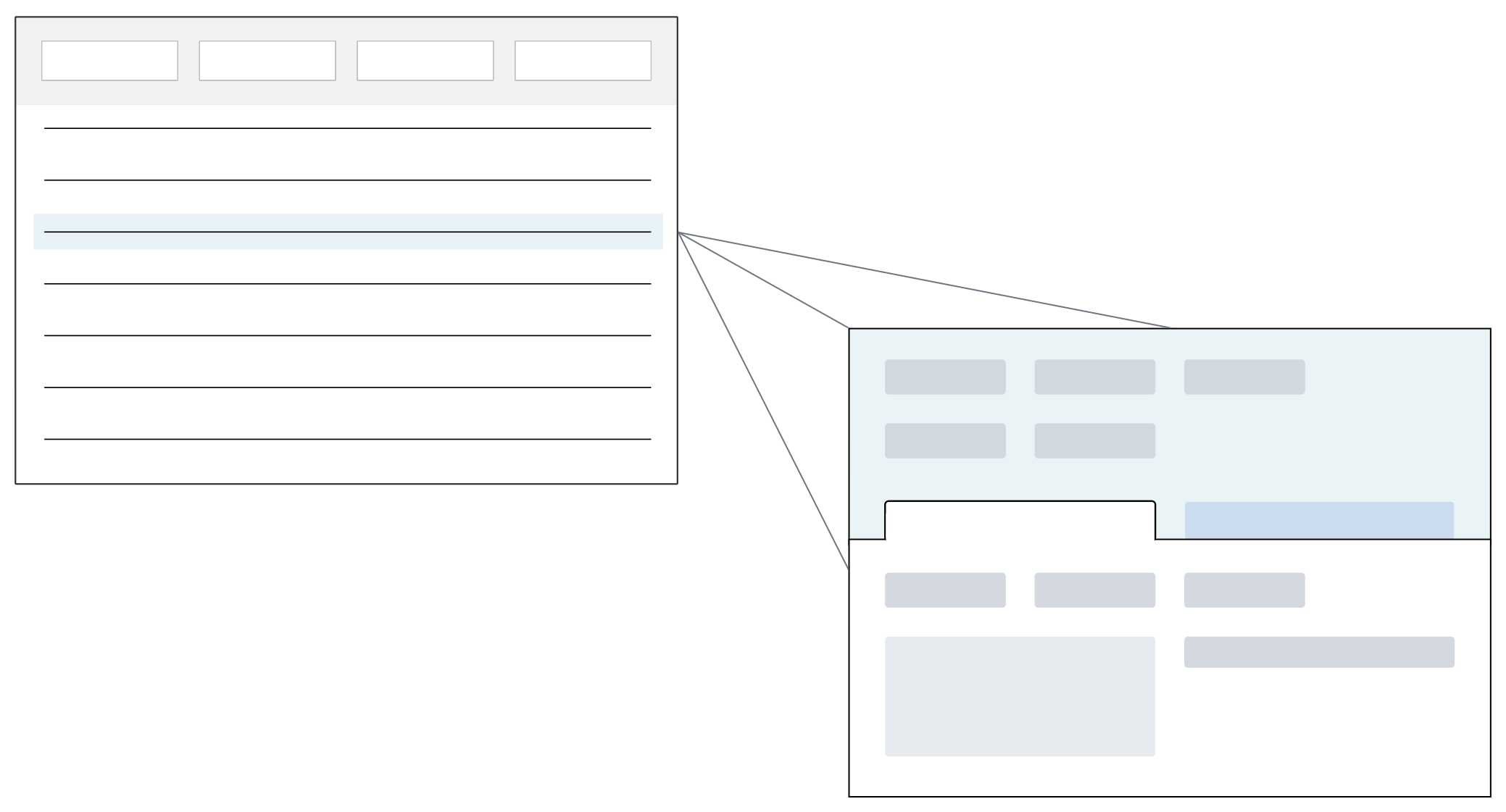
The Standard application type manages independent records. Users enter information one record at a time in the detail form of the application.
The initial application view is the list form. From there, you can open a record in the detail form and see additional fields related to the selected record. The information for each record is independent of other records in the table.
Styles
Different styles can be applied to a Standard application, such as:
Standard—Displays data in a list form where you can edit records or open the list form to a detail form.Mini App—Opens a mini application over another application. You can search records without the main application closing. A mini app can be opened from the navigation menu or through an application action.Header—Configured as part of a Header Detail application.Detail—Configured as part of a Header Detail application. Learn more in the Header Detail application topic.Card—Displays application records in a card format, rather than in a list form. Summary data for each record can be seen and visualized within the card.
Advanced list application
The Advanced list application type enables users to edit records from the list form. Optionally, this application type can also have Header filters that show meaningful combinations of ways to refine the visible records.
Header filter fields should only include data items that are valid for sorting. These are generally data items that share a common value across multiple records. For example, in a company directory, you might want to sort by location or department.
Additional configuration options are available, such as the ability to use row groups to organize records. Similar to Header Detail applications, row grouping makes each record in the list form a summary record that holds all of the related records. Open the detail form to view or create records that have the same Header filter field values. Learn more in Advanced List application configuration
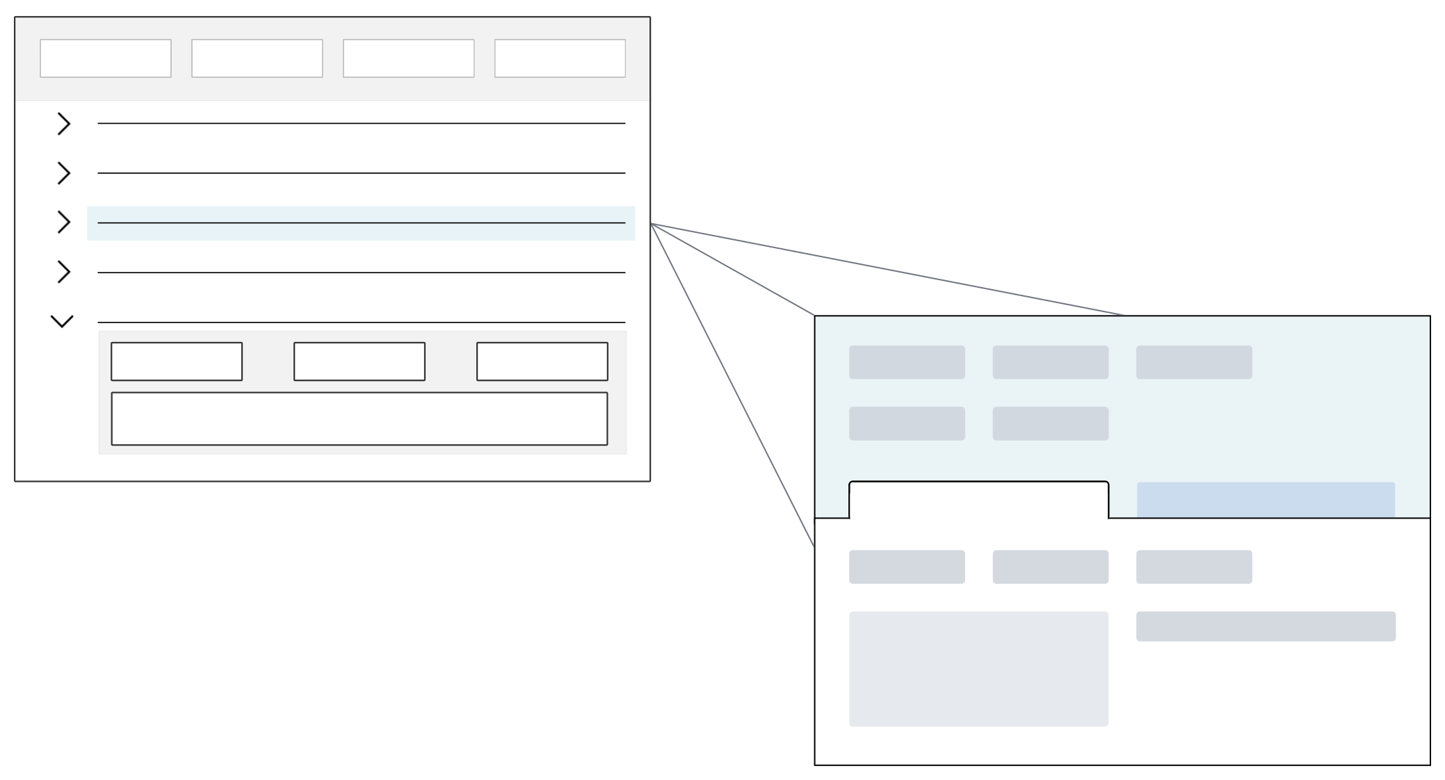
The diagram below represents a Standard style Advanced List application which opens to the list form. Records can be edited in the list form, or opened to the detail form.
Styles
Different styles can be applied to an advanced list application, such as:
Standard—Displays records in an editable list form. Optionally, configure Header filter fields that show meaningful combinations of filters to refine the visible records.Mini App—Opens a mini application over another application. You can search records without the main application closing. A mini app can be opened from the navigation menu or through an application action.Header—Configured as part of a Header Detail application. This enables Advanced List features such as Save as Group, and Grouped Detail in a Header Detail application. Learn more in Header Detail application.Card—Displays application records in a card format, rather than in a list form. Summary data for each record can be seen and visualized within the card.
Options
In addition to styles, there are several options you can apply to advanced list applications, such as:
- Grouped Detail—Opens the application in the list form, but provides a Load and Reset button. Records are not shown until values are entered in the Header filter fields and the Load button is selected. This feature uses row groups to group related records in the list form. Open one of the list form records to view, edit, or create records that share the same Header filter field values from one location. The Header values are defaulted into the records automatically. If you use this feature, you must also configure Save as Group. Learn more in Grouped Detail option for Advanced List application.
- Save as Group—Records are not saved when users exit the row or use the save row action. Instead, they are only committed to the database when you select the application's Save form action. This option can be selected without selecting the Grouped Detail option. Learn more in Save as Group option for Advanced List and Relationship applications.
Grouped Detail option for Advanced List application
The Grouped Detail option for Advanced List applications allows users to create and view records which are grouped together based on common header filter field values.
Each header filter field is configured as a row group. Row groups summarize the list form records into related groupings based on shared values. This means each record in the list form is a summary record that contains one, or many, records that all share the same header filter field values.
For example, the Grouped Detail option is enabled for the Time Entry Daily - Job application. This application is used to keep track of the hours worked by employees on specific projects during a given time period. Each record in the list form represents a project on a specific day, and exists as a summary record that holds all of the associated records for that project. When you open the detail form of the record, you can view, create, or edit the records associated with the project.
Forms
Advanced List applications with Grouped Detail enabled can open in either the list form, or the detail form with a list region, based on how the application is configured. The diagram below represents an application opening in the detail form:
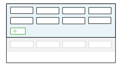
When opened in the detail form, you must enter values into the header fields and select the Load button to populate records. When you create a record, values from the header fields are automatically applied to the new record. Form action buttons are applied to all detail records at once, meaning all changes are processed and committed to the database together.
When opened in the list form, each record represents a group of records that have the same header field values. Open a record from the list to view individual records in the group. Depending on how the application is configured, you may be able to change header field values in the detail form. If you do, the changed record may no longer be part of the group from which you accessed it.
Grouped Detail configuration
Configure a Grouped Detail option for Advanced List applications in the Application Builder application.
Application Builder
In the Application Builder record there are several considerations for configuration, such as:
- Application Type must be
Advanced List. - Application Style must be either
StandardorMini App. - The Grouped Detail checkbox must be selected.
- Optionally, you can enable the single click to edit option in Application Properties. Learn more in Enable single click to edit fields.
In the List Form Fields section, there are several considerations for configuration of your header row, such as:
- You must have at least one field where Row Group is selected.
- The Row Group checkbox must be selected for each field you want included in the header. Only fields configured as a row group show in the header. For more information, see the Advanced List application configuration topic.
In the Detail Form Fields section, there are several considerations for configuration of your detail form, such as:
- The detail form must include all the header fields. That is, every field that is selected as a Row Group on the List Form Fields page must also be configured on the Detail Form Fields page.
- To load records from another table, add an Event Actions on the Actions page and select Load Button Clicked for the event action. In the Name field enter the name of the logic block for the event action.
Application Settings
To apply application settings to an Advanced List application with Grouped Detail enabled, you must select List in the Form field for the Control Actions on the Actions page.
To set control actions in a Grouped Detail view, on the Actions page, in the Form field, select Advanced List.
For more information see Advanced list application and Grouped Detail option for Advanced List application.
Save as Group option for Advanced List and Relationship applications
The Save as Group option for Advanced List and Relationship applications holds changes to the application's records in a NATE container. Changes are only commited to the database when the application's Save form action is selected, not when you exit a row or select the Save row action.
To configure, select the Save as Group checkbox in the application or application settings definition. The setting on the application setting overrides the configuration on the application.
Advanced List applications
The Save as Group option for Advanced List applications enables you to process batch records that share common values in the header fields. To validate the records before you save them, configure the Before Group Save event action in the Event Action section of the application.
For example, the Assign Serial Numbers Mini App has the Save as Group option enabled. This application allows a user to create serial number records and assign those serial numbers to inventory transactions in another application. The Save as Group option holds all the records for a single transaction in a NATE container and only writes them to the serial cross-reference table when the user has completed all changes for the transaction and selects the Save Form action.
Relationship applications (Tree and Standard)
The Save as Group option for Relationship application ensures that the the flatten hierarchy feature only occurs when the form action Save is selected within the application. This increases performance in Relationship type application. If Save as Group is not selected, the flattening of hierarchies happens automatically anytime a record is changed in the application.
Advanced List application configuration
Configure an Advanced List application with the Data Item Definitions, Table Definitions, and Application Builder applications.
Learn more about application configuration in Application configuration overview.
Data Items
You must have data items that are capable of being filtered for the header row fields. If you include an unsupported data item type in the header it is hidden in the list form display, but present in the detail form.
Data items can be created in the Data Item Definitions application, or in the Application Builder.
Table
Configure your table in the Table Definitions application.
Application Builder
In the Application Builder application, you must select the Advanced List type. Different styles can be applied, such as:
Standard—Displays records in an editable list form. Optionally, configure Header filter fields that show meaningful combinations of filters to refine the visible records.Mini App—Opens a mini application over another application. You can search records without the main application closing. A mini app can be opened from the navigation menu or through an application action.Header—Configured as part of a Header Detail application. This enables Advanced List features such as Save as Group, and Grouped Detail in a Header Detail application. Learn more in Header Detail application.Card—Displays application records in a card format, rather than in a list form. Summary data for each record can be seen and visualized within the card.
In addition to styles, there are several options you can apply to advanced list applications, such as:
Grouped Detail—Opens the application in the list form, but provides a Load and Reset button. Records are not shown until values are entered in the Header filter fields and the Load button is selected. This feature uses row groups to group related records in the list form. Open one of the list form records to view, edit, or create records that share the same Header filter field values from one location. The Header values are defaulted into the records automatically. If you use this feature, you must also configure Save as Group. Learn more in Grouped Detail option for Advanced List application.Save as Group—Records are not saved when users exit the row or use the save row action. Instead, they are only committed to the database when you select the application's Save form action. This option can be selected without selecting the Grouped Detail option. Learn more in Save as Group option for Advanced List and Relationship applications.
Header Detail application
Use the Header Detail application type to link detail records that have the same header information into one application.
Header Detail applications are a combination of one Header application and one or more Detail applications. They are useful for one-to-many relationships that use transactional information.
Structure
Header Detail applications exist over a table structure that is comprised of multiple tables. Learn more in the Header Detail table structure topic. The Header and Detail applications can only be accessed through the Header Detail application. The applications cannot be launched individually.
By default, a Header Detail application opens to the list form. Records from the list form open in the header detail form. Records in the detail list of the detail form open in detail form. The diagram below shows the path through these forms.
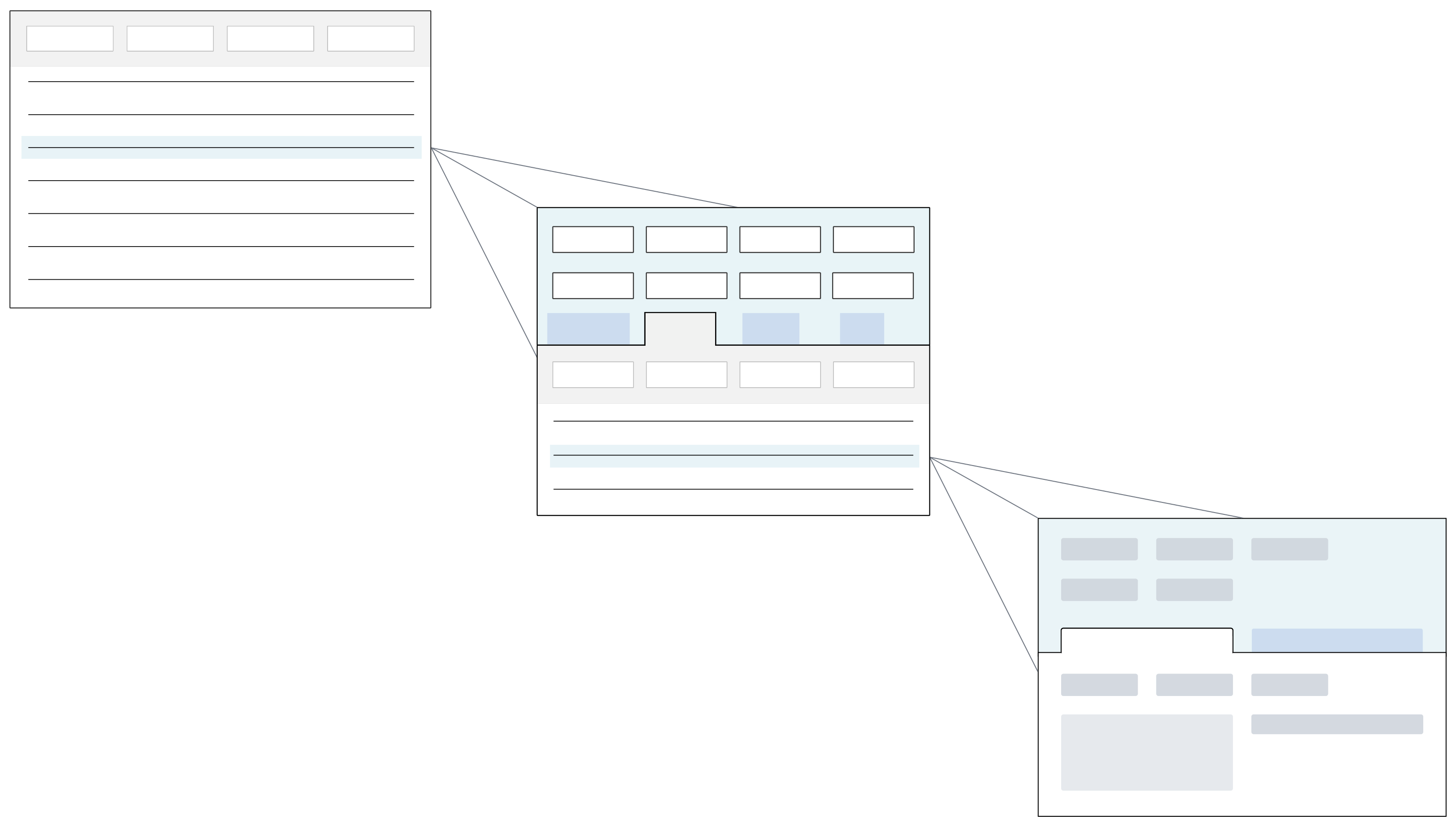
When a Header record is deleted from a Header Detail application, both the Header record and associated Detail records are deleted. This only occurs if the Header and Detail are part of an HD Structure. Header Detail (HD) Structures group records from a Header Detail table together. Learn more in HD Structures and logic blocks topic.
Configuration Options
Configure Header Detail applications with different options, such as:
- Tree Option—Displays detail records in a hierarchy that can be collapsed and expanded. Users can move directly to individual nodes within the heirarchy, and can view subtotal values for nodes. For more information see Configure a relationship tree in a Detail application
Advanced Listtype—Enables additional features, such as an editable header in the list form.- Workflow orchestration—Automatically transitions the Header or Detail application's workflow state when the other application state changes. Learn more in the Configure a workflow orchestration topic.
- Create Join Table for HD—Creates a join table between the Header and Detail table. This ensures that when an interactive report is created over the Header Detail application with the Report Quick Start form action, both the Header and Detail table information is included. This option only works for Header Detail applications configured with a single Detail table.
Header Detail application configuration
Configure Header Detail applications with the Table Definitions, Application Builder, and Logic Block Builder applications.
Prerequisites
To build a Header Detail application, you must already have configured a Header table, as well as one or more Detail tables. The Header and Detail tables must be included in a table of type Header Detail.
Build one or more Detail style applications of type Standard over the Detail tables. The Detail application controls the display of the detail form of the header detail form and the detail form. Configure the layout for your Detail application within the Header Detail application you create in the Application Builder.
Build a Header style Header application of type Standard or Advanced List over the Header table. The Header application controls the display of the list form, as well as the header region of the header detail form. Configure the layout for your Header application within the Header Detail application you create in the Application Builder.
To learn more about where you configure the various application action controls for Header Detail forms, see the Configure Header Detail actions topic.
Header Detail table
You must have a table of type Header Detail. This table connects the Header table and Detail table. For more information, see the Header Detail table structure topic.
You can create the Header Detail table during your application configuration, or in the Table Definitions application.
Application Builder
In the Application Builder application, create an application of type Header Detail. Select or create the Header Detail table for your application. Once your application record is created, select the Add button in the Viewer panel to select your Header and Detail applications. Within each application, configure your fields and layout.
There are several configuration options, such as:
- Allow Quick Import—When selected, adds the quick import capabilities to the Header Detail application. This allows data to be imported into the detail tables through a form action on in the Header Detail view.
- Single Click To Edit—When selected, list form fields open in edit mode after a single click. Learn more in Enable single click to edit fields.
- Is Extension Application—When selected, indicate this application is being used to extend an existing base application.
- Create Join Table for HD—When selected, the system creates a join table between the Header and Detail table. The join table name becomes visible in the RQS Table field. This ensures that when an interactive report is created over the Header Detail application with the Report Quick Start form action, both the Header and Detail table information is included. This option only works for Header Detail applications configured with a single Detail table.
- DetailApplications.ActivePage—When selected, the Detail application is defaulted to open in the Header Detail application. This checkbox is configurable in the Detail Applications subtable.
- Detail Page Configuration—When selected, the layout of the Header and Detail applications inside the Header Detail application.
Logic Block Builder
In the Logic Block Builder application, there are several considerations for configuration, such as:
- All logic blocks must be created over the Header Detail table, and then configured as actions for the application they affect.
- Background Task logic blocks cannot be built over the Header Detail table. They must be built over the Header table instead.
- Logic blocks used as table triggers must be built over the table that they update, and then added to the table as a trigger.
- Post-trigger table triggers that update the Header Detail table must be built over the Header table, and then added to the Header Detail table. See Configure table triggers for Header Detail applications for more information.
- Use the Create HD Structure action to reference Header Detail records in logic bocks. Configure the action to hold the Header Record, and any associated Detail records. See HD Structures and logic blocks for more information.
Configure table triggers for Header Detail applications
There are special considerations for table triggers used in Header Detail applications.
Triggers have different purposes on each of the tables that make up a Header Detail table:
- Detail—The logic block fetches data from the detail row, and not the header.
- Header—The logic block fetches from only the header, and not the detail rows.
- Header Detail—The logic block can fetch data from both the header and detail.
Sequence
Table triggers for Header Detail tables run in a specific sequence. When there are multiple detail tables, the table triggers run depending on the order in which the detail tables are defined in the Detail Tables subtable in the header detail table definition.
If there is one header detail table, one header table, two detail tables defined, and workflow logic blocks configured, the logic blocks run in the following order:
- Action Block - Header Detail table
- Table Triggers - Header table
- Table Triggers - Detail table 1
- Table Triggers - Detail table 2
- Table Triggers - Header Detail Table
- Post-Run workflow - Header table
HD Structures and logic blocks
Header Detail (HD) Structures group records from a Header Detail table together. You can then reference the structure, rather than the Header and Detail tables separately, in logic blocks.
HD structures are created in several ways, such as:
- Automatically—The system create an HD structure when a user creates a new record in the Header Detail application. You can then enter values into the fields and save the changes.
- Manually—Use the Create HD Structure action in the Logic Builder. You can use insert actions to add values to the HD Structure. Learn more in the Create HD Structure action topic.
When a Header record is deleted from a Header Detail application, both the Header record and associated Detail records are deleted. This only occurs if the Header and Detail are part of an HD Structure.
The HD structure type you select depends on how you're using the HD structure. HD structures can be:
| Type | Use to... | Configuration Notes |
|---|---|---|
| New | Insert a new record to a Header Detail table. Logic blocks treat the structure as a record to be inserted into the database. | To prevent unwanted updates from occurring, use a NATE container. If you don't use a NATE container, updates and validations from Header to Details and Details to Header with modified by another user errors may occur. The same updates in a Temporary HD Structure do not trigger and perform validations. |
| Existing | Update an existing Header Detail record. | |
| Temporary | Create a structure that isn't saved automatically. For example, passing a Header Detail record into a called logic block. | If you use temporary HD Structure but want to commit them, you must use the Save HD action before you reinsert any new HD structures. Validations that exist for New and Existing HD Structures are bypassed which means you do not need to use a NATE container. You cannot commit a temporary structure, so its usage is more limited. |
When a logic block is built over a Header Detail table, the logic block has access to the Header records. Use a Fetch Details action to access and work with the Detail records. When a logic block is not built over a Header Detail table, create an HD structure in the logic block.
For example in the WriteProcurementOrderToSupplierview logic block, the actions in the logic block create a new HD structure, insert a record into a header table, fetch detail records, insert a detail record in the data found loop, and then save a header detail record. The table below is an example of these logic block actions:
| Action | Action type | Action Summary |
|---|---|---|
| 0 | Create HD Structure | Create new HDStructure |
| 1 | Insert Records | Insert a record in ProcurementOrdersSupplierViewHeader |
| 2 | Fetch Detail Records | Fetch all ProcurementOrderDetail records |
| 3 | Insert Records | Insert a record in ProcurementOrdersSupplierViewDetail |
| 4 | Save HD | Save ProcurementOrdersSupplierView |
Insert records in to a Header Detail table
Logic blocks can use HD structures to insert records into Header Detail tables. Usually these records come from one or more tables that are not Header Detail tables, such as Main tables.
For example, the WriteGLTransaction logic block is the action block used to insert records into the GeneralLedgerTransactions table, which is a Header Detail table. When the WriteGLTransaction logic block is called, an HD structure is passed in. The WriteGLTransaction logic block validates the record, and then inserts the Header Detail record into the GeneralLedgerTransactions table.
Integrations
Logic blocks can use HD structure to create records during integrations, and organize data before inserting them into a Header Detail table.
For example, the CreatePayableTransactions logic block is used to insert records into the PayableTransactions table during integrations. The PayableTransactions table is a Header Detail table.
- The
CreatePayableTransactionslogic block is called by theIntegratePayableTransactionslogic block. TheIntegratePayableTransactionslogic block is built over thePayablesIntegrationtable, which is a Main table. - The
IntegratePayableTransactionslogic block passes in records for a specific run number to theCreatePayableTransactionslogic block. - The records are grouped and held in an HD Structure using the Create HD Structure action, and then inserted into the
PayableTransactionstable.
The IntegratePayableTransactions table is a Main table and the PayableTransactions table is a Header Detail table, and using the HD Structure allows you to organize the records before inserting them.
Pass data to a called logic block
Logic blocks can use HD Structure to pass data to another logic block. Usually this is done using the Call a Logic Block action.
For example, the CreateCreditCardIssuerInvoice logic block passes values in to the WritePayableTransaction logic block, which then inserts records into the PayableTransactions table. The PayableTransactions table is a Header Detail table.
When a supplier invoice is paid using a credit card payment method, an invoice is automatically created to reflect the balance now owed to the credit card company. This steps below describe the logic performed to complete this process.
- The
CreateCreditCardIssuerInvoicelogic block creates a temporary HD Structure to hold and organize values, inserts values into the structure, and then calls theWritePayableTransactionlogic block. - When the
WritePayableTransactionlogic block is called, the HD structure created in theCreateCreditCardIssuerInvoicelogic block is passed in. - The
WritePayableTransactionsaves records to thePayableTransactionstable. - The values are validated, and then committed to the
PayablesHeaderandPayablesDetailtables.
Insert into header detail structure
Insert records as header detail records from one or more tables. This logic block pattern is commonly used to insert records into a commonly used table from multiple sources. That is, it is commonly used in action blocks when records write to a table from multiple sources. For example, if you are saving a record in the Cash Transfers application and also need the transaction to post in the General Ledger application, use this logic block pattern to insert the record.
Using data from one or more tables, you can insert into a completely separate Header Detail structure.
To insert into a Header/Detail structure, you must create two temp tables in the logic block. One for the header table of the H/D structure and one for the detail table of the H/D structure. Throughout the logic block, you can insert into the temp tables and then use them as the Header table and Detail table when you want to insert into the Header/Detail structure.
Example
The most common use case for this logic block pattern is inserting into the GeneralLedgerTransactions Header detail structure when writing a journal entry. Cash transfers, supplier invoices, expense reports, payments, donation receipts, and other various application write journal entries.
Accountants use the Cash Transfer application to transfer money from one account to another account, and the resulting transaction must be recorded as a journal entry. After the cash transfer workflow status changes to RTP, the WriteCashTransferGLRecord logic block runs, which takes the information in the cash transfer record and writes a corresponding journal entry. When the logic block runs successfully, the cash transfer status changes to PTGL. When the logic block errors, the cash transfer workflow status changes to ERR.
First, the logic block creates two temp tables: one that matches the structure for the GeneralLedgerHeader table, which is the header table for the GeneralLedgerTransactions Header/Detail table, and one that matches the structure for GeneralLedgerDetail table, which is the detail table for the GeneralLedgerTransactions Header/Detail table.
When creating the temp table for the header, the Allow Multiple Entries check box must be cleared. When creating the temp table for the detail, Allow Multiple Entries check box must be selected. This is because one Header/Detail record can have one header and multiple details, but it cannot have multiple headers.
Next, the GLHeader temp table is inserted into once and the GLDetail temp table is inserted into twice because the debits and credits in the detail records must be equal to write a journal entry.
Like inserting records into the detail of a Header/Detail application without saving the detail records to the database, the name of the inserts into the temp tables must be the same as the temp table name. If the names are not the same, the insert does not work.
After records have been inserted into the header and detail temp tables, use the Save HD action to insert into the GeneralLedgerTransactions table. Unlike the inserts to the temp tables, the name of the Save HD action doesn't have to match the name of the Header/Detail table. The GLHeader temp table is used as the header table and the GLDetail temp table is used as the detail table.
In this example, the WriteGLTransaction logic block is called to do the insert into the GeneralLedgerTransactions table. WriteGLTransaction is the one source to write entries to the GeneralLedgerTransaction table. In the Call a Logic Block action, the GLHeader temp table is used as the header table and the GLDetail table is used as the detail table.
Configure Header Detail actions
This table shows where you configure the various application action controls for the Header Detail application forms.
To learn more about forms, see the Application forms topic. To learn more about regions of a Header Detail application, see the Header Detail application settings topic.
| To impact the form... | With the Action Type... | On the region.... | Define in the application... |
|---|---|---|---|
| Header detail | Event Actions | Header | Header |
| Header detail | Application Links | Header | Header |
| Header detail | Dynamic Link | Header | Header |
| Header detail | Search Actions | Header | Header |
| Header detail | Row Actions | Header | Header |
| Header detail | Form Actions | Header detail | Header |
| Header detail | Field Actions | Header detail | Header |
| Header detail | Control Actions | Header detail | Header |
| Header detail | Control Actions | Detail list | Detail |
| Header detail | Event Actions | Detail list | Header or detail |
| Header detail | Application Links | Detail list | Detail |
| Header detail | Dynamic Link | Detail list | Detail |
| Header detail | Search Actions | Detail list | Detail |
| Header detail | Row Actions | Detail list | Detail |
| Header detail | Dbl Click Override | Detail list | N/A |
| Header detail | Dbl Click Override | Header detail | N/A |
| Detail | Field Actions | Detail | Detail |
| Detail | Row Actions | Detail | Detail |
| Detail | Form Actions | Detail | Detail |
| Detail | Control Actions | Detail | Detail |
| Detail | Event Actions | Detail | Detail |
| Detail | Application Links | Detail | Detail |
| Detail | Dynamic Link | Detail | Detail |
| Detail | Search Actions | Detail | Detail |
| Detail | Dbl Click Override | Detail | Detail |
| List | Dbl Click Override | List | N/A |
| List | Field Actions | List | Header |
| List | Form Actions | List | Header |
| List | Control actions | List | Header |
| List | Event actions | List | Header |
| List | Application Links | List | Header |
| List | Dynamic Link | List | Header |
| List | Row Actions | List | Header |
| List | Field Actions | Detail | N/A |
| List | Form Actions | Detail | N/A |
| List | Search Actions | List | N/A |
Header Detail field dependencies
Field dependencies define a set of selectors for your application. In Header Detail applications, field dependencies can be configured on the Header, or the Detail applications.
The fields used to configure field dependencies are:
- Controlling Field Type—The Type of data item shown in the Dependent Field. For example, a
Calendardata item Type configures the application to be able to show a calendar in the Dependent Field. - Controlling Field—The name of the field (data item) where you enter the Controlling Field data item name. For example, this is the field where you enter the name of the Calendar you want displayed in the Dependent Field.
- Dependent Field—The field that is impacted by the controlling field's value. For example, the calendar designated in the Controlling Field is shown in the Dependent Field.
| If the Controlling Field is in the... | And the Dependent Field is on the... | Define the Field Dependency in the... |
|---|---|---|
| Detail application | Detail application | Detail application |
| Header application | Detail application | Detail application |
| Header application | Header and Detail applications (the same Dependent field is used in both applications). | Header and Detail applications |
| Header and Detail application (the same Controlling Field is used in both applications). | Detail application Dependent fields in the Detail are controlled by the Controlling Field on the Detail form. Dependent fields in the Header are controlled by the Controlling Field on the Header Form. | Header and Detail applications |
Header Detail application settings
Apply application settings to Header Detail applications.
Create individual application settings for the Header application and each individual Detail application to control settings for specific regions of the final Header Detail application. If you have multiple Detail applications, you can apply different data mappings, action controls, and layout settings to each detail.
After you have configure your desired application settings for the Header application and Detail applications, enter them on the Header Detail App Settings page for the Header Detail application to link them together. From the Header Detail application settings, you can disable the entire application using the Read Only Application checkbox.
Header Detail regions
The settings you create over the Header Detail application do not allow you to control any region configurations.
The following diagram of a Header Detail structure shows which regions of the Header Detail application are controlled by the Header and the Detail applications settings:
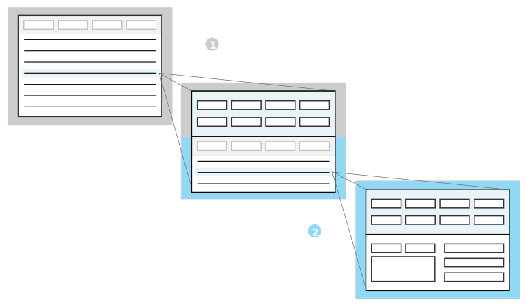
| Header application—The settings you build over this application control the header region and List form of a Header Detail application. |
|---|---|
| Detail application—The settings you build over this application control the Detail List form and Detail form of a Header Detail application. |
Header Detail application setting configuration
Configure application settings for Header Detail applications with the Application Setting Definitions and Application Builder applications.
To configure application settings for Header Detail applications, you must configure:
- Header application settings—Controls what you see, and how you interact with the list and header forms of the Header Detail application.
- Detail application settings—Controls what you see, and how you interact with the header detail and detail forms of the Header Detail application.
- Header Detail application settings—Connects the Header and Detail application settings to the the Header Detail application.
Header application setting
The table below describes the setting types you can configure on different pages of the Application Setting Definitions application.
| On the page... | Use the setting type... | To effect the Header Detail form... | Considerations |
|---|---|---|---|
| Field | Default Field | Header Detail | Learn more in Data mapper. |
| Filter Field | List | Only Filter Fields of type List should be mapped. | |
| Workflow | List or Header Detail | ||
| Layout | Pages | Header Detail | Used to hide pages, rows, and fields on the Header application. |
| Rows | List | ||
| Field Options | List or Header Detail | Only use List or Detail values in the Field Layout Settings subtable. | |
| Actions | Control Actions | List or Header Detail | Used to configure Control Actions for the Header and List form. |
Detail application setting
The table below describes the pages, the setting types, and the form affected by the configuration.
| On the page... | Use the setting type... | To effect the Header Detail form... | Considerations |
|---|---|---|---|
| Field | Default Field | Header Detail or Detail | Learn more in Data mapper. |
| Filter Field | Header Detail | Only Filter Fields of type Detail List should be mapped. | |
| Workflow | Header Detail or Detail | ||
| Layout | Pages | Detail | Used to hide pages, rows, and fields, on the Detail application. |
| Rows | Detail | ||
| Field Options | Header Detail or Detail | Only use List or Detail values in the Field Layout Settings subtable. | |
| Action | Control Actions | Header Detail or Detail | Used to configure Control Actions for the Detail List and Detail form. |
Header Detail application setting
The Fields, Layout, and Actions pages of the Header Detail application settings should not be configured. On the Header Detail App Settings page, enter the names of the Header application settings, and all Detail application settings.
Common fields
Common fields are data items that share values when they are used in two tables in the same application. For example, a Subtable and Main table, or a Header table and Detail table.
When a value is entered into one of the common fields, the value automatically populates in the common field of the other table.
Common fields are configured in the Table Definitions application. If the table is a Header Detail table, configure common fields in the Header / Detail page. For other types of tables, configure common fields on the Relationships page.
By default, common fields cannot be changed after they have been automatically populated. Use the SubListCommon.CommonFieldsLookup field to configure if users can change or clear a common field value in a Detail table or Subtable field.
Common fields allow you to:
- Align information between tables.
- Filter a table lookup field or search application.
- Create unique indexes for the Subtable or Detail table.
Updating common fields with logic
If you use logic to update one of the common field values, you must provide the Header Detail table as the Data Source Name. This allows the system to recognize the common fields between Header and Detail tables.
Relationship trees in Detail applications
Application developers can display detail records in a hierarchy, with nodes that can be expanded and collapsed to show the relationships between records, by configuring a relationship tree in the detail list region of a Header Detail application.
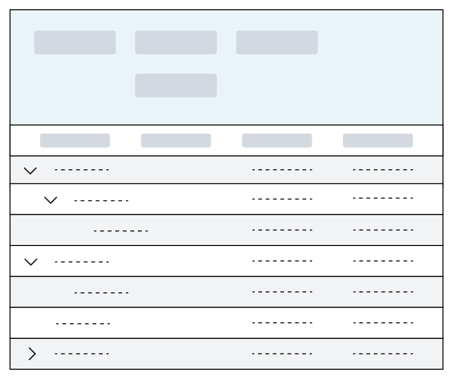
For example, the Multi-Level Bill of Material Inquiry application is configured with a relationship tree in its detail application. Users specify information in header fields and then use a form action to populate the detail list. The detail list then displays all product components of a bill of material in a hierarchical structure with nodes they can expand. The records are read-only, so users cannot add records to the detail table. Learn more in Example: Relationship tree in a Detail application.
Unlike Relationship applications, which are built over a relationship table and an entity table, relationship trees configured in Detail applications are built over a Detail table, which has a flat structure. You must design logic blocks to populate the detail table and define the relationships between the records. For this reason, users can add root node records only, but you can hide the Add button using control actions. Learn more in Configure a relationship tree in a Detail application.
Configure a relationship tree in a Detail application
Application developers use the Data Item Definitions, Table Definitions, Application Builder, and Logic Block Builder applications to configure a relationship tree in a Detail application.
Data Item
During application configuration, or in the Data Item Definitionss application, you must create a Text type data item to specify as your Parent Field on your Detail table below. Your logic blocks populate this data item with the value of its parent record's Child Field, which establishes a hierarchical relationship between records.
You can specify the nwId as the Child Field, or you can create your own Number data item. The nwId is created automatically for each record, which means that copied records have different nwIDs. If the records you insert into the Detail table need to later be copied into another table, you cannot use the nwId as your Child Field.
If you choose to use your own data item as the Child Field, consider the following:
- Unlike nwId, which is created automatically, you must populate this field with a logic block.
- Each record must have a unique value. Use enough characters to accommodate the number of unique records that your users might need.
Table
In the Table Definitions application, you must:
- Add the data items you created to your Detail table.
- Navigate to the Relationships page.
- Specify a data item in the Child Field field. This can be the nwId or the
Numberdata item you created above for this purpose. - Specify a data item in the Parent Field field. This is the data item you created above for this purpose.
Specifying a Child Field and Parent Field automatically adds the RelationshipExpansionDefaultFields data item group to your Detail table, which includes the nwRelationshipExpansionKey, nwRelationshipNoLeafKey, RelationshipDepth, and IsExpandable data items. Learn more about these data items and how to use them in your logic blocks in the sections below.
Detail application
In the Application Builder application, the following options are available to configure your Detail application:
- Primary tree—To select the field the Expand
 icon is located on in the detail list, specify the field as the
 Primary Treein the Display field on the Field Selection subtable on the List Form Fields page. If you don’t specify a field as aPrimary Tree, the Expand icon is on the first field listed in the Field Selection subtable. - Application Link Style—If you configure application links on your Detail application, you can specify a Link Style of
Expand Child Nodes. When a user closes the application that you linked to and returns to the Header Detail application, the nodes they opened remain expanded. This is only up to four levels deep. By default, all nodes are collapsed when users navigate to the detail list region of your Header Detail application. - Subtotals—To display subtotals for a root node record and all its children, select
Subtotalin the Aggregation field on the List Form Fields page for the field you want to display subtotals for.
Logic Blocks
In the Logic Block Builder application, you must build logic blocks to populate the table your Detail application is built over. To create the hierarchy of records and enable the relationship tree, the following data items in your detail table must be populated with the correct values:
| Data Item | Purpose |
|---|---|
| The data item defined as the Child Field on the Detail table | Identifies the record. |
| The data item defined as the Parent Field on the Detail table | Determines the relationship to the parent record. This is the data item you created above. The Parent Field value must always match the Child Field value of its parent record. If the record is a root node, the Parent Field should be left empty. |
| Determines the path from the root node record to the current record. The nwRelationshipExpansionKey value must always start with the root node record’s Child Field, followed by the Child Field of each parent record, down to the Child Field of the current record. Each value must be separated with a | character. For example, if the root node’s Child Field is 1, its child record’s Child Field is 2, and the current record's Child Field, which is a child of the child, is 3, the nwRelationshipExpansionKey for the third level record must be 1 | 2 | 3.The nwRelationshipExpansionKey of each root node should be match its Child Field. |
| Groups records in the hierarchy. The nwRelationshipNoLeafKey value must always match the nwRelationshipExpansionKey value of its parent record. |
| Determines the record’s place in the hierarchy. The nwRelationshipDepth value for all root node records must be set to 0. If the record’s parent record is a root node, its RelationshipDepth must be set to 1. |
| Determines whether to display the Expand icon on a record. If the record has any children, this field must be set to true. |
Unlike Relationship type applications that use a relationship table and an entity table, relationship trees in Detail applications are built over a flattened data structure. The above data items form the visual hierarchy between records, but they still must be inserted into the table in the order they should appear in the application. For example, you need to insert the following records:
- Record 1, a root node record
- Record 2, a child of Record 1
- Record 3, a child of Record 2
- Record 4, a child of Record 1
- Record 5, a root node record
The logic block should insert them into the table in this order:
- Record 1
- Record 2
- Record 3
- Record 4
- Record 5
Limit fetches to the database by recursively calling a logic block to insert records.
Example: Relationship tree in a Detail application
The Multi-Level Bill of Material Inquiry application is an example of how a relationship tree in a Detail application is configured.
Logic blocks fetch records from the Bill of Materials application’s tables and insert them into a hierarchical structure in the Multi-Level Bill of Material Inquiry application’s detail table.
Object overview
Business users can examine all components of a product in a hierarchical structure with the Multi-Level Bill of Material Inquiry application. They enter values in the required fields to specify a product, and then use the View form action to populate the detail list region with product's components. These components are organized into a structure of parent components which can be expanded to see child components.
For example, if a user was to view components of a cell phone, they might see a parent component of Front Panel. When they select the Expand icon on that record, they see that components that make up the Front Panel, such as Front Frame, Front Cover Housing, and Screws.
Configuration elements
| Object | Object Type | Configuration details |
|---|---|---|
| Multi-Level Bill of Material Inquiry | Header Detail application | The Multi-Level Bill of Material Inquiry application is a Header Detail application, composed of the BOMExplosionHeaders and BOMExplosionComponents applications. The BOMExplosionComponents detail application is built over the BOMExplosionComponents detail table. |
BOMExplosionHeaders | Header application | This application is configured with the View form action, which triggers the ExplodeBOMWrapper logic block. |
BOMExplosionParentIDText | Data item | This data item captures the Child Field of the parent record. |
BOMExplosionComponents | Detail table | This Detail table is configured to support a relationship tree in the BOMExplosionComponents Detail application. On the Relationships page, nwId is entered in the Child Field field, and BOMExplosionParentIDText is entered in the Parent Field field.Specifying a Child Field and a Parent Field automatically adds the RelationshipExpansionDefaultFields data item group to the detail table. Learn more in Configure a relationship tree in a Detail application. |
Logic block configuration
The ExplodeBOMWrapper logic block is triggered when a user selects the View form action. Among other functions, this logic block and the child logic blocks that it calls work together to:
- Fetch records from the
BOMHeadersandBOMComponentstables. These tables hold the data that users enter when they create bills of material in the Bill of Material application. - Organize records into relationships by populating the
BOMExplosionParentIDText,nwRelationshipExpansionKey,nwRelationshipNoLeafKey,RelationshipDepth, andIsExpandabledata items. The logic blocks traverse theBOMHeadersandBOMComponentstables to establish a hierarchy. If there is only a header record for a component, it must be a root node record in theBOMExplosionComponentstable. If there is only a detail record for a component, it is a bottom level component with no children. - Insert records into the
BOMExplosionComponentstable. The user can now view a hierarchy of components in the Multi-Level Bill of Material Inquiry application.
Header Detail application best practices
These best practices ensure that header detail applications are configured consistently throughout Nextworld.
When to use
Use a header detail application when you have a one to many relationship where the transaction represents one document that stays together throughout the process, including workflow. A header can have multiple details; however, details should not always be required. Most transactions should allow the header to be saved without any details when it is first created. Each transaction can have different requirements for when the details become required. The application should require the details and issue an error prior to moving the transaction into that state. For example, a Purchase Order allows you to create a header without any details when the header is at a NEW status. Details become required when the order is moved to PROGRESS, but it does not move the transaction to PROGRESS, until there is at least one detail.
For more on header detail application form flow and configuration, see Header Detail application.
General best practices
- Do not run logic blocks in the header that update all detail rows because of field value changes. This causes performance issues when the row count is high. If your detail row is dependent on one or more fields in the header, disable the header fields when one detail row is entered.
- Do not directly insert a record to a Detail table. Always work within an HD Structure. Inserting directly can cause data integrity issues because common fields are not populated and post insert logic blocks do not run. Even if those constructs are not used in the current application configuration, future development could introduce both them and data integrity issues. See HD Structures and logic blocks for more information.
- In the detail application list, specify a Display Name. The display name is translated. If no display name is specified, then the internal object name (which is not translated) is used.
- If the header contains multiple pages, configure the detail to be inline with the header pages. This is configured in Application Builder.
- If an application is needed to display information from the detail, create a read only or list only application over a join table (header and detail table). Or create a read only or list only standard application over the detail table. Records can only be added to the detail table through a header/detail application.
- A join table should be listed in the RQS Data Source field. If a join between the header and detail already exist, that can be used. If one does not exsit, the Create Join Table for HD action can be used to automatically create one for you. This ensures that when an interactive report is created over the Header Detail application with the Report Quick Start form action, both the Header and Detail table information is included. This option only works for Header Detail applications configured with a single Detail table.
Module Settings application
Use the Module Settings application type to configure settings that control how applications look and can be interacted with. Unlike application settings which can only be applied to a single application, module settings can be applied to many.
For example, you could create a Module Settings application for related financial applications. Then, you could add a Global Setting for Fiscal Year that defines the start date of the fiscal year, then defaults that value into records for all of the applications with the module setting applied. Module Settings applications provide a way to configure that in one step, rather than having to configure it for each individual application. When the fiscal year for your company changes, you can update the module setting without having to update each application in the module.
Each field in a Module Settings application represents one module setting. This means Module Settings applications often have many settings that are applied to the associated applications. The scope of each module setting controls how it is applied to records. There are different levels of module settings, such as:
- Global settings—Apply to all records within applications that reference the configured settings.
- Organizational settings—Apply to all records associated with an org unit within applications that reference the configured settings.
- Person settings—Apply to all records associated with an employee directory record within applications that reference the configured settings.
Once a Module Setting application is configured, you can link it to as many applications as you would like with the data mapper tool, or with logic blocks. Learn more in the Module Settings application configuration topic.
The initial application view for Module Setting applications is the list form. You can select a record from the list to open the configured settings. You can select the scope of each setting from this view.
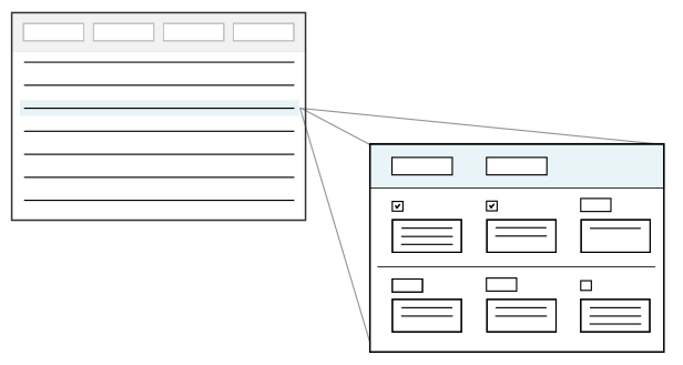
With Module Settings you can control the scope of how the settings are applied, as well as specific field configurations.
Field Configurations
You can control how users interact with fields, such as:
- Required fields—Require a value before the record can be saved.
- Field types—Configures the type of record the module setting applies to.
Module settings should be designed with the expectation that they won't change frequently. You can configure a Module Setting so that once set, it can't be changed.
Users can launch Module Settings applications and configure settings by entering values in fields. Certain configurations make the values entered into the fields become default values across the module.
Records created in a Module Settings applications are consumed by the application, application settings, and application linking. Module settings are part of the configuration of an application, and define core attributes of the application. Applications evaluate module settings for every transaction at runtime.
Module Settings application configuration
Configure a Module Settings application using the Data Item Definitions application, Table Definitions application, and Application Builder application. After the settings are configured, you can use them in applications.
Data Item
During application configuration, or in the Data Item Definitions application, you can create a new data item to configure a custom setting, or reuse previously created data items.
Table Definitions
In the Table Definitions application, open or create the table which your Module Setting application will be built over.
On the Settings Configuration page, setting any of the options below to true will determine whether a create button for Global, Org Unit, and Person will be displayed on the application and what type of module settings can be setup.
- Global settings— When selected, this will allow users to setup a global module setting that could apply to all records within applications that reference the configured settings.
- Organizational settings—When selected, this will allow users to setup an org unit module setting that could apply to all records associated with an org unit within applications that reference the configured settings.
- Person settings—When selected, this will allow users to setup a person module setting that could apply to all records associated with an employee directory record within applications that reference the configured settings.
On the Settings Configuration page, in Settings Field subtable, add the following fields:
GlobalSettingOrganizationalUnitName- Only needed if you are allowing Org Unit level settings.Directory- Only needed if you are allowing Person level settings.- Any additional settings fields.
Application Builder
In the Application Builder application, build the Module Settings application over the table and configure the settings.
GlobalSettingdata item—Add on the header row to create a Global Setting checkbox in the Module Settings application. This is how you configure the module settings to be on a global level.OrganizationalUnitName_Namedata item—Add on the header row to create the Organizational Unit fields in the Module Setting application. This is how you configure the module settings to be on an organization level, and select the organization.OrganizationalUnitName_OrganizationalUnitTypedate item—Add on the header row if you want certain fields to only be configurable when the org unit is of type Company.Directory_Namedata item—Add on the header row to create the Person field in the Module Setting application. This is how you configure the module settings to be on an employee level, and select the employee.- Custom data items—Add to create the desired fields where you want the module settings applied.
- Global Settings, Organizational Settings, or Person Settings checkboxes—Select the checkboxes to allow configuration of the individual data items for those respective levels. Each data item can have the Global or Person checkbox selected individually, as well as the type of organization you want configured.
Reference Module Settings in applications
Once the module settings are configured, you can reference them in any application or application setting with the data mapper, or the Retrieve Module Settings action in the Logic Builder.
There are several ways to reference the module settings in an application, such as:
- Open the Data Mapper from the Filtered page, in the table which the application is built over.
- Open the Data Mapper from the Fields page, in the application settings for the application.
- Use the Retrieve Module Settings action in the Logic Builder.
Learn more in the Data mapper and Retrieve Module Settings action topics.
Relationship application
Use the Relationship application type to define connections between records in the same table. Records are defined as either a parent or child record within a relationship.
Parent records can have one, or many, child records associated with them, while child records may only have one parent. For example, the relationship between employees and cubicles, where each employee has only one cubicle, and each cubicle can have only one employee. Alternately, the relationship between a department and the employees who work there, where there can only be one department which each employee belongs to, but multiple employees belong to the same department.
Styles
How relationship records are organized and displayed in the application is based on the application style selected, such as:
Standard—Displays parent and child records in a list form without a hierarchy or indication of their relationship. Open the detail form of a record to view the associated relationship records.Tree—Displays parent and child records in a list form within the hierarchy defined by their relationship. Child records are nested below the parent records and are accessed by expanding the row. The detail form is always visible next to the list form, and shows information for whatever record you have selected in the list.Tree Only Mini App—Displays records in the Tree style, but from within a mini app. Mini apps launch from either the Navigation Menu or through an application action in a floating window. This style is often used for inline applications and dashboards.
The diagram below shows a tree style application on the left, and a standard style application on the right.
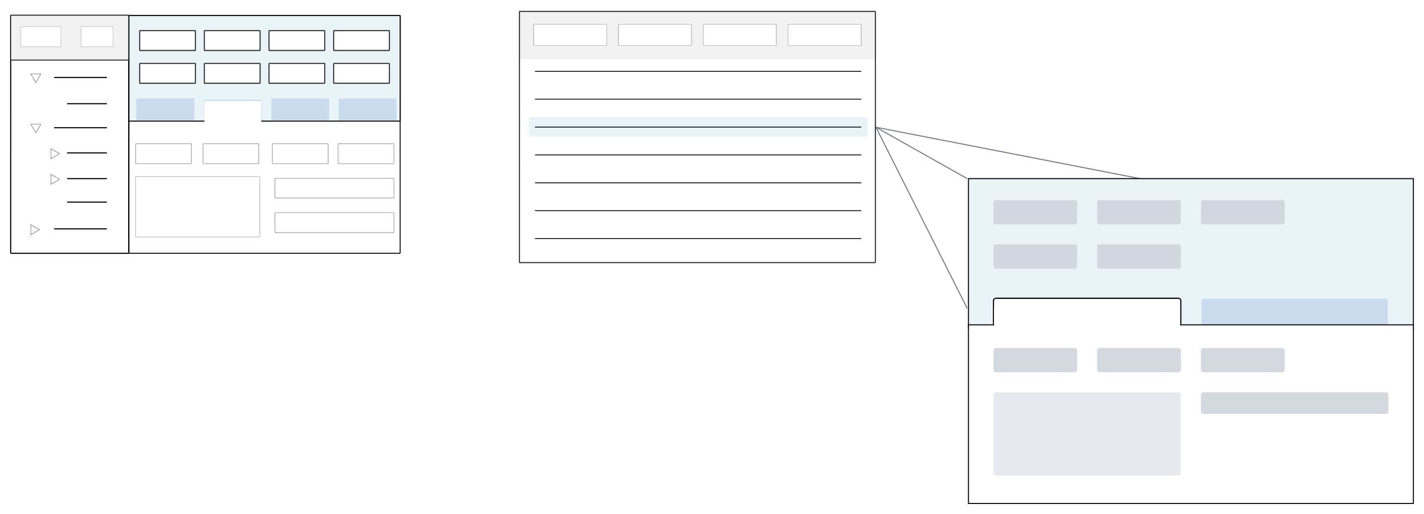
Relationship applications are a complex configuration requiring multiple steps. Learn more in the following topics:
- Standard style Relationship applications
Standard style relationship applications open in the list form and show a flattened view of the child and parent records. Open the detail form of a record and navigate to the Relationship page to view related records.
- Tree style Relationship applications
Tree style Relationship applications open in a list form with records displayed in a hierarchy. Child records are nested below parent records in a tree that can be expanded or collapsed. Select a record to show additional record information in a form located next to the tree.
- Relationship application structure
Relationship applications are composed of multiple tables and applications. This topic outlines the different components and objects needed to configure a relationship application.
- Relationship application configuration
Configure Relationship applications with the Data Item Definitions , Table Definitions , and Application Builder applications.
- Relationship application actions reference
This table shows where you configure the various application action controls for the relationship application forms.
Standard style Relationship applications
Standard style relationship applications open in the list form and show a flattened view of the child and parent records. Open the detail form of a record and navigate to the Relationship page to view related records.
The detail form is always controlled by a connected entity application that you must define in the Relationship application. Learn more in Relationship application structure and Relationship application configuration.
For example, you could have a directory application with contacts of type Organizational Unit and of type Person. In this application, the parent records would be Organizational Unit records, and the child records would be Person records. When you use the application to create directory records, you would associate person records with the organizational unit which they work at. This type of relationship application would be best organized with Standard style since an organization may have hundreds or thousands of child records associated with it. This would not be useful in a hierarchal tree structure.
The diagram below represents a Standard style Relationship application:
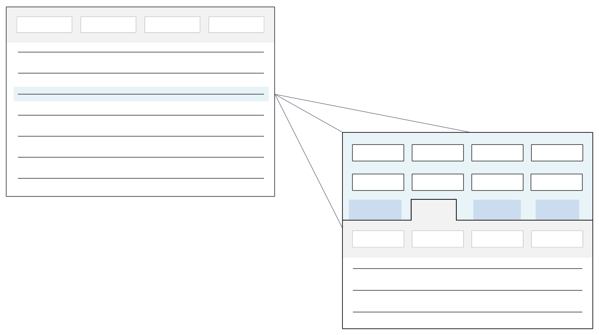
This application style supports a relationship cardinality of one-to-one and one-to-many.
Standard style relationship application best practices
These best practices ensure that all standard style relationship applications are configured consistently throughout Nextworld.
When to use
Use a relationship application with standard style when you have a parent child relationship, but you want to show them as a list and not as a tree. This relationship could be a one to one, one to many, or many to many.
For more on standard style relationship application form flow and configuration, see Standard style Relationship applications.
Tree style Relationship applications
Tree style Relationship applications open in a list form with records displayed in a hierarchy. Child records are nested below parent records in a tree that can be expanded or collapsed. Select a record to show additional record information in a form located next to the tree.
For example, you could have a project management application with activities of type Project and of type Task. When you use the application to create project and task records, tasks must be created and associated with the project which they belong to. This type of relationship application would be best organized with Tree style. Task records would be visible beneath their associated project in the list form of the application, and their details can be easily viewed without having to navigate away from the tree.
You can configure Tree style Relationship applications to display the detail form next to the list form, or to show a list of related records next to the list form once a record is selected. The diagram below shows these two views:
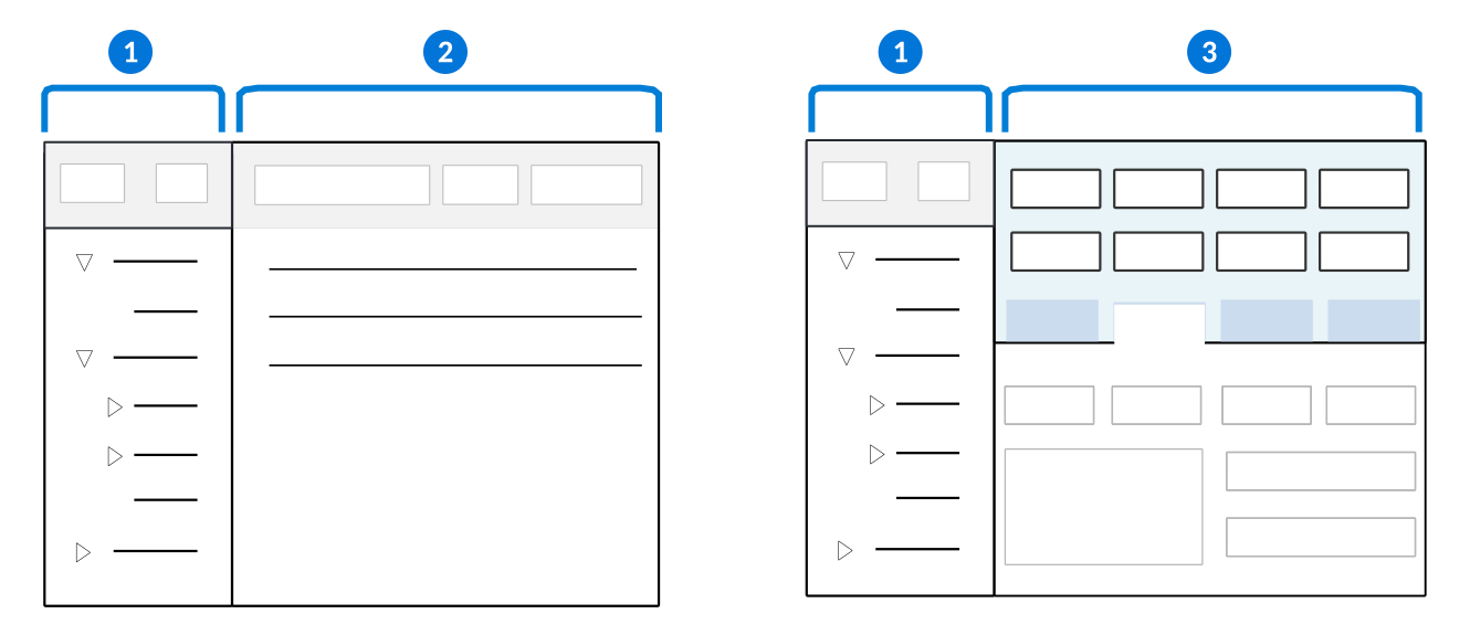
| Tree—Displays records from the application in a hierarchy with child records below their parent records. See Trees for an overview of navigation in a tree. |
| List form—The list form shows the child records of the parent record selected in the tree. You cannot edit records from the list form. Instead, open the detail form of the relationship application to modify them. The detail form displays a Relationships page where you can manage relationships. This configuration is only supported if you use a single application in your relationship. See [link: 'RelationshipMultiEntity'] topic for more information. |
| Detail form—The detail form shows the details of the record selected in the tree. This form ensures that you don't have to navigate away from the relationship application to edit record information. See [link: 'MultiApplicationConfig'] topic for more information. |
Learn more in Relationship application structure and Relationship application configuration.
Multi-entity relationship applications
Tree style Relationship application can be configured with multiple detail form entity applications. These applications, referred to as multi-entity relationship applications, are used when you have multiple applications you want combined into one tree style application. Within these applications, the different pages within a detail form represent the different relationship detail applications. This allows you to create, edit, and delete source records from all of the applications in one place. You can also define relationships between the attributes to create a hierarchal structure in the tree. Learn more in the Multi-entity relationship application configuration topic.
Relationship trees can also be included as Detail applications in Header Detail applications. Learn more in Relationship trees in Detail applications.
Tree style relationship application best practices
These best practices ensure that tree style relationship applications are configured consistently throughout Nextworld.
When to use
Use a relationship application with a tree style when you have a parent child relationship and you wish to show it in a hierarchical, tree view. This relationship could be a one to one, one to many, or many to many.
For more on tree style relationship application form flow and configuration, see Tree style Relationship applications.
Relationship application structure
Relationship applications are composed of multiple tables and applications. This topic outlines the different components and objects needed to configure a relationship application.
The diagram below represents a Standard style Relationship application:
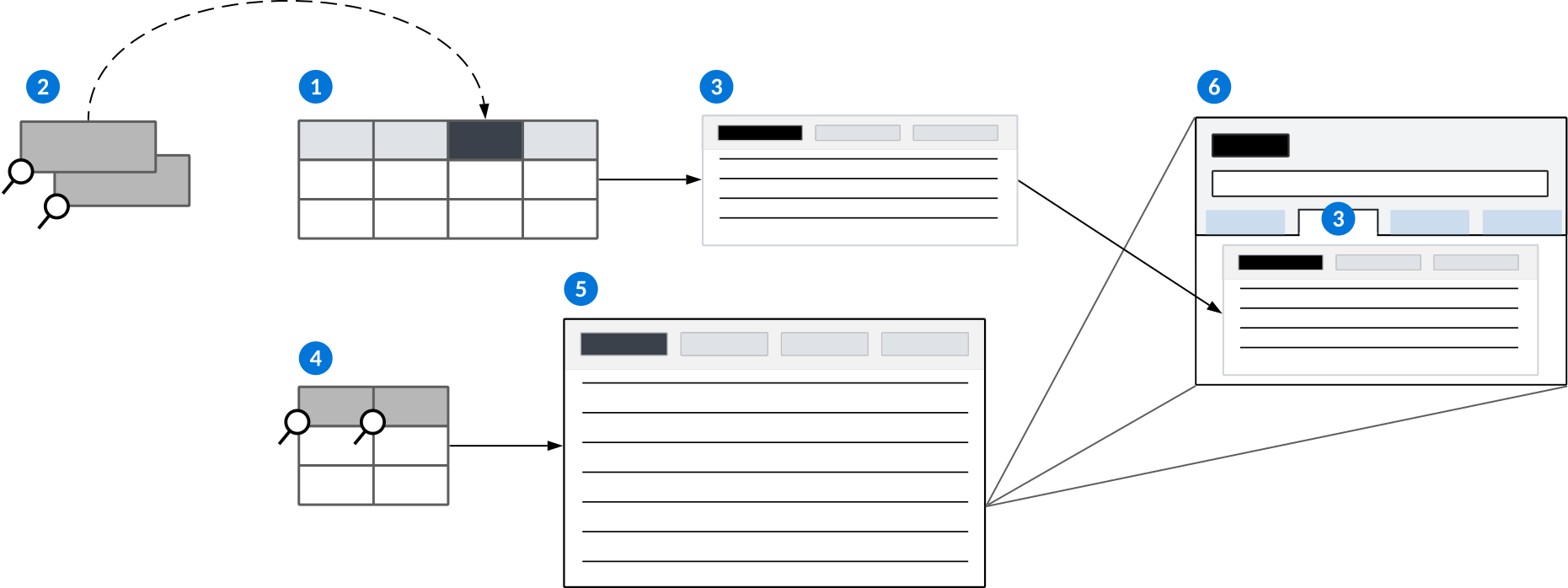
| Entity table—The table of type Main that stores the relationship application's records. This table should be configured with the data items you want used in the relationship application. |
|---|---|
| Child Field—The table lookup data item that identifies child records in the entity table. If using a Join table, the data item specified here should be the same data item used to connect the primary join table to the secondary table in the Join Definition. Parent Field—The table lookup data item that identifies parent records in the entity table. |
| Entity application—An application of type Standard or Advanced List built over the entity table. This application is referenced in the Relationship application configuration and controls the Relationship page in the detail form. |
| Relationship table—The table of type Main that stores the relationships defined between the records in the entity table. This table must have the Child Field and Parent Field added as fields, and also defined on the Relationships page of the table record. |
 | Relationship application—The application of type Relationship that controls what you see when you open the application. This application is built directly over the relationship table for Standard style Relationship applications. |
 | Detail form of a relationship record—Open to view the related records. |
For example, Employees is a Relationship application built over the EmployeeRelationships table. In this table, the Child Field data item is Contact and the Parent Field data item is RelatedContact. Both of these data items are table lookups to the Directory table. This allows you to pull records from Directory to EmployeeRelationships so that you can build relationships between the records.
Tree style Relationship applications
Tree style Relationship applications have a few additional requirements, such as:
- You must create a Left Outer Join table over the entity and relationship table.
- The Primary Join Table is the relationship table. The join field from the primary table should be the same data item that is specified for the Child Field in the relationship table.
- The Secondary Tables are the entity tables. The join field from the entity tables should be a required field from that table, preferably one that is enabled for table lookups.
Learn more in Relationship application and Relationship application configuration.
Relationship application configuration
Configure Relationship applications with the Data Item Definitions, Table Definitions, and Application Builder applications.
Relationship applications are a multistep configuration which requires multiple objects. To review the structure of a relationship application, see the Relationship application structure topic.
Data Items
Relationship applications require two data items of type Table Lookup that point to the entity table:
- Child Field—The name of the data item that identifies the child entity record in the relationship. If using a Join table, the data item specified here should be the same data item used to connect the primary join table to the secondary table in the Join Definition.
- Parent Field—The name of the data item that identifies the parent entity record in the relationship.
Table Definitions
Relationship applications require two tables of type Main:
- Entity table—Stores the relationship application's record. The relationships are built between these records.
- Relationship table—Stores the relationship between records. The Relationship table must contain the data items that a relationship application can use in its initial list or tree form, as well as the Child Field and Parent Field data items added on the Relationships page. The Child Field and Parent Field are table lookups to the entity table. If your application is Standard style, you build it directly over this table.
If your application is a Tree style, you build an additional table of type Join which connects the entity and relationship applications. In the join table record, on the Relationships page of the table record, you must:
- In the Join Type field, select
Left Outer Join. - In the Primary Join Table field, specify the relationship table. The join field from the primary table should be the same data item that is specified for the Child Field.
- In the Secondary Tables subtable, specify the entity tables. The join field from the entity tables should be a required field from that table, preferably one that is enabled for table lookups.
Application Builder
Relationship applications require two applications. In the Application Builder, you must:
- Configure an entity application of type Standard or Advanced List over the entity table. This application controls the relationship page on the detail form of the relationship application.
- If the entity application does not have pages configured, any detail fields that are not part of the header appear on a blank page next to the Relationships page. You can specify a name for this page by configuring the detail application pages.
- Configure a Relationship application over the relationship table or a Join table which connects the relationship and entity tables. This application controls what you see when you open the application.
- Select your application style. Use Standard style if you are building over a table of type Main, or Tree style if you are building over a Join table.
- In Advanced, on the Relationship Configuration page, in the Entity Application field, enter the name of your entity application.
- Optionally, select the Tree-Detail Form checkbox if you want the application to use tree detail form. Learn more in Tree style Relationship applications.
- Optionally, select the Save as Group if you want records to only commit to the database when you select the application's Save form action. Records are not saved when users exit a row or select the Save row action. Learn more in Save as Group option for Advanced List and Relationship applications.
Learn more about application configuration in Application configuration overview.
Relationship trees can also be included as Detail applications in Header Detail applications. Learn more in Relationship trees in Detail applications.
Multi-entity relationship application configuration
Configure a multi-entity relationship application in the Data Item Definitions application, Table Definitions application, List Lookup Definitions application, and Application Builder application.
Create the entity applications
Each entity application you want to use in the multi-entity application must be fully configured with a table and application built over it.
In the Table Definitions and Application Builder applications:
- Build your tables. These are your entity application tables.
- You must include fields which are available as related fields, and have a primary search field defined.
- Build your applications over the tables. These are your entity applications.
Only Standard applications and Advanced List applications can be used.
In the List Lookup Definitions application:
- Create a list lookup. This is your entity list lookup which is referenced in the relationship detail application you configure later.
- Add Lookup Keys for each of the entity applications you built. Provide a unique value and icon for each entity application.
These values and icons are the visible representation of the entity applications you just built. Learn more in Basic list lookup configuration.
Create a relationship detail application
In the Data Item Definitions application:
- Create a
Texttype data item. - In the Lookup Name field of the
Texttype data item, enter the name of the entity list lookup you created. - Create an individual
Table Lookupdata item for each entity application you built. - For each
Table Lookupdata item, enter the name of the entity table that the application is built over in the Related Table field on the Formatting and Validations page.- This populates each application in the multi-entity relationship application you build later.
- These data item table lookups should match the list lookup values you entered.
In the Table Definitions application:
- Create a
Maintype table. This is your relationship detail table. - On the Fields page, in the Fields field, add the
Texttype data item and all of theTable Lookupdata items.- This creates a dependent list lookup for the Type field on the Relationship Configuration page of the relationship application.
In the Application Builder application build a Standard type application. This is your multi-entity application. On the General Configuration page, in the Table field, enter the name of the relationship detail table.
Create the multi-entity relationship application
In the Data Item Definitions application:
- Create a
Table Lookupdata item. This is your primary multi-entity table lookup. - On the Formatting and Validations page, in the Related Table field, enter the name of the entity table you built.
- Create a
Table Lookupdata item. This is your parent multi-entity table lookup. - On the Formatting and Validations page, in the Related Table field, enter the name of the entity table you built.
In the Table Definitons application:
- Create a
Maintype table. This is your multi-entity table. - On the Fields page, in the Fields subtable, add the primary multi-entity and parent multi-entity
Table Lookupdata items you created. - On the Fields page, in the Fields subtable, add the
Texttype data item you created. - On the Relationships page, add the primary data item to the Child Field and the parent data item to the Parent Field.
In the Application Builder application:
- Build a
Relationshiptype application. - On the General Configuration page, in the Table field, enter the name of the multi-entity table.
- On the Relationship Configuration page of your application, in the Relationship Detail Application field, enter the multi-entity application you created.
- Select the Tree-Detail Form checkbox to open the Multi-Application Definition section.
- Reference the list lookup you created in the Type Field.
- Add a new row in the Applications field for each entity application.
Example: multi-entity relationship application
The Equipment Relationships application is a helpful example of how to configure a multi-entity relationship application.
Object overview
Use multi-entity relationship applications when you have records with unique attributes that you can't combine into one table to build a normal relationship application over. The Equipment Relationship application is built over the Directory application and Equipment application. Once configured, the data from both applications displays in a hierarchal tree detail in the multi-entity relationship application. A user can use the application to view, edit, create, or delete record entries for both application's in one place. They can also view the equipment that each organizational unit has since the application data was related to each other.
Configuration elements
This application was built as a configuration example for multi-entity relationship applications.
| Object | Object Type | How it works in the configuration |
| Entity applications | ||
| EquipmentMaster | Table - Main | This is an entity table. You build an entity application over it. |
| Directory | Table - Main | This is an entity table. You build an entity application over it. |
| EquipmentMaster | Application - Standard This application can also be Advanced List type. | This is an entity application. You build it over an entity table. In this instance, it was built over the EquipmentMaster table. Configured on the General Configuration page, in the Table field. |
| Directory | Application - Standard This application can also be Advanced List type. | This is an entity application. You build it over an entity table. In this instance, it was built over the Directory table. Configured on the General Configuration page, in the Table field. |
| Relationship Detail application | ||
| Equipment Entity Type | List Lookup | This List Lookup contains the values and icons you want displayed for the entity applications in the multi-entity application. Configured in the Lookup Keys field. There is a Value and Icon for each entity application. In this case, Organizational Unit and Equipment. |
| Equipment | Data Item - Table Lookup | This data item is a table lookup over one of the entity tables, in this case the EquipmentMaster table. Configured on the Formatting and Validations page, in the Related Table field. |
| OrganizationalUnit | Data Item - Table Lookup | This data item is a table lookup over one of the entity tables, in this case the Directory table. Configured on the Formatting and Validations page, in the Related Table field. |
| EquipmentEntityTypes | Data Item - Text | This data item holds the list lookup with the values and icons for the entity applications. On the Formatting and Validations page, in the Lookup Name field, enter the list lookup of Equipment Entity Type. |
| EquipmentMultiEntity | Table - Main | This multi-entity table holds the table lookups for the entity tables and the data item with the list lookup values. Configured on the Relationship page, in the Primary Search field, and on the Fields page, in the Fieldssubtable. The data items for Equipment, OrganizationalUnit, and EquipmentEntityTypes are entered. |
| EquipmentMultiEntity | Application - Standard | This Relationship detail application is built over the relationship detail table, in this case the EquipmentMultiEntity table. |
| Multi-entity relationship application | ||
| RelationshipExpansionDefaultFields | Data Item - Data Item Group | Groups the data items so they can be added in a number of tables or applications. This data item is added to every relationship table by default. It does not need to be created. |
| EquipmentMultiEntityParent | Data Item - Table Lookup | This data item is a table lookup over the entity table, in this case the EquipmentMultiEntity table. Configured on the Formatting and Validations page, in the Related Table field. |
| EquipmentMultiEntityPrimary | Data Item - Table Lookup | This data item is a table lookup over the entity table, in this case the EquipmentMultiEntity table. Configured on the Formatting and Validations page, in the Related Table field. |
| EquipmentRelationships | Table - Main | This multi-entity table holds the Table Lookup, Number, and Data Item Group data items. Configured on the Relationships page. The primary table lookup, in this case EquipmentMultiEntityPrimary, is entered in the Primary Field, while the parent table lookup, in this case EquipmentMultiEntityParent, is entered in the Parent field. Configured on the Fields page, in the Fields subtable. This is where the data items are entered. In this case, the EquipmentMultiEntityPrimary, EquipmentMultiEntityParent, and RelationshipExpansionDefaultFields. |
| EquipmentRelationships | Application - Relationship | This multi-entity relationship application is built over the multi-entity table. In this case, the EquipmentRelationships table. Configured on the Relationship configuration page, in the Relationship Details Application field, you enter the relationship detail application. In this case, the EquipmentMultiEntity application. To open the multi-entity application section, the Tree-Detail View checkbox must be selected. The Text type data item must be entered in the Type Field field to fill in the list lookup entity types it was associated with. In this case, the EquipmentEntityType. The entity applications must be entered and configured in the Application field. In this case EquipmentMaster and OrganizationalUnits. |
Relationship application actions reference
This table shows where you configure the various application action controls for the relationship application forms.
| Form | Action | Area | Defined in Application |
|---|---|---|---|
| Tree-List | Field Actions | List | N/A |
| Tree-List | Row Actions | List | Relationship |
| Tree-List | Form Actions | List | Relationship |
| Tree-List | Control Actions | Tree | Relationship |
| Tree-List | Event Actions | List | Relationship |
| Tree-List | Application Links | List | Relationship |
| Tree-List | Dynamic Application Links | List | Relationship |
| Tree-List | Search Actions | List | Relationship |
| Detail | Field Actions | Detail | Entity |
| Detail | Row Actions | Relationships page | Relationship |
| Detail | Form Actions | Detail | Entity |
| Detail | Control Actions | Detail | Entity |
| Detail | Control Actions | Relationships page | Relationship |
| Detail | Event Actions | Relationships page | Relationship |
| Detail | Application Links | Detail | Entity |
| Detail | Dynamic Application Links | Detail | Entity |
| Detail | Search Actions | Detail | Entity |
| List | Field Actions | List | N/A |
| List | Row Actions | List | Entity |
| List | Form Actions | List | Entity |
| List | Control Actions | List | Entity |
| List | Event Actions | List | Entity |
| List | Application Links | List | Entity |
| List | Dynamic Application Links | List | Entity |
| List | Search Actions | List | Entity |
Composite application
The Composite application type provides a way to group related applications as steps under a single access point. This enables users to navigate between the applications without having to use the menu or application links.
You can configure Composite applications so that application steps must always be completed in a specific order, application steps may be completed in any order, or the order of steps is determined by values selected in previous application steps. This could be achieved through use of event actions that disable or show application steps based on criteria you define, or through use of the Guided application style.
The diagram below shows an example of how you could navigate through a Composite application:
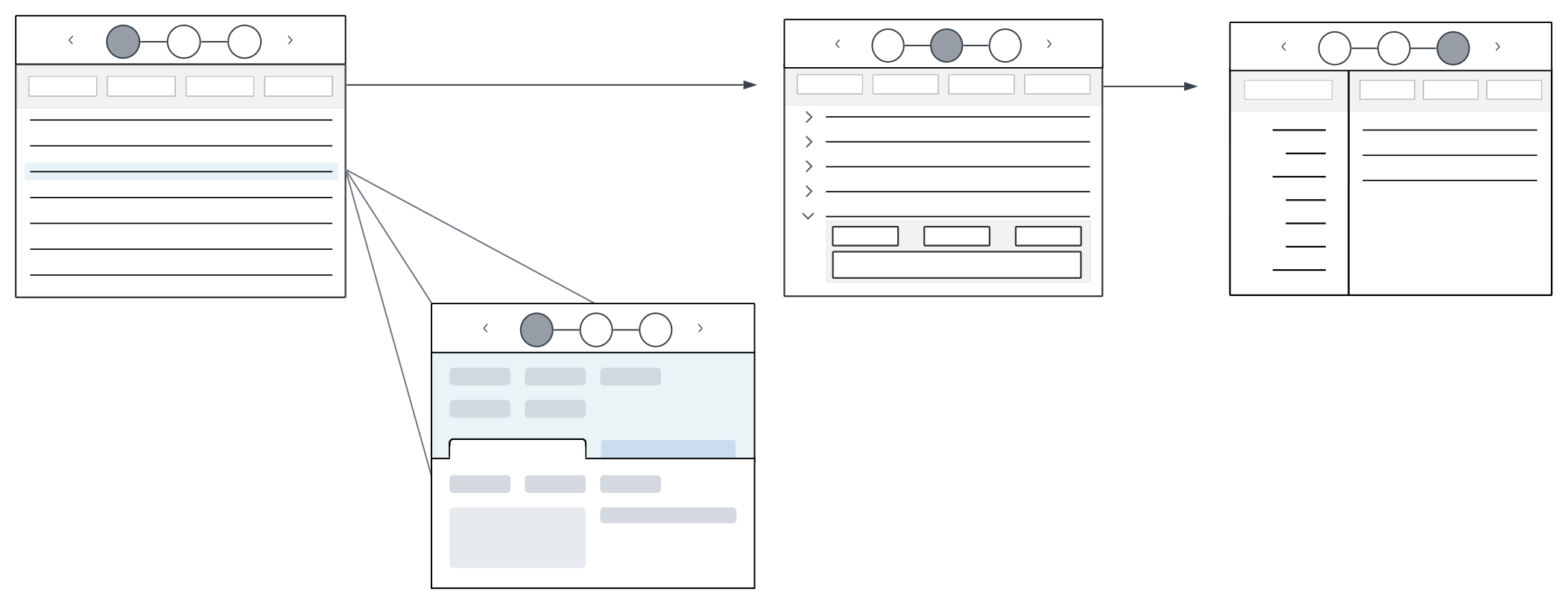
Styles
Different styles can be applied to a Composite application, such as:
Standard—Creates a standard composite application which can optionally be configured with navigation cues for users. Standard composite applications have Next and Previous buttons, as well as icons representing the application steps, which you can use for navigation. Learn more in Standard style Composite application.Guided—Creates an ordered, guided navigation experience through the application with a simplified user interface. Optionally, configure the application to control which application step a user is navigated to based on field selection in previous application steps. Only the Next and Previous buttons are available in the header region. This style is useful for configuration of mobile applications. Learn more in Guided style Composite application.
Standard style Composite application
Standard style Composite applications group related applications underneath a single access point, and contain application step icons and navigation buttons in the header region.
Standard style Composite applications are composed of two regions:
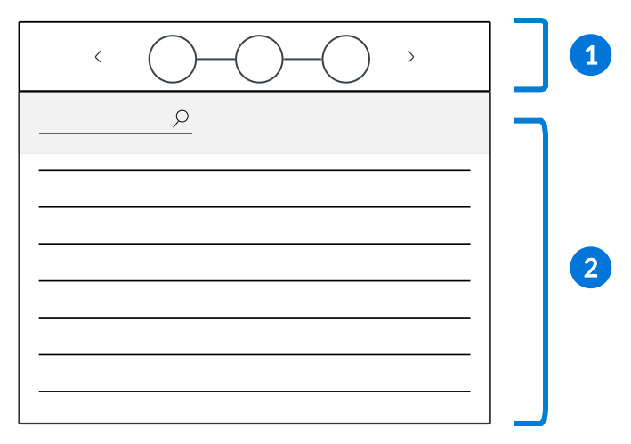
| Composite header region—Select the arrows or icons to navigate between the application steps. |
|---|---|
| Application form region—View, edit, or create data in the selected application step. |
You can dictate if the application steps are contained within their own, or the same, transaction boundary. By default, application steps are held within their own transaction boundaries so that records saved within an application step are committed at that time. You can optionally configure the application so that all changes in the application steps are only committed through a global save configured on the Composite. This allows records from multiple application to access pending work from one another before the saves are committed.
You can control how users navigate through the application steps by configuring Row Actions, List Form Actions, Event Actions, or Common Context.
Actions
Configure Event Actions to disable application steps within the composite application based on different criteria. This allows you to control how users access and use the application.
Actions and events already configured on the individual applications are still applied in the Composite application. Events and actions configured on the Composite application, however, only apply to specific applications. This allows an application step to behave differently in the Composite application than it does on its own.
There are specific Event Actions you can use in Composite applications, such as:
Form is Initialized—Configure an action to occur when a form is initialed. For example, disabling steps when the user opens a new form, or disabling previous steps once they've initiated the next form.Advanced List Form is Initialized—Configure to enable or disable steps without going into a detail view. This event type is only available for steps of advanced list type.
Field Value Changed—Configure an action to occur when a field value is changed. For example, disabling steps so the user can't move on until they've filled in the required fields.Before Save—Configure an action to occur when you initiate a save. For example, confirming everything has been configured correctly up until the point of save.
Common Context
Configure Common Context in Composite applications to filter for constant values throughout the application steps. For more information, see Common Context configuration.
Guided style Composite application
Guided style Composite applications control the sequence of steps a user takes with a simplified user interface. This application type and style are useful for configuring mobile applications.
Guided Composite applications function differently than Standard Composite applications in several keys ways, including:
- Application step icons are not available for navigation in the Header region.
- Users are automatically navigated to the next application step when a value is entered into the last field on the page.
- Data syncing between each application step and the Composite table occurs when navigating to the next application step.
- Action blocks and table triggers defined on the Composite application table run at the end of the composite flow. Action blocks and triggers on individual application steps do not run.
- The entire composite flow is treated as a single transaction boundary.
- You cannot edit existing records within a Guided Composite since it does not have a list form where you can select the record to edit.
Guided style Composite applications are composed of two regions:
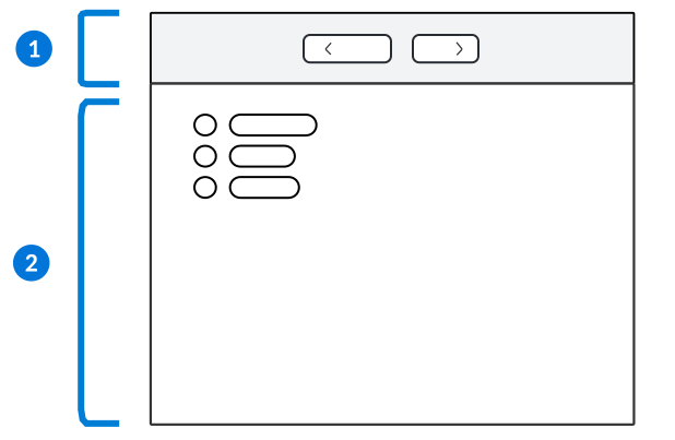
| Composite header region—Select the arrows to navigate between the application steps. |
|---|---|
| Application form region—View, edit, or create data in the selected application step. |
Configuration options
There are several features you can use with Guided Composite applications, such as:
- Queue app link—Use the Queue App Link logic block action to control which application step a user is navigated to based on the value they enter. Learn more in Queue App Link action.
- Camera scannable fields—Use camera scannable fields to enable mobile users to scan a barcode with a phone or tablet to fill in detail form fields. Learn more in Camera scannable fields for mobile users.
- Inline list and table lookups—Use inline list and table lookups to create inline lookup fields with text entry. The options panel shows as inline underneath the list, rather than expanding when selected. Users can select a value by typing in the field, scanning a barcode, or selecting from the suggestions. Learn more in List lookups and Table lookups.
Composite application configuration
Configure your Composite application using the Application Builder application.
Prerequisites
Before you configure your Composite application, you must:
- Define the individual applications for each step that will be part of your Composite application.
- Create a new table for the Composite application. This table is different than the tables the individual application steps are built over.
For Standard Composite applications, the Composite table is required, but does not have any effect on the Composite application or the application steps. Each application step's table is updated with applicable data from the composite application.
For Guided Composite applications, the Composite table is used to hold all the data from the application steps, and must contain the fields used in each step of the application. Individual application step tables are not updated with data from the Composite application, and action blocks do not run on them.
Learn more about application configuration in Application configuration overview.
Application Builder
There are Application Styles available for Composite applications. Options include:
Standard—Creates a standard Composite application which can optionally be configured with navigation cues for users. Learn more in Standard style Composite application.Guided—Creates an ordered, guided navigation experience through a Composite application with a simplified user interface. This style is useful for mobile application creation. Learn more in Guided style Composite application.
In the Application Builder, in the Application Properties panel you can optionally configure several features, such as:
- In the Disable Application Step Options field, you can disable the start page, the end page, or both. Selected options are hidden from view in the composite application header.
- In the Composite Transaction Boundary Configuration field, you can optionally specify the behavior of the transaction boundary for the composite application.
- If an option is selected, you can also optionally configure async save for your composite using the Background Operations field. This ensures that large records don't time out and users won't experience long wait times while the save finishes. Learn more in NATE development considerations. Behavior for different save types when async is enabled is:
Save and Exit, Save and Stay, Save and Add Another: Navigates out of the current composite. If the app is a nested Guided Composite, the user is navigated out of the subflow and into the next step of the parent composite.
Save and New: Refreshes the current composite application with a new record. If the Save and New is initiated by a Queue App Link logic block, then the default step and data mappings are honored when the composite re-initializes.
- If an option is selected, you can also optionally configure async save for your composite using the Background Operations field. This ensures that large records don't time out and users won't experience long wait times while the save finishes. Learn more in NATE development considerations. Behavior for different save types when async is enabled is:
- In the Composite Start Page Definition and Composite Finish Page Definition fields, you can enter a description of the Composite application. This information is visible on the start and end pages.
In the Configuration panel, you must:
- In the Composite Application Steps section, enter the applications you want included as steps in the Composite application.
- For Standard style Composites, in the Composite Application Links section, connect the application steps in the composite. Each application step must have a link defined both to and from the other application steps in order for them to have multi-directional flow. If you do not create links, the application steps appears in the composite header but are disabled. The flow between application steps can be further defined using actions and common context.
For Guided style composites, users are automatically navigated to the next application step once a value is entered into the last field on the application page. Optionally, you can use the Queue App Link logic block action to navigate users to different application steps based on the values they select in the application's fields.
Composite application best practices
These best practices ensure that Composite applications are configured consistently throughout Nextworld.
When to use
Use a Composite application when you have a group of applications that you want to be easily accessible for users from one location. Use this type to enforce a navigation flow between applications by having the user save a specific application before moving on to the next application in the composite header.
Do not design a Composite application so that it contains an application with the sole purpose of linking to another application. Instead, consider adding the linked-to application into the Composite application.
Gantt application
Use the Gantt application type to display product schedules in a list form and interactive visualization.
Application developers build Gantt applications over Header Detail tables. The Header Detail application built over that table provides the records for the Gantt application.
Gantt applications are useful for business processes which require scheduling, such as Manufacturing.
For example, Manufacturing uses Gantt applications to show work orders and the expected time to complete them. Each work order is a header record in the underlying table, while the associated detail records make up the individual tasks or components.
Expand a header record to view the detail records nested beneath it, and to show the detail records in the visualization. Each record is represented by a bar in the visualization and shows the start date, duration, and end date of the event or task. The header record provides a summary of the detail records beneath it, and will show the earliest start date and latest end date of the combined detail records beneath it. Some Gantt applications also contain additional display fields that provide information such as what type of event or task was completed.
The diagram below represents a Gantt application:
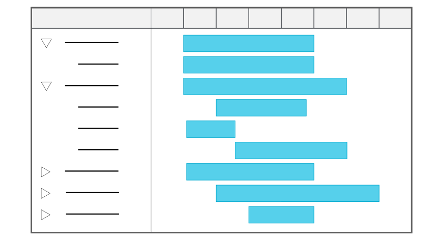
Learn more in Gantt application configuration.
Styles
Gantt applications can be configured in several styles, such as:
Standard—Displays the Gantt application's record list and visualization.Mini App—Displays a mini application over another application. You can view the Gantt application without the underlying application closing. A mini app can be opened from the Navigation menu or through an application action.
Gantt application configuration
Configure Gantt applications with the Data Item Definitions, Table Definitions, and Application Builder applications.
Prerequisites
Gantt applications can only be built over existing Header Detail tables. To build your Gantt application, you must already have your Header Detail tables and applications created. Learn more in Header Detail application configuration.
Application Builder
In the Application Builder application, select Create and then Existing Table in the Create Application window. Enter the name of the Header Detail table you want to build the application over, then select the Application Style. Options include:
StandardMini App
Select the List Form in the Configuration panel, then in the Viewer panel, define the Task Name and Start Date Field. Select either an End Date Field or Duration.
By default, Gantt applications are read-only. You can optionally configure an event action and application link to allow edits from the Gantt application. To configure, in the Configuration panel, select the following options:
- Application Links—Configure an application link that allows you to update the appropriate records. For example, you could create a work table and application then use a logic block to update the underlying Header Detail table.
- Event Actions—Reference the name of your application link, the same EventActions.TableSchema from your application link, and the EventActions.Event type of Gantt Double Click.
Application Setting Definitions
Optionally, use an application setting to filter out unnecessary records.
Learn more in Gantt application.
Mini apps
A Mini App is a style of application that opens in a floating window. Mini apps launch from either the navigation menu, or through an application action.
Mini apps open over applications. This means when you interact with a mini app, the original application work is not lost.
Application settings can be applied to mini apps. For example, you can apply an application setting to a mini app so it opens with a default value in the filter. You could also apply an application setting to default a value when new records are created. Often, mini apps are used with search actions. The result is a mini app that opens over the application screen, where the user can view, edit, delete, or create records, and then populate field values in the initial application.
Types
Mini app style can be applied to several application types, such as:
- Standard
- Report
Mini Apps as Actions
Mini apps are commonly used to open applications from an application. This is known as an action, which is configured when you build the application.
Learn more about how to configure actions in Configure actions for an application.
- Search Action
A search action provides a way to search the records of an application, and is always used with a table lookup field. When a user clicks the magnifying glass icon on a table lookup field, a mini app opens. From the mini app, you can select a record and return the value to the table lookup field. You can also edit, delete, or create records in the mini app.
When you delete, create, or modify records in the mini app, the changes are saved to the application table. When you create or edit a record in the mini app, you can populate the value in the lookup field.
- Row action
A row action provides a way to open a mini app that displays related records with a button on a row.
When you use a mini app as a row action, you can view the records of another application. For example, if you had an application that manages recipes for a cafeteria, you could use a row action to view inventory quantities of an ingredient. The row action could open the Inventory mini app so you could see how much of an ingredient you have in stock.
Mini app configuration
Configure mini apps using the Table Definitions and Application Builder applications.
Table
In the Table Definitions application, build a table of type Main. Mini apps can only be built over this type of table. Alternately, create the table when you create your application record.
Application Builder
In the Application Builder application, select a Standard or Report application type, and the Mini App application style.
If you create a mini app that helps users search for records from another table or application, you must include a table lookup field in the Mini app.
Learn more in the Search actions and search applications topic.
Search actions and search applications
Search applications enable users to view, select, or create records in other tables. Search applications are linked to other applications by a Table Lookup field, also referred to as a search field or typeahead field.
Table lookups are data items added to an application that point to records in another application's table. On their own, table lookup fields enable you to use a typeahead function to search for records that match your search query. Optionally, you can link a search application to your table lookup field to allow users to open a mini app where they can review a list form of records.
Table lookup fields are indicated by a Search  icon. Users can either type a value into the field to search for matching records or, if a search application is configured, select the Search icon to open the search application.
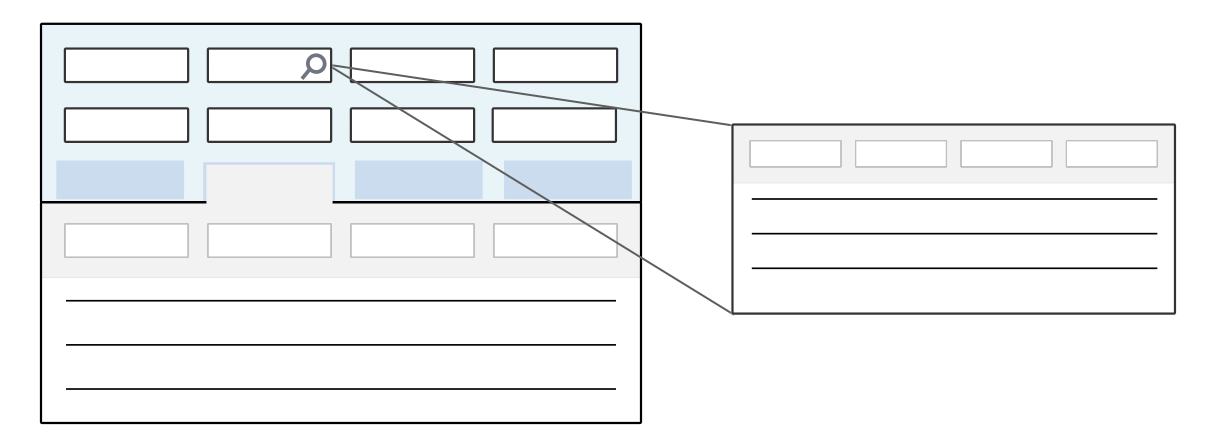
Search Applications
Search applications are mini apps configured to preview, filter, select, and create records in the table which they are built over. They allow users to search through a list form of records within the mini app, rather than just using the typeahead feature available in a table lookup field. This is helpful when there are many records available within a table lookup field since users can use the filter rows in the the mini app column headers to narrow down results.
For example, the DirectorySearch search application is built over the same table as the Directory application. In the Customer Invoices application, you can open the DirectorySearch application using the search action for the Customer Name field. In the search application you can view and select existing directory records, or create a new record to be saved to the Directory table.
Search applications are linked to table lookup fields in the Search Action section in the Configuration panel of the Application Builder. Both the search application and the search field can be filtered to narrow down the available records. Learn more in the Search application configuration topic.
Search application configuration
Search actions connect search applications to table lookup fields. Configure search applications in the Search Actions section, in the Configuration panel of the Application Builder. Filters can be applied to typeahead fields through different configurations.
Prerequisites
Before you can create your search application, you must have:
- Application—An underlying application to attach your search application to.
- Data Item—A
Table Lookupdata item on the application where you want to connect your search application. - Table—A table for your search application to be built over.
Create a search application
In the Application Builder application, to configure your search application, you must:
- Create an application of Application Type or and style
Mini App. - Select the table you want your search application built over. Often, this is the same table selected in the Related Table field of the
Table Lookupdata item that you will reference when you configure your search action. - Configure the list form fields to your specifications.
Connect a search application
Search applications can be defined on either the table or application definition. When defined on the table, any table lookup which points to that table automatically uses the specified search application. When defined on the application, you can select which search application is used and override any previously defined search applications.
To define on the table, navigate to the Settings page and enter the search application in the Default Search Application field.
Or, in the Application Builder application, open the application where you want to connect the search application, then navigate to the Search Action section of the Configuration panel. To configure:
- In the Search Field field, enter the name of the
Table Lookupfield where you want to attach the search application. If the table lookup is within a subtable, use the format of SubtableName.FieldName in the field. - In the Search Application field, enter the internal name of the search application you configured.
- If the search application was built over a table different than the Related Table of the table lookup field, you must use the Return Mapping section of the Data Mapper to map either the
nwIdor the primary search field on the search action. - Optionally, you can also map other values back to populate other fields on the same form. Values being set on the record from the Return Mapping always override whatever was in those fields originally.
Filtering the records
Filters can be applied to the search application with application settings. These filters do not apply to the typeahead/search field. To filter the search field, use data mappings in the Search Action section in the Application Builder application, or filtered table lookups configured on the Related Table in the Table Definitions application. Learn more in the Filtered table lookup configuration and Search application configuration topics.
Both the search field and search application can be influenced by these configurations:
| Filtered table lookup mapping exists | Search action mapping exists | Application setting mapping exists | Typeahead/search field result | Search Action application result |
|---|---|---|---|---|
| Yes | Yes—Same table | Yes No | Filtered Table Lookup and Search Action mapping applied Filtered Table Lookup and Search Action mapping applied | Filtered Table Lookup, Search Action, and Application Setting mappings applied Filtered Table Lookup and Search Action mapping applied |
| Yes | Yes—Different table | Yes No | Filtered Table Lookup mapping applied Filtered Table Lookup mapping applied | Search Action and Application Setting mapping applied Search Action mapping applied |
| Yes | No—Same table | Yes No | Filtered Table Lookup mapping applied Filtered Table Lookup mapping applied | Filtered Table Lookup and Application Setting mapping applied Filtered Table Lookup mapping applied |
| Yes | No—Different table | Yes No | Filtered Table Lookup mapping applied Filtered Table Lookup mapping applied | Application Setting mapping applied No filter applied |
| No | Yes—Same table | Yes No | Search Action mapping applied Search Action mapping applied | Search Action and Application Setting mapping applied Search action mapping applied |
| No | Yes—Different table | Yes No | No filter applied No filter applied | Search Action and Application Setting mapping applied Search Action mapping applied |
Other Configuration Considerations
There are several considerations for search applications, such as:
- Return Mappings and search actions over non-related tables are not supported on subtable search actions.
- You can use application settings to control whether the search application is read only, or to hide/disable the Create button if you don't want users to add records to the underlying table.
Configure actions for an application
Application actions are the events that are initiated by a user's interaction with an application. Application developers configure the actions used in an application on the Actions page of the Application Builder application.
The following topics describe the different configuration options for application actions:
- Field, Row, and List Form Actions
Configure field, row, and list form actions to create buttons and action menus in an application to open application links or run logic blocks.
- Control Actions
Control actions hide or disable fields buttons. This includes standard system buttons like Save or Cancel , as well as custom buttons created by an application developer.
- Event Actions
Event actions run logic blocks automatically when users perform actions, such as select a field or delete a row, in the application. Logic blocks that run as event actions are built over the same table as the application they are run from.
- Application links
Use application links to open other applications, interactive reports, or dashboard pages from inside an application. Application links used to navigate outside of the application can appear as buttons or row actions, or they can change the application that users see when they create or edit a record.
- Search actions and search applications
Search applications enable users to view, select, or create records in other tables. Search applications are linked to other applications by a Table Lookup field, also referred to as a search field or typeahead field.
- Copy actions
Copy actions run logic blocks when the user selects the Save and Add Another or Create a Copy button. Use copy actions to clear or set field values in records created from other records.
- Logic Block Prompts
Use logic block prompts to run a logic block from a list form action with information entered by a user at run time that isn't already saved in a table. Logic block prompts open a mini app which prompts users to enter information before running a logic block.
- Application overrides
Use overrides to change the application that opens when the user clicks the Create button, the Edit button, or double-clicks top open a record in a list.
Field, Row, and List Form Actions
Configure field, row, and list form actions to create buttons and action menus in an application to open application links or run logic blocks.
There are several buttons and action menus you can configure, such as:
- Field actions—Creates a button for a field.
- Row actions—Creates a row action menu in the detail list and subtables, and a form action menu in the detail form.
- List form actions—Creates a form action menu in the list form.
How you configure the action determines if the action opens an application link or runs a logic block.
Field actions
To configure Field Actions, in the Application Builder navigate to the Field Actions section in the Configuration panel. There are several types of field actions, such as:
- Standard—A button appears under the specified field on the Detail and Header Detail forms of applications. If there are multiple actions configured on the same field, a dropdown option appears. Alternately, you can configure a field action on an expansion row. Leave the FieldActions.FieldActionOptions field empty to create a standard field action.
- Subtable—A button icon appears next to the specified field in a subtable. Leave the FieldActions.FieldActionOptions field empty and enter the subtable name in the FieldActions.FieldSchemaList field to create a subtable field action.
- Button Only—A button appears in the Detail form. The label and field itself are hidden. If there are multiple actions configured on the same field, a dropdown option appears.
- Button and Field Label—A button appears in the Detail form with the label. The field itself is hidden. If there are multiple actions configured on the same field, a dropdown option appears.
- List View Action—A clickable link appears on the list form of an application. Only one action is allowed per field.
- Calendar Event Action—Displays the button in the calendar event. This option can only be used with calendar data item fields.
Actions that open application links
To configure an application link as an action in the Application Builder application, you must:
- Configure an application link in the Application Links section.
- Add the application link as an action in either the Field Actions, Row Actions or List Form Actions section.
- For List Form Actions and Row Actions, use the Link Type field to control if the user must save the record before the application link opens.
Actions that run logic blocks
To configure a logic block as an action in the Application Builder application, you must:
- Configure the logic block using either the Field Actions, Row Actions, or List Form Actions subtable.
- For List Form Actions and Row Actions, the selection in the Link Type fields controls how the action works when a user has saved a record. This field also controls if a logic block runs within the transaction boundary. The options include:
Application (Extend Trans Boundary)—Extends the NATE container to the application you are opening with the application link. For more information, see the Nested NATE containers topic.Application (Save Not Required)—Does not require the user to save the record before the application link opens the new application. Runs outside of the transaction boundary. Often, changes are still available when the user navigates back to the first application.Application (Save Required)—Requires the user to save any unsaved changes to the record before the logic block runs. Runs outside of the transaction boundary.Logic Block - Not in Trans Boundary—Does not require the user to save the record before the logic block runs. Runs outside of the transaction boundary, which means if this logic block updates a record, the change is applied whether or not the current record is saved.Logic Block - Not in Trans Boundary (Save Required)—Requires the user to save the record before the logic block runs. Runs outside of the transaction boundary.Logic Block In Trans Boundary—Does not require the user to save the record before the logic block runs. Runs within the transaction boundary and any changes from the logic block are part of the same NATE container. This means that if the record is not saved, any changes to the record made by the logic block are discarded.
For actions configured on subtables, you must:
In the Logic Block Builder, in the Loop Subtable Action action, select the Select Current Subtable Row checkbox to ensure the logic block runs on the subtable row which the action was performed on. Logic block support of the Select Current Subtable Row can only be used for subtable mains, not for subtable subs.
In the Application Builder, in the Row Actions section, you must:
- Configure the logic block as an action using either the Field Actions, Row Actions, or List Form Actions subtable.
- For row actions, select the subtable row where you want the row action configured.
- In the Event Actions section, you can also optionally configure a row action event to hide and show row actions on your subtable. Like list forms, this event action should not be used for data manipulation.
Control Actions
Control actions hide or disable fields buttons. This includes standard system buttons like Save or Cancel, as well as custom buttons created by an application developer.
There are several control actions you can configure, such as:
- System actions—Automatically available on all applications. For example, Get Sharable Link or Save and Exit.
- Custom actions—List form, row, or field actions added to the application by an application developer. Learn more in Field, Row, and List Form Actions.
- Subtable actions—Available in a subtable. These include custom row actions, and system actions such as the Add and Delete buttons.
To configure control actions in the Application Builder application, open the Control Actions section in the Configuration panel. There are several considerations, such as:
- The value in the Form field controls the options available in the Control Action field.
- Whether you want to hide or disable the action.
- If the action is a custom action or in a subtable, you must enter the name of the action or the name of the subtable.
For example, if you want to hide all of the row actions in an application, you can select All Form Actions in the Control Action field.
The table below shows what fields to use to configure control actions for a single system or custom action, a subtable system or custom action, or all system or custom actions:
| Control Action | Display Name | Table Name | ||
|---|---|---|---|---|
| System | All system actions | X | ||
| Single system action | X | |||
| Subtable system action | X | X | X | |
| Custom | All custom actions | X | ||
| Single custom action | X | X | ||
| Subtable custom action | X | X | X |
Enable column controls for checkboxes
Enable columns to have Select All and Clear All checkboxes with the Datatable True/False Click (with multiple selection) event action.
This event action is available on the detail lines of Header Detail applications, the detail list of Relationship applications, and on subtables used in any application type. Once configured, the Select All and Clear All actions are available in the action menu of the selected field.
Event Actions
Event actions run logic blocks automatically when users perform actions, such as select a field or delete a row, in the application. Logic blocks that run as event actions are built over the same table as the application they are run from.
Configure event actions in Application Builder, in the Configuration panel in the Event Actions section. For all event actions, you specify:
- Event—The event to run the logic block from
- Name—The name of the logic block to run
If the event is configured for an action on a:
- Specific field—Enter the name of the data item in the Field Name field.
- Specific subtable field—Enter the name of the subtable in the Event Subtable field. You also need to enter the name of the data item in the Field Name field.
Learn more about the different event actions in Logic blocks and event actions.
Application links
Use application links to open other applications, interactive reports, or dashboard pages from inside an application. Application links used to navigate outside of the application can appear as buttons or row actions, or they can change the application that users see when they create or edit a record.
Configure your application link
In the Application Builder, in the Application Links section, you must specify:
- A unique name for the application link.
- A Destination Type for the link. In this case, either
DashboardorApplication. To link to an interactive report, selectApplication. - The name of the application, interactive report, or dashboard page you want to link to in the AppLinks.LinkedApplication field.
- Optionally, application settings or data mappings for application links of type
Application.
For application links to an interactive report, data mappings require additional configuration steps. To configure, you must create the publisher mappings in the Common Context section of the application record. Then, navigate to the Interactive Report Builder and open the interactive report record, where you must:
- Configure the subscriber mappings in the Common Context section.
- In the appropriate report version, select the name of the common context configuration in the Common Context field.
See the Common Context configuration topic for more information.
Then, navigate to the Application Setting Definitions application and open or create the record for the application setting applied to your report. The application setting must have the:
- Settings Type field set to
Interactive Report. - Name of your interactive report record entered in the Interactive Report Record field.
- Name of the appropriate report version entered in the Interactive Report Version field.
Configure your action or dynamic application link
Application links with a Destination Type of Dashboard Page or Application do not appear in an application until the link is associated with an action or dynamic application link.
After application links are defined in the Application Links subtable, they can be added as different types of actions, such as:
- Field Actions—A button below a field.
- Row Actions—A button in the row action menu of the list form, or the form action menu in the detail form.
- List Form Actions—A button in the list form action menu.
- Create Override—Changes the application that opens when a user selects the Create button in an application.
- Edit Override—Changes the application that opens when a user edits an application record.
If you want to open different application links depending on a field value, use a dynamic application link. Dynamic application links require application links to be configured with specific naming formats. Learn more in Dynamic application links.
Inline Applications
Application links can also be used to embed an inline application into the detail form of an application. See the Configure inline applications topic for more information.
Filtering in application links
Advanced filter mappings, field mappings, and frozen filters can be applied to application links through application and application setting configurations. There are several considerations for how filters are prioritized on fields, such as:
- If an advanced or frozen filter exists, field mappings are ignored.
- If both an advanced and frozen filter exist, both are applied, but any fields included in both filters are only filtered by the frozen filter.
- If the same type of filter is configured in both the application and application setting, both are applied, and any shared fields are filtered by both. This can cause limited or no queries to be returned.
Navigate to applications on save
Use application links with the Save and Continue action so that when a user saves a record, they open a different application or record in the same window.
The Save and Continue button does not appear in an application unless you associate it with an application link. To configure the Save and Continue button, you must:
- Configure an application link. Learn more in Application links.
- Enter the application link you configured in the Save and Continue Application Link field.
In the generated application, the Save and Continue button becomes the default save action. Select this button to save the current record and then open the application link.
Dynamic application links
Use dynamic applications links to connect multiple application links to a single button or action. The application link which opens when the link is selected is determined by the value entered within a specified field.
Before you can configure a dynamic application link, you must configure the application links you want included. Only application links with a Dashboard of Application or Dashboard can be used.
Learn more about configuring application links in Application links.
Every application link included in a dynamic link must use the same prefix in their link name. That prefix should be the link name of the dynamic link. After the prefix, add the field value you want associated with the application link. This is how the system can find the appropriate application link when a value is entered in the source field.
For example, the Payments application could have a dynamic application link where the value selected in the Transaction Type field determines which link should be followed. To configure, you would create your application links with the following information:
| Link Name | Link Destination |
|---|---|
ViewPayManual Check | Manual Checks |
ViewPayAP Payment | Payments |
ViewPaySupplier Credit | ApplySupplierCredits |
ViewPayCustomer Refund | ManualChecks |
Then, in the Dynamic Application Links section of the Application Builder, you would create a dynamic application link with the following values:
| Link Name | Source Field | Value | Destination Link Name |
|---|---|---|---|
ViewPay | SubTransactionType | * | ViewPay* |
Then, you would associate that dynamic link with a button or action. When a user enters a value in the Transaction Type field, the value selected would tell the system which application link that button or action should lead to. If a user selected Manual Check in the Transaction Type field, the application link to the Manual Checks application would be used.
Connect to other visualizations with application links
Use application links to attach additional visualizations to an application. When a user interacts with components of an application's visualization, they can navigate to other visualizations with related data.
For example, if you are in the list form of the Supplier Invoices application which has a visualization for the company totals. A component of the company totals are the company credits. You can configure a visualization link so when a user selects the company credits part of the visualization, it navigates them to the general ledger record that shows a different visualization built over the company credits.
Prerequisites
You must set up the visualizations and application link before you can configure the visualization link. To configure, in the Configuration panel of the Application Builder you must:
- Navigate to the Field Dependencies section and configure the visualizations you want for the application. Learn more in Visualization Builder.
- Navigate to the Application Links section and configure an application link. Learn more in Application links.
Visualization Link
In the Visualization section, you must:
- Enter a display name for the visualization.
- Enter the name of a visualization you configured and want attached to the application.
- Enter the application link you configured in the VisualizationLinks.AppLinkName field.
Copy actions
Copy actions run logic blocks when the user selects the Save and Add Another or Create a Copy button. Use copy actions to clear or set field values in records created from other records.
Copy actions can run logic blocks that set field values or logic blocks that would normally run as event actions that validate field values. For example, if a logic block runs as a Row Exited event action that updates another table, you could configure a logic block as a copy action that performs a similar update or calls an action block.
Configure copy actions in Application Builder in the Configuration panel, in the Copy/Recurring Template Actions section. To configure a copy action, enter the name of the logic block to run.
Logic Block Prompts
Use logic block prompts to run a logic block from a list form action with information entered by a user at run time that isn't already saved in a table. Logic block prompts open a mini app which prompts users to enter information before running a logic block.
Configure your mini app
In the Application Builder application, create a new mini app. The mini app must be built over the same table that initiates the list form action. This is generally a table of type Main, but for Header Detail applications it is the Header table.
Configure your logic block prompt
Configure logic block prompts in Application Builder in the Configuration panel, in the List Form Actions section. Once you select your Link Type, the following Logic Block Prompt fields become available for configuration:
| Display Name | The name that displays at the top of the mini app that opens. |
|---|---|
| Application Setting Name | The name of the application setting to apply when opening the mini app from the list form action. |
| Prompt Name | The unique name of this logic block prompt. This field is used to identify the prompt when adding it as a list form action. |
| Prompt Mini App | The name of the mini app to use as the logic block prompt. This application must be built over the same table as the logic block, unless it is a Header Detail application. Logic block prompts are only supported on the list form of Header Detail applications. In this case, the logic block must be built over the Header Detail table, and the mini app must be built over the Header table. |
Once you've created your prompt, configure your action in the following fields:
| Logic Block | The name of the logic block to run from the prompt. |
|---|---|
| Display Name | The name that displays on the list form action button. |
| Prompt Name | The name of the prompt, defined in the Prompt Name field of the Logic Block Prompts subtable. |
Application overrides
Use overrides to change the application that opens when the user clicks the Create button, the Edit button, or double-clicks top open a record in a list.
Use overrides to change the application that opens when users open or create a record. Overrides result in application links being opened instead of the application the action is on.
In Application Builder in the Application Properties panel, expand the Application Link Overrides section and configure the override using the Row Double Click/Edit Override and Create Override fields.
Application advanced features
Application developers can configure advanced features on applications.
For more information on Nextworld development, see the following topics:
- UI settings for your applications
Application developers can control the user interface (UI) of their applications with different configuration options.
- Application layouts
Application developers use application layouts to create versions of an application with a different field placement, style, and more.
- Application layouts
- Inline applications
Inline applications allow you to add a fully functioning application or report into the detail form of another application.
- Configure inline applications
Configure inline applications with the Data Item Definitions application, Application Setting Definitions , and Application Links subtable in the Application Builder application. Inline applications allow you to add an application into the detail form of another application.
- Inline application best practices
These best practices ensure that inline applications are created consistently throughout Nextworld.
- Configure inline applications
- Common Context
Use common context to populate fields or filters in one application or interactive report based on a value published in another application or report. Or, use common context to create or select a record in an application link based on a published value.
- Common Context best practices
These best practices ensure that common context values are configured consistently throughout Nextworld.
- Common Context configuration
Configure common context using the Application Builder or Interactive Report Builder to control values when viewing, filtering, and creating records on dashboard pages, applications, and interactive reports.
- Example: common context on a dashboard
The Receivables dashboard page is a helpful example of a common context configuration on a dashboard because you can view the configurations in the separate applications, and view the behavior on the dashboard page.
- Common Context best practices
- Data mapper
Use the Data Mapper tool to identify source data and link, or map, it to a destination target. It is used to configure common context, application settings, and field mappings in application actions.
- Data mapper source types
There are many different ways in which you can define source type data in the data mapper tool.
- Data mapper destination types
There are many different ways in which you can define destination type data in the data mapper tool.
- Data mapper source types
- Visualizations
Visualizations displays data from application records in a visual format, such as a graph or a chart. Visualizations display in the list form of applications and can be used in dashboard cards to quickly summarize information.
- Visualization Builder
Use visualizations to display data in a visual format, such as a graph or pie chart. Build visualizations in the Visualization Builder accessible from the Application Builder and Interactive Report Builder .
- Visualization data mapper configuration
Configure a visualization using the data mapper to display data from an application's records in a visual format, such as a graph or a chart.
- Visualization types
Determine which type of visualization to use based on what information you want to display, or how you want to display it.
- Visualization Builder
- Record notes
Enable record notes in applications to allow business users to attach supplementary notes and comments to records. Notes are attached to individual records, and support a chronological history or dialogue about the record.
- Enable record notes for an application
Application developers configure their applications to support record notes using the Table Definitions application.
- Enable record notes for an application
- Templates
Use templates to define the content you want used in different business processes, such as creating records or defining notifications.
- Record Templates
Application developers can enable record templates so business users can create records with pre-defined field values.
- Message templates
Use message templates in message definitions to create automated messages and notifications. Message templates contribute the content for messages.
- Field Templates
Use field templates to attach a field action button on the field of an application which provides predefined values.
- Record Templates
- Field Dependencies
Field dependencies allow you to dictate what is shown in one field, based on a value in another field in the application. For example, one field could hold the name of a valid configured format, and that would dictate which format is used in an address field.
- Conditional Field Dependencies
Conditional field dependencies allow you to conditionally apply a field characteristic to the dependent field based on the value selected in the controlling field. For example, defaulting the a currency value in the dependent field to be a negative number if a specific list lookup value is selected in the controlling field.
- Configure attachments for applications
Attachment options are included by default on all application types. They are accessible within a dialog box, but can be configured to appear inline on the detail form of a record. You can also adjust the threshold size of file types which controls the size of files which are automatically previewed in the Attachment Manager.
- Camera scannable fields for mobile users
Application developers can configure applications to enable camera scannable fields. Camera scannable fields allow users of the platform to scan a barcode with a phone or tablet to fill in detail form fields.
- Configure camera scannable fields
Configure camera scannable fields in the Application Builder or Application Setting Definitions applications. Scannable fields allow mobile users to scan a barcode to input values into application detail form fields.
- Configure camera scannable fields
- Enable single click to edit fields
Enable the Single Click to Edit option in your Advanced List and Detail applications. When selected, list form fields open in edit mode after a single click.
- Configure an iFrame for an application
Configure an iFrame field for your application in the Data Item Definitions, Content Item Definitions, and Application Builder application.
- Quick Import feature for Header Detail applications
Enable the Quick Import feature in Header Detail applications to allow users to import detail records directly within the application.
UI settings for your applications
Application developers can control the user interface (UI) of their applications with different configuration options.
Simplify list forms and subtables
Use Appearance Options to simplify the visible UI elements in a dashboard card, or an application's subtables or list form. For example, you can hide the filters and filter modifiers in column headers, or hide field level help buttons.
The Appearance Options field is available in multiple applications, including:
- Application Builder—In the Application Properties panel, on the Advanced page.
- Application Setting Definitions—On the Layout page.
- Dashboard Card Builder—In the Application Configuration section.
Application layouts
Use application layouts to create versions of an application with different field placements, styles, and more. Application layouts inherit the underlying business logic and actions of their parent application, but can be configured for different uses. Learn more in Application layouts.
Application layouts
Application developers use application layouts to create versions of an application with a different field placement, style, and more.
Application layouts inherit the underlying business logic and actions of their parent application, but can be configured for different uses.
For example, the Amortization Schedules – Deferred Revenue application is an application layout created from the Amortization Schedules – Prepaid Expenses application. Each application has its own menu entry because managing amortization schedules for prepaid expenses is different than managing them for deferred revenue. In the Amortization Schedules – Prepaid Expenses application, the Start Date and End Date fields are hidden because, unlike deferred revenue schedules, calculations are based on period.
Learn more in Configure application layouts.
Configure application layouts
Configure application layouts in the Application Builder with the Create Layout row action. Application layouts enable you to create versions of an application with different styles and field placements, while still retaining the underlying business logic.
Application layouts are identified with the Layout checkbox.
There are several considerations when configuring application layouts:
- Be aware of the business logic of the parent application. For example, if you remove required fields from an application layout, users won't be able to save records.
- You cannot use an application layout if its parent application doesn’t exist in the environment.
- Use caution when removing an existing field from the application layout. Don't remove the field if it's used as part of an application link to map data between the application layout and base application.
- If there are applications that have application links to the base application, you must customize their application settings to apply the layout.
- Extension fields are always shown as a tab on application layouts. To change their placement, you must make changes in the extension application.
- You cannot create application layouts over Composite applications. Instead, create application layouts for the individual application steps within a composite.
- If you create an application layout over a Relationship application, you must create it over the entity application which controls the detail form of the relationship application.
Configure an application layout
To create an application layout, in the Application Builder, you must:
- Search for the base version of application you want to create the layout over. For Header Detail applications, this is either the Header or the Detail application record. Ensure you select the base application and not a customized or extended version.
- Select the Create Layout row action. This opens a mini app where you can name your layout. Once you save, the application layout record is created.
- Open the application layout record and make the changes you want in the application.
- Save and generate all related applications. If you are configuring a Header Detail application, you can use the Generate Related Apps row action.
Application settings
Once you create and generate the application layout, you reference it in an application setting. You can create a new application setting or customize an existing record.
In the Application Setting Definitions application, specify the parent application in the Name field and the application layout in the Application Layout field on the Layout page. Then, specify the application setting in the Menu Definitions application to open the new layout from the menu.
For Header Detail applications, you must associate each application layout to its corresponding application setting. Learn more in Header Detail application settings.
Inline applications
Inline applications allow you to add a fully functioning application or report into the detail form of another application.
Inline applications can only be Interactive Reports, or Mini Apps of type Standard, Advanced List, or Tree.
The diagram below illustrates how multiple applications can be used inside the detail form of another application:
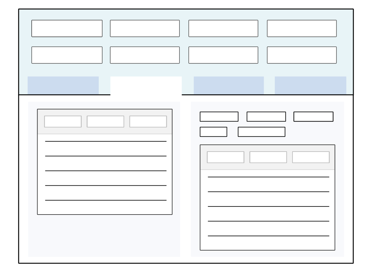
See the Configure inline applications topic for more information on how to add an inline interactive report or application.
Configure inline applications
Configure inline applications with the Data Item Definitions application, Application Setting Definitions, and Application Links subtable in the Application Builder application. Inline applications allow you to add an application into the detail form of another application.
To create a read-only inline application, disable the data item of the inline application in the application record or application setting definition. To conditionally have a read-only inline application, configure a logic block to disable and enable the fields. To control whether the inline application is read-only with security, use restricted field profiles or workflow restricted field profiles.
Data Item Definitions
In the Data Item Definitions application, create a data item of type Object. This data item must be added to the primary application's underlying table.
Inline Application
Configure the application or interactive report which you want included inline. Inline applications can only be Interactive Reports, or Mini Apps of type Standard, Advanced List, or Tree Only.
Primary Application
In the Application Builder application, add your data item to the detail form of your primary application. This determines where the inline application is populated.
In the Configuration panel, in the Application Links section, select the Create button and configure an application link with the following fields:
- In the AppLinks.LinkName field, enter the name you used for the data item. These names must match for the configuration to work.
- In the Destination field, enter the name of the inline application or interactive report you want shown.
- In the Destination Type field, select
Application. - Use the AppLinks.DataMapperObject field to map in a
Titledata mapping type to control the display name of your inline application. Optionally, use data mappings to filter the results you want seen in the inline application
Logic Block Considerations
There are several considerations for inline applications and logic block configuration, such as:
- Inline applications are held in the same NATE container as their primary application. Any changes made to the primary or inline applications are held in a single container which the logic block can access.
- Logic blocks that apply UI hints to a field are only applied to the field and application selected during configuration. If the same field is used in the primary application or other inline applications, the UI hints are not applied.
- Logic blocks used to refresh the display on a primary application also refresh the inline applications. Refresh displays configured on the inline applications do not apply to the primary.
Inline application best practices
These best practices ensure that inline applications are created consistently throughout Nextworld.
Inline applications can bring a friendlier UI experience to the user when interacting with data from multiple sources. See Inline applications for more information.
When creating an inline application, there needs to be a data item defined for the detail/child application. That data item should be created as an Type and named the same as the application. For example, SerialAssociationComponents and WOSerialAssociationAssemblies.
The object data item created to represent the detail/child application should be included in the host table and application. When naming the host table and application, it should end with the name Host. However, this is optional since you can create an inline application over an existing table or use an existing application. Here are some examples, WOSerialAssociationHost (table and host application), WOOutputTransactionSerialsHostLB (table), WOOutputTransactionSerialsHost (host application), PickListHostLB (table), and PickListHost (host application). The SerialAssociationComponents and WOSerialAssociationAssemblies data items are in the WOSerialAssociationHost table.
- Performance Considerations
- The table holding the data item should not be placed inside high risk tables. For example, do not put this type of data item in the
WorkOrderHeadersorSalesOrderHeaderstables. Heavily used transaction tables should not hold inline applications. - Do not use extensive advanced filtering through the data mappings. Using advanced filtering with multiple expressions will impact performance. Instead, load the data and perform table filtering through logic.
- For example, see the
WOMaterialTransactionSerialsHostapplication and theSelectWOMaterialTransactionSerialsdetail/child application. Logic was written in theInitializeWOMaterialTransactionSerialsHostlogic block to load the data and decrease the amount of advanced filtering needed in the application.
- For example, see the
- The table holding the data item should not be placed inside high risk tables. For example, do not put this type of data item in the
- The use of common context works well when the detail/child application is a list view that needs to be filtered based on values selected from the host application. For example:
- Host Application:
WOSerialAssociationHost- Publishers: WorkOrder, ParentSerialMaster
- Subscribers: ParentSerialMaster
- Application:
WOSerialAssociationAssemblies- Publishers: SerialMaster
- Application:
SerialAssociationComponents- Subscribers: WorkOrder, ParentSerialMaster
- Host Application:
Common Context
Use common context to populate fields or filters in one application or interactive report based on a value published in another application or report. Or, use common context to create or select a record in an application link based on a published value.
Common context has two components:
- Publishers—The field which dictates the values populated in the Subscribers. When a value is entered or published into a publishing field, it populates all the subscribing fields configured in the same scope.
- Subscribers—The field or application link which is populated by the publishing field value.
Example
Common context is often used to filter for records with related information amongst multiple applications or interactive reports. For example, on a dashboard page you could configure common context so that when a customer name is entered in an application field, other applications or reports populate the customer's transaction and contact information in their respective cards.
Similarly, in a composite application, you could configure common context so that when a customer name is entered in the first application step of the composite, the selected customer's information would be visible in subsequent application steps.
The diagram below shows a dashboard page with common context configured in three applications used as dashboard cards:
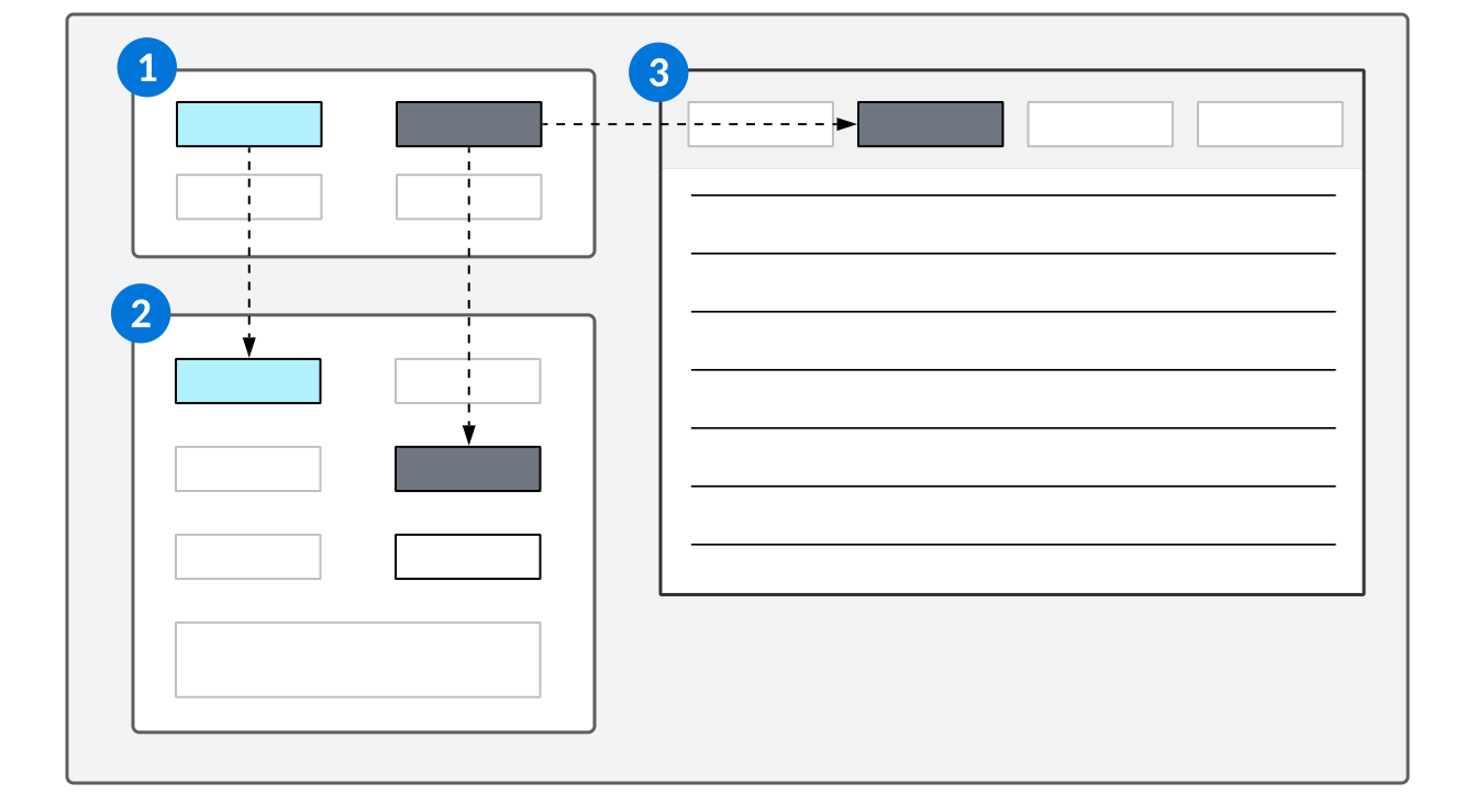
| The application is configured with two Publisher fields. |
|---|---|
| The application is configured with two Subscriber fields. The values in each Publisher field populate the Subscriber fields within the same scope. |
| The application is configured with one Subscriber field. The value in the Publisher field populates the Subscriber field within the same scope. |
View an example of a dashboard using common context in Example: common context on a dashboard.
Scope
Common context is configured within a scope. The scope defines in what context a Subscriber listens to a Publisher. This is necessary because Publishers and Subscribers can have one-to-many, many-to-one, and many-to-many relationships. The scope is defined using the data mapper tool when configuring the Publisher or Subscriber. You can also create a boundary for the common context scope in both a dashboard page, or a composite application configuration. This enables you to use the same application in multiple places without it being impacted by the common context tied to it elsewhere.
Learn more in Common Context configuration.
Common context can be used in place of, as well as in addition to, logic blocks and application settings to control field values.
Common Context best practices
These best practices ensure that common context values are configured consistently throughout Nextworld.
Filtering
Using application settings to filter an application or a dashboard that is also filtered by common context on initiation can lead to multiple fetches. In order to avoid this issue, use common context to drive all filtering through a single publishing source and drive all default values into that record instead of through individual applications. For dashboards, use Chrome Options on dashboard cards with the Hide Filter option.
Scope naming
Because multiple applications and dashboards could potentially be configured to publish to the same scope, if scopes names are not well defined it could cause issues with duplication and overwriting values. Scopes should be made as specific as possible for the use cases for which they are being developed. If you only expect to publish values from a single application, use that application name within the scope name. If you could potentially use multiple applications to publish values from the same scope, then name it for something common to those applications. For example, you can use the dashboard, product family, or composite application name as part of the scope name when creating for use ion multiple applications or dashboards.
Common Context configuration
Configure common context using the Application Builder or Interactive Report Builder to control values when viewing, filtering, and creating records on dashboard pages, applications, and interactive reports.
Common context Subscribers and Publishers are configured in the Configuration panel, in the Field Dependencies section in the Application Builder, or in the Common Context section of the Interactive Report Builder. Publishers are the source from which Subscribers receive data and are usually configured within separate applications or reports.
Scope
Publishers and Subscribers are grouped using a scope. The scope defines in what context a Subscriber listens to a Publisher. This is necessary because Publishers and Subscribers can have one-to-many, many-to-one, and many-to-many relationships. The scope is defined using the data mapper tool when configuring the Publisher or Subscriber. Common context can be used in place of, as well as in addition to, logic blocks and application settings to control field values.
Scope boundary
You can create a boundary for your common context scope so that if the application or interactive report is reused elsewhere, it is not impacted by common context tied to the dashboard or composite application you configure.
On a dashboard page record, select the Common Context Scope Boundary checkbox.
In a composite application record, navigate to the Composite Configuration page and select the Common Context Scope Boundary checkbox.
Publishers
The table below describes the Publisher options available for common context as well as any specific configuration requirements:
| From (source) | To (destination) | ||
|---|---|---|---|
| Field | Description | Field | Description |
| Select table (Source) | Select the location from which you want to map the value. If no source is selected from an application publisher, values will be published from both the list and detail regions of the form. | Define a scope | Enter the name of the scope this publisher is part of. This can be the same scope as other publishers, or it can be a newly created scope you're defining. |
| Field (Source) | Select the field or subtable field in the application or report to use as a publisher. The value in this field is used to populate subscriber fields. | Destination Field | This field populates automatically, based on the Source Field. If the Source Field is a table lookup field, this field populates with the source field and the related field. |
| Source Related Field | If the Source Field is a table lookup field, use this field to select the related field. |
For example, the ReceivablesCommonContext application uses the Contact field as a publisher to other cards on the Receivables Dashboard page, and uses the following configuration:
| From (source) | To (destination) | ||
|---|---|---|---|
| Source Form | Detail | Scope | ReceivablesScope |
| Source Field | Contact | Destination Field | Contact_Name |
| Related Source Field | Name |
Subscribers
The table below describes the Subscriber options available for common context as well as any specific configuration requirements:
| From (source) | To (destination) | ||
|---|---|---|---|
| Field | Description | Field | Description |
| Common Context Method (only in Application Builder) | Select Subscribe to Common Context. | Destination Type (only in Application Builder) | Select one of the following destination types to which your data will be mapped:
|
| Scope | Enter the name of the scope associated with the publisher you want to subscribe to. | Destination Region | Depending on what Destination Type you chose, select a form or region to which your data will be mapped. |
| Field (Source) | Enter the name of the field associated with the publisher to which you want to subscribe. | Destination Field | Select the field in the application or report which you want to populate. The value of this field populates when any value that is published. |
| Filter Prefix | Select from the following values for filtering (optional):
| Destination Related Field | If the Destination Field is a table lookup, select the related field. |
For example, the ContactNotesMini application uses the Contact field as a subscriber to the Contact field on the Dashboard Filter dashboard card, and uses the following configuration:
| From (source) | To (destination) | ||
|---|---|---|---|
| Common Context Method | Subscribe to a Common Context | Destination Type | Filter Field |
| Scope | ReceivablesScope | Destination Region | List |
| Source Field | Contact_Name | Destination Field | Contact |
| Filter Prefix | = Exact Match | Destination Related Field | Name |
View an example of a common context dashboard configuration in Example: common context on a dashboard.
Common Context Monitor
You can use the Common Context monitor to show which publishers and subscribers are recognized and whether they are populated. If a publisher or subscriber doesn't appear, it is not configured correctly. If it appears but is not populated, you may have selected the wrong publisher field or typed the subscriber incorrectly.
Access the Common Context Monitor by opening the Sidebar Menu, expanding the Monitors section, and toggling on Common Context.
Example: common context on a dashboard
The Receivables dashboard page is a helpful example of a common context configuration on a dashboard because you can view the configurations in the separate applications, and view the behavior on the dashboard page.
Example
Accounting staff use the Receivables dashboard page to quickly view contact details and invoices. The applications used on this dashboard page each have fields configured as either Publishers or Subscribers.
| Dashboard Card Title | Dashboard Card Name | Application Name | Common Context Fields |
|---|---|---|---|
| Dashboard Filter | Receivables Common Context | ReceivablesCommonContext | Contact_Name Item_ItemNumber OrganizationalUnit_Name |
| Contact Notes | Contact Notes | ContactNotesMini | Contact_Name |
| Contact History | Contact History | ContactHistoryMini | Contact_Name |
| Invoice Details | Receivables Join | ReceivablesJoin | CustomerName_Name OrganizationalUnit_Name Item_ItemNumber |
| Cash Receipt Details | Cash Receipts Invoice Join | CashReceiptsInvoiceJoin | Payor_Name OrganizationalUnit_Name |
Because each application uses common context, this means that the Subscriber fields populate on the different dashboard cards when the Publisher values change. The following fields in the Receivables Common Context dashboard card are publisher fields:
- Contact
- Org Unit
- Item
When a user enters a value in the Contact field on the Receivables Common Context dashboard card, the value they enter populates in the following dashboard cards:
| Dashboard Card Title | Dashboard Card Name | Field |
|---|---|---|
| Contact Notes | Contact Notes | Contact |
| Contact History | Contact History | Contact |
| Invoice Details | Receivables Join | CustomerName |
| Cash Receipt Details | Cash Receipts Invoice Join | Payor |
When a user enters a value in the Org Unit field on the Receivables Common Context dashboard card, the value they enter populates in the following dashboard cards:
| Dashboard Card Title | Dashboard Card name | Field |
|---|---|---|
| Invoice Details | Receivables Join | Org Unit |
| Cash Receipt Details | Cash Receipts Invoice Join | Org Unit |
When a user enters a value in the Item field, the value they enter populates in the Item field of the Receivables Common Context Dashboard card.
Because all of the subscribers are configured as filter fields, the value entered in the Publisher field populates in the filter of the dashboard card, and filters the records.
On this dashboard page, the Receivables Common Context dashboard card application has a Publisher configured. The following configuration is defined on the Field Dependencies page of the ReceivablesCommonContext application:
| From | To |
|---|---|
| Field | Common Context |
| Publish a Common Context | |
| Contact | Receivables Scope |
| Name | Contact_Name |
The Cash Receipts Invoice Join dashboard card is on the same dashboard page, and has the following Subscriber configuration in the definition of the CashReceiptsInvoiceJoin application:
| From | To |
|---|---|
| Common Context | Filter field |
| Subscribe to a Common Context | List |
| ReceivablesScope | CustomerName |
| Contact_Name | Name |
| Exact Match |
These configurations result in the following behavior:
- A user enters a value in the Contact field in the Dashboard Filter dashboard card.
- The CustomerName filter field in the Cash Receipt Details dashboard card populates with the value entered in the Dashboard Filter card.
- The records in the Cash Receipt Details dashboard card are filtered.
Data mapper
Use the Data Mapper tool to identify source data and link, or map, it to a destination target. It is used to configure common context, application settings, and field mappings in application actions.
The Data Mapper tool is available in multiple locations within Nextworld, including the Application Links, Search Actions, and Composite Application Links sub-tables in the Application Builder application.
The tool is comprised of a series of option and input fields for identifying the data you want to map and which targets you want populate. This is represented in the Data Mapper tool as source (left section) and destination (right section) components. The options available in the source section classify as mappable data and the options available in the destination section classify as a target location. The end result is the source data populating the target.
For example, an application setting exists over the Apply Customer Credits application with a data mapping definition configured. The end result of the data mapping is that when you open to the list form of the Apply Customer Credits application, the value Customer Credit automatically populates the Cash Receipt Type filter field, which is the data item CashReceiptType.
| From (source) | To (destination) | ||
|---|---|---|---|
| Source Type | Constant | Destination Type | Filter Field |
| Source Value | Customer Credit | Destination Region | List |
| Destination Value | CashReceiptType |
Source and destination options
All data mappings follow the same basic rule of mapping source data to a destination target. However, there are multiple ways in which you can map data because there are various combinations of source and target options that can be selected based on different situations and dependencies. Some of these options depend on where you are accessing the Data Mapper tool from, as well as the type and style of the source and destination applications. The options available for the source and destination value can also vary based on the the source type, destination type, or destination region selected.
Where the data mapper is used
The data mapper is used to configure different things in Nextworld including:
- Common Context
Learn more in Common Context and Common Context configuration - Application settings
Learn more in Application settings. - Field mappings in application actions
Learn more in Configure actions for an application.
Data mapper source types
There are many different ways in which you can define source type data in the data mapper tool.
For more information, see the following data map source types:
- Field data mapper source
The value of a field in the source application. Selecting Field for the Source Type displays the options for the Source Value as a drop-down menu containing all the data items in the source application table.
- Constant data mapper source
A value that is mapped as-is. Selecting Constant for the Source Type displays the Source Value as an input field where static values can be entered.
- Module setting data mapper source
The value of a field in a Module Settings type application.
- System value data mapper source
Select System Value as the Source Type when you want to map a Nextworld system value to the target destination. After selecting System Value , a lookup containing Nextworld supported system values displays.
- nwId and nwHeaderId data mapper source
Select nwId or nwHeaderId as the Source Type to map the nwId or nwHeaderId for a given record in the source application.
- Workflow data mapper source
Select Workflow as the Source Type to map a workflow status from the source application to a destination application. This source type results in Source Value options displayed as a multiple selection drop-down menu of valid workflow options based on the destination application.
- Input data mapper source
Select Inputs as the Source Type to configure input options for Report Builder .
- Common Context data mapper source
Select Common Context as the Source Type to configure options for common context applications.
- Relative Field data mapper source
Select Relative Field as your Source Type when you want to map a date value or range of values relative to the current date.
Field data mapper source
The value of a field in the source application. Selecting Field for the Source Type displays the options for the Source Value as a drop-down menu containing all the data items in the source application table.
When you choose this source type, you can map the data to these destination types:
- Default Field
- Filter Field
- Title
- Subtitle
- nwId (only if the value of the Source Value Related field is
nwId)
Once a field is selected as the Source Value, the value of that field for a given record in the source application is mapped to the destination target. The data mapped in is in the format of the data item type of the Source Value.
Table Lookup fields
If the data item selected as the Source Value is a table lookup, then the Source Value Related options display as an additional drop-down containing all the related fields for that table lookup. When a Source Value Related is selected, the mapped data is the value of that related field for a given record. The data mapped is in the format of the data Item type in the Source Value Related.
You can select the table lookup's nwId as well, which results in the data being the nwId for that table lookup. A nwId can be mapped to a target where the Destination Type value is nwId, or if the destination fields are configured as such:
| To (destination) | |
|---|---|
| Destination Type | Field |
| Destination Value | table lookup |
| Destination Value Related | nwId |
Constant data mapper source
A value that is mapped as-is. Selecting Constant for the Source Type displays the Source Value as an input field where static values can be entered.
When you choose this source type, you can map the data to these destination types:
- Default Field
- Filter Field
- Title
- Subtitle
The Source Value is exactly what is entered in the input field. This value can vary based on the selection of destination options. For example if the target is a list lookup data item, the value displays as a list lookup. The Source Value with a list lookup target is always a multiple selection if the Destination Region is List. If the region is not in list form, then the multiple selection setting is based on the target data item.
The other constant type Source Type value is Constant (Translatable). This value works exactly like a constant but can be translatable.
Module setting data mapper source
The value of a field in a Module Settings type application.
When you choose this source type, you can map the data to these destination types:
- Default Field
- Filter Field
- Title
- Subtitle
- nwId (only if the value of the Source Value Related field is
nwId)
System value data mapper source
Select System Value as the Source Type when you want to map a Nextworld system value to the target destination. After selecting System Value, a lookup containing Nextworld supported system values displays.
When you choose this source type, you can map the data to these destination types:
- Default Field
- Filter Field
- Title
- Subtitle
- nwId (only if the value of the Source Value Related field is
nwId)
The following are the system values that you can use as a source type in the data mapper component:
| System value | Display name | Value | Data Item type |
|---|---|---|---|
| nwsvtrue | True | True | TrueFalse |
| nwsvfalse | False | False | TrueFalse |
| nwsvcurrentdate | Current Date (Today) | Today | Date |
| nwsvcurrentdatetime | Current Date Time (Now) | Current date and time | DateTime |
| nwsvcurrenttime | Current Time | Current time | Time |
| nwsvlifecycle | Lifecycle | The lifecycle currently in use | Text |
| nwsvusername | Username | The username of the current user | Text |
| nwsvuserrecordid | User ID Record | The ID of the user record associated with the current user | TableLookup |
| nwsvuserdirectoryid | User Directory ID | The ID of the directory record associated with the current user (might not exist) | TableLookup |
| nwsvoregunitid | User Org Unit ID | The ID of the directory record associated with the org unit of the current user (might not exist) | TableLookup |
| nwsvnamespace | Tenant Namespace | The Tenant Namespace for the current session | Text |
| nwsvdefaultvalue | System Value Default | The default value for the specified field as configured in the Data Item Definitions application | The data item type of the destination field |
nwId and nwHeaderId data mapper source
Select nwId or nwHeaderId as the Source Type to map the nwId or nwHeaderId for a given record in the source application.
When you choose these source types, you can map the data to these destination types:
- nwId
- Default Field (only if the value of the Source Value Related field is
nwId)
You can also map a nwId to a target that fits the following requirements:
- The the Destination Type is
Field - The Destination Value is a table lookup
- The Destination Value Related is
nwId
Workflow data mapper source
Select Workflow as the Source Type to map a workflow status from the source application to a destination application. This source type results in Source Value options displayed as a multiple selection drop-down menu of valid workflow options based on the destination application.
A Workflow Source Type can only map to a Destination Type of Workflow in a List Region. This is because you can filter on a workflow, but the value of a workflow can only be changed manually, not by an application setting or application link.
Input data mapper source
Select Inputs as the Source Type to configure input options for Report Builder.
When you choose this source type, you can map the data to these destination types:
- Default Field
- Filter Field
- Title
- Subtitle
- nwId
Common Context data mapper source
Select Common Context as the Source Type to configure options for common context applications.
This data mapper source type is only available when configuring common context on the Field Dependencies page in the Application Builder application. When you choose this source type, you can only map the data to the Common Context destination type.
Relative Field data mapper source
Select Relative Field as your Source Type when you want to map a date value or range of values relative to the current date.
When you choose Relative Field as your source type, you can map the data to these destination types:
- Default Field
- Filter Field
Use the Relative Filter source type to map a specific time value or range of values. In the example below, the value is one calendar day:
| Value | Mapping | Description |
|---|---|---|
| Up to today |
| All values prior to and including the start of the current day. |
| Today | Start of range
End of range
| Range of values starting at 12:00:00 AM on the current day and continuing for 24 hours. |
| Yesterday | Start of range
End of range
| Range of values starting at 12:00:00 AM on the day before the current day and continuing for 24 hours. |
| Tomorrow | Start of range
End of range
| Range of values starting at 12:00:00 AM on the day after the current day and continuing for 24 hours. |
You can also define the range of time that is mapped for a custom number of days, weeks, months, or years by specifying the number of units. See the table below for an example of how the Relative Field source type can be used to show values for a six month range in relation to the current date:
| Value | Mapping | Description |
|---|---|---|
| Previous 6 months | Start of range
End of range
| Starts at 12:00:00 AM on the first day of the month that started 6 months before the current month and continues up to 11:59 PM on the last day of the month before the current month. |
| Next 6 months | Start of range
End of range
| Starts at 12:00:00 AM on the first day of the month after the current month and continues until the end of the 6th month. |
Data mapper destination types
There are many different ways in which you can define destination type data in the data mapper tool.
For more information, see the following data map destination types:
- Default field data mapper destination
Select Default Field as the Destination Type to display the Destination Value options as a drop-down of data items that exist in the destination application's table. Default fields require a Destination Region Selection , which must be a detail or advanced list region.
- Filter field data mapper destination
Select Filter Field as the Destination Type to display the Destination Value options as a drop-down of data items that exist in the destination application's table. Use the range picker component to select a range of data to filter for.
- Mode data mapper destination
Select Mode as the Destination Type to configure a destination application to open a new record when setting up an application link to a detail form. This destination type only applies to application links where the form configured is Detail .
- nwId and nwHeaderId data mapper destination
Select nwId or nwHeaderId as the Destination Type to map the nwId or nwHeaderId for a given record in in the source application to the destination application. The Destination Type only accepts an nwId value if the Source Type field is nwId or the Source Value Related field is nwId .
- Common Context data mapper destination
Select Common Context as the Destination Type to configure options for common context applications.
- Data mapper destination regions
Destination regions allow you to select the specific region of your target, such as application forms.
- Title and subtitle data mapper destination
Select Title as the Destination Type to set the target to be the title of the destination application. Select Subtitle as the Destination Type to set the target to be the subtitle of the destination application.
- Workflow data mapper destination
Select Workflow as the Destination Type to make the target the workflow filter field on the destination application list form. The only valid selection for Destination Region is List .
Default field data mapper destination
Select Default Field as the Destination Type to display the Destination Value options as a drop-down of data items that exist in the destination application's table. Default fields require a Destination Region Selection, which must be a detail or advanced list region.
When you choose this destination type, you can map data from these source types:
- Field
- Constant
- Module Setting Field Mapping
- System Value
- Input
- nwId (only if the Destination Value Related field is
nwId)
Data can be mapped in to Advanced Lists such as detail lists in Header Detail applications and Relationship pages in Relationship applications.The data is mapped in to the target field when you click the Add Row button.
Default mode (no selection)
If no mode is selected in Application Links, then the target is used to retrieve an existing record in the destination application. You are telling the target to find the record where the data item in destination application equals the data that is passed in from the source.
This is a configuration where Mode is undefined:
| Source (from) | Destination (to) | ||
|---|---|---|---|
| Source Type | Field | Destination Type | Default Field |
| Source Value | NWTDataItemTypeNumber | Destination Region | Detail |
| Source Value Related | undefined | Destination Value | NWTStandardApplicationNUMBER |
| Destination Value Related | undefined | ||
| Destination Filter Prefix | undefined |
The result is that when you follow the application link, the record that has the value of the NWTDataItemTypeNumber field in the source application record, opens in the destination application. For instance, if the value of NWTDataItemTypeNumber is 123456, then the record in the destination application that has that same number in the field specified in the Destination Value opens upon selecting the application link.
Create mode
If the mapping is not being configured in application links, or if Mode is set to Create, the data from the source section is defaulted in to the data item selected as the Destination Value on a new record in the destination application.
This configuration where Mode is set to Create: opens a new record in the destination application and defaults the value 123456 into NWTStandardApplicationNUMBER:
| Source (from) | Destination (to) | ||
|---|---|---|---|
| Source Type | Field | Destination Type | Default Field |
| Source Value | NWTDataItemTypeNumber | Destination Region | Detail |
| Source Value Related | undefined | Destination Value | NWTStandardApplicationNUMBER |
| Destination Value Related | undefined | ||
| Destination Field Prefix | undefined |
The result is that when you follow the application link or any other source data that has Mode set to Create, a new record opens in the destination application where the value of the NWTDataItemTypeNumber field in the source application defaults into the field specified in the Destination Value. For instance, if the value of NWTDataItemTypeNumber is 123456, then 123456 automatically populates the NWTSTandardApplicationNUMBER field in the newly opened destination record.
Table lookup default fields data mapper source
Select a table lookup Default as the Destination Value to map data from the source table lookup to the destination table lookup.
If the data item selected as the Destination Value is a table lookup, then the options in the Destination Value Related field display as a drop-down menu containing all the related fields for that table lookup. The selected table lookup becomes the target. As long as the data mapped in to the table lookup exists, all table lookup fields are populated.
One of the Destination Related Field options is nwId. When this option is selected it only accepts an nwId as the data, either with an nwId Source Type or Source Value Related.
Filter field data mapper destination
Select Filter Field as the Destination Type to display the Destination Value options as a drop-down of data items that exist in the destination application's table. Use the range picker component to select a range of data to filter for.
When you choose this destination type, you can map data from these source types:
- Constant
- Module Setting Field Mapping
- System Value
- Field (only if the Source Value Related field is NOT
nwId)
Once a data item is selected as the Destination Value the target becomes the filter for that data item on a List Region. Filter Field destination values can be table lookups as well, so there can be options for Destination Value Related containing all the related fields. The only valid Destination Value Related selection in this case is the main typeahead search field on the table lookup's table.
Mapping an nwId to a filter field is never valid.
The fields in the header of an advanced list application are considered filters, and follow the same mapping rules as filters on a table.
Destination filter prefix
The Destination Filter Prefix provides additional specificity for Filter Field targets.
Date, DateTime, Currency, Time, Number data Item types have a Range Picker component in table filters. The Range Picker lets you define a value so that a range of data can be filtered. When mapping data to a filter that has a Range Picker, the Destination Filter Prefix options display to allow you to specify the the >= From and <= To inputs. The Destination Filter Prefix options for Range Picker are captured in the table below.
| Destination Filter Prefix | Target |
|---|---|
| = Exact Match | Sets the target for the data to be both >=From and <=To resulting in an exact match filter |
| >= Starting from and including | Maps to the >=From input in the Range Picker |
| <= Up to and including | Maps to the <=To input in the Range Picker |
You can map to just the >= From, or just the <= To, or you can do one mapping for each to get a full range to filter on. Here are some examples for >=From and <=To:
| Source (from) | Destination (to) | ||
|---|---|---|---|
| Source Type | Constant | Destination Type | Filter Field |
| Source Value | 1 | Destination Region | List |
| Source Value Related | undefined | Destination Value | NWTStandardApplicationNUMBER |
| Destination Value Related | undefined | ||
| Destination Filter Prefix | >= Starting from and including | ||
| Data | Target | ||
| 1 | Filter Field > List > NWTStandardApplicationNUMBER > '>=From' | ||
The result is a mapping that configures the >=From part of the range. The lowest number that a user can choose for the field is now 1.
| Source (from) | Destination (to) | ||
|---|---|---|---|
| Source Type | Constant | Destination Type | Filter Field |
| Source Value | 100 | Destination Region | List |
| Source Value Related | undefined | Destination Value | NWTStandardApplicationNUMBER |
| Destination Value Related | undefined | ||
| Destination Filter Prefix | <= Up to and including | ||
| Data | Target | ||
| 100 | Filter Field > List > NWTStandardApplicationNUMBER > '>=From' | ||
The result is a mapping that configures the <=To part of the range. The lowest number that a user can choose for the field is now 100.
The combination of these two mappings results in a range of 1 to 100.
Text filters
If the filter target does not have a Range Picker, then = Exact Match is only one option for Destination Filter Prefix.
Selecting = Exact Match adds an = to the front of the text data being mapped in. This makes your filter an exact match instead of a partial match. You can also leave Destination Filter Prefix undefined, which is the default, and it maps the data to the target filter as is, resulting in a partial match filter.
| Source (from) | Destination (to) | ||
|---|---|---|---|
| Source Type | Constant | Destination Type | Filter Field |
| Source Value | 'test' | Destination Region | List |
| Source Value Related | undefined | Destination Value | NWTStandardApplicationTEXT |
| Destination Value Related | undefined | ||
| Destination Filter Prefix | = Exact Match | ||
| Data | Target | ||
| 'test' | Filter Field => List => NWTStandardApplicationText | ||
The result is that when you open the list form of the destination application, the value of =test appears within the destination specified data item, NWTStandardApplicationTEXT.
Mode data mapper destination
Select Mode as the Destination Type to configure a destination application to open a new record when setting up an application link to a detail form. This destination type only applies to application links where the form configured is Detail.
This destination type applies to the Application Links subtable on the Actions page in the Application Builder application. Once you choose Mode as the destination type, configure the source data as either Default (undefined) or Create.
Default mode (no selection)
The Default Mode requires no selection. It takes whatever data is mapped from the source to a destination where the Type is a Default Field, and uses it to find an existing record in the destination application that matches the mappings. If a record is found then the application link opens the found record on the destination application when executed.
Create mode
The Create mode is configured by selecting Mode for the Destination Type and Create for the Source Type. Executing an application link with Create Mode configured opens a new blank record on the detail form of the destination application. All other data mappings configured are defaulted in to the new record.
nwId and nwHeaderId data mapper destination
Select nwId or nwHeaderId as the Destination Type to map the nwId or nwHeaderId for a given record in in the source application to the destination application. The Destination Type only accepts an nwId value if the Source Type field is nwId or the Source Value Related field is nwId.
When you choose this destination type, you can map data from these source types:
- nwId
- Field
- Module Setting Field Mapping
- System Value (only if the Source Value Related is
nwId)
Open an existing record based on the Source Value when application linking to a detail form. Open an existing record based on the Source Value when application linking to a detail form.
The data mapping looks for an existing record in the destination application that matches the nwId provided by the source data. If a record is found, then the application link opens to the found record on the destination application when executed.
Common Context data mapper destination
Select Common Context as the Destination Type to configure options for common context applications.
This data mapper destination type is only available when configuring common context on the Field Dependencies page in the Application Builder application. When you choose this source type, you can only map the data from the Common Context source type.
Data mapper destination regions
Destination regions allow you to select the specific region of your target, such as application forms.
For default and filter field destination types a Destination Region is required. For example in a relationship app, there are specific options for list, relationship page, and tree region. This is key for specifying your exact target. Destination Region options vary based on the destination application type and style, as well as the destination type (filter or default). The table below breaks down the options.
| Application type/style | Destination filter options | Destination default options |
|---|---|---|
| Standard | List | Detail |
| Standard/Detail | Detail List | Detail |
| Standard/Header | List | Header |
| Relationship | List, Relationship page, and Tree region | Detail and Relationship page |
| Report | Container | Container |
This example is a mapping to default data in the list on the relationship page:
| Source (from) | Destination (to) | ||
|---|---|---|---|
| Source Type | Constant | Destination Type | Default Field |
| Source Value | ASSETS | Destination Region | Relationship Page |
| Source Value Related | undefined | Destination Value | NwtGIAccount |
| Destination Value Related | NwtAccountName | ||
| Destination Filter Prefix | undefined | ||
| Data | Target | ||
| ASSETS | Default => Relationship Page => NwtGIAccount_NwtAccountName | ||
The result is that the value is defaulted into the list when the Add Relationship button is selected.
Title and subtitle data mapper destination
Select Title as the Destination Type to set the target to be the title of the destination application. Select Subtitle as the Destination Type to set the target to be the subtitle of the destination application.
The subtitle is only valid if the destination application is a mini app. No other selections are needed in the destination section when configuring titles or subtitles.
When you choose this destination type, you can map data from these source types:
- Field (only if the Source Value Related field is NOT
nwId) - Constant
- Module Setting Field Mapping
- System Value
Workflow data mapper destination
Select Workflow as the Destination Type to make the target the workflow filter field on the destination application list form. The only valid selection for Destination Region is List.
When you choose this destination type, you can only map data from the Workflow source type.
Visualizations
Visualizations displays data from application records in a visual format, such as a graph or a chart. Visualizations display in the list form of applications and can be used in dashboard cards to quickly summarize information.
Visualizations display the information saved in application records, as well as related information such as the sum of values in multiple records. Visualizations show data at a specific point in time, and require additional configuration to display a progression of data over time. The visualization displays at the top of the list form of an application, above the column headers of the detail list region. You can configure one or more visualizations for an application.
Visualizations are part of the application definition and use data mappings or the Visualization Builder to define different attributes such as the type, values, or labels. Both configuration options are available on the Field Dependencies page of the application. The type of visualization determines how the data is displayed. Learn more in the Visualization types topic.
Learn more in the Visualization data mapper configuration and Visualization Builder topics.
Visualization Links
You can use application links to attach additional visualizations to an application. When a user interacts with components of an application's existing visualization, they can navigate to other visualizations with related data.
For example, if you are in the list form of the Supplier Invoices application which has a visualization for the company totals. A component of the company totals are the company credits. You can configure a visualization link so when a user selects the company credits part of the visualization, it navigates them to the general ledger record that shows a different visualization built over the company credits.
Learn more in the Connect to other visualizations with application links topic.
Visualization Filters
Many visualization types are capable of being filtered. You can select a component of the visualization in order to filter the records being shown in the list form by that value. Select the part of the visualization you want to filter with, and then select the Filter  icon located under the Action menu. To clear the filter, select the Clear Filter
  icon.
icon.
Visualization Builder
Use visualizations to display data in a visual format, such as a graph or pie chart. Build visualizations in the Visualization Builder accessible from the Application Builder and Interactive Report Builder.
A visualization is built from records in a table. Filters applied to the data table also apply to the visualization. There are multiple places to use visualizations, such as:
- Applications—The visualization appears above the data table on the list form of the application. When there are multiple visualizations configured, a dropdown menu allows users to select which is visible. Configure application visualizations in the Visualizations section of the Configuration panel.
- Dashboards—The visualization appears as a read-only display of the data in a dashboard card. Configure dashboard visualizations in the application, then reference the application in a dashboard card.
- Interactive Reports—The visualization appears in reports. Configure report visualizations in the Visualizations tab of the Interactive Report Builder.
There are three panels used for configuration in the Visualization Builder. Each panel serves a different purpose in configuration, as seen in the diagram below.
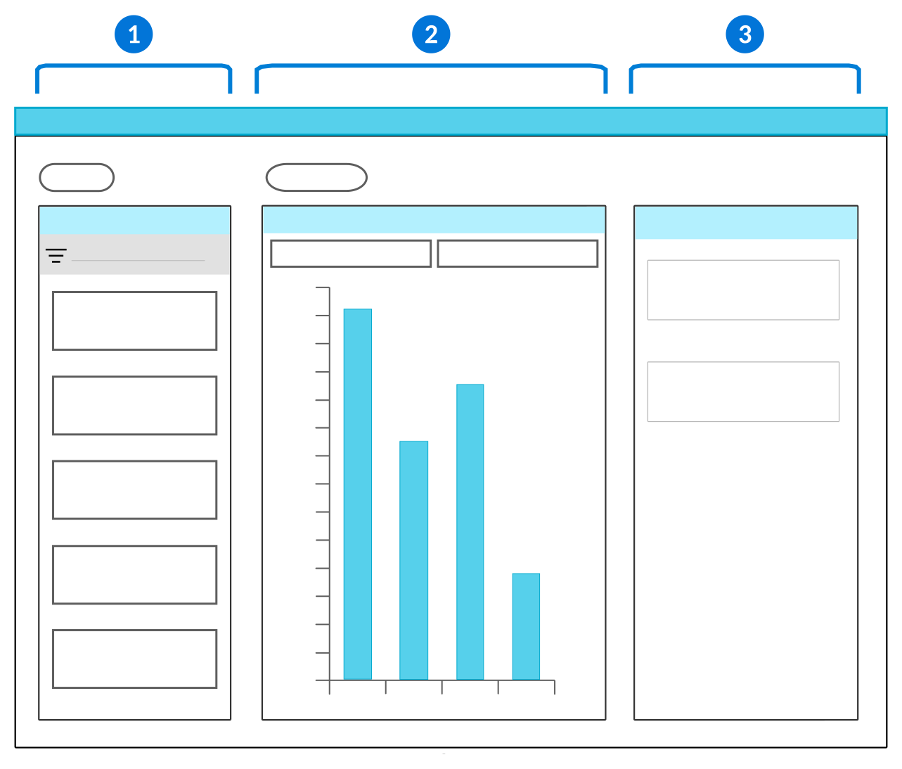
| Fields panel—Containsthe fields you can use to build your visualization. Use the drag and drop function to move the fields from the Fields panel into the Viewer panel. |
| Viewer panel—Contains the x-axis and y-axis fields where you can drop the fields you selected from the Fields panel. You can only have one field in the x-axis field, but there is no limit on how many fields can be placed in the y-axis field. Select the visualization Type to determine how the data is shown. See the Visualization types topic for more information. |
| Details panel—Contains the characteristics and attributes of the fields you select. Additionally, enables you to group the data or select different color formats. Color formatting allows you to define conditions and colors for different stylizations of the visual data. For example, you can:
|
Certain visualization Type also must be configured with a Data Shape to further define how the data is shown. There are multiple data shapes to choose from, such as:
Row Based—Values of each y-axis field are plotted on the visualization as separate series on the visualization. Values of the x-axis field create the categories on the x-axis.Aggregation Based—Values of the y-axis provide aggregations of all the application records instead of displaying specific values. Values of the x-axis field group the aggregated values from the y-axis. For example, a count of unpaid invoices is your y-axis, grouped by each month in the year as your x-axis.Column Based—Values for the x-axis and y-axis come from the same data item. The value of the record is used for the y-axis. The label of the data item found on the Synonyms page is used for the x-axis. Select as many data items as you want to appear on the visualization.
Visualization data mapper configuration
Configure a visualization using the data mapper to display data from an application's records in a visual format, such as a graph or a chart.
To add visualizations to an application, you must:
- Access the Visualization Builder or add data mappings in the Visualizations subtable on the Field Dependencies page.
The following tables show the mappings which are required for every visualization, the series mappings which dictate how the records are processed, and the optional mappings.
Required Mappings
There are several mappings which are required for every visualization, such as:
| Mapping | Defines | Details |
| Type | The type of visualization to display. This determines the other available data mapping options. | Only one visualization type can be defined for each visualization. Define this first in your data mapping. |
| Title | The name of the visualization that displays in the Selected Visualization drop-down menu. | Only one is defined for a visualization. This can be a constant. Any text can be used for the title. |
Series Mappings
There are different mapping options which dictate how the visualization processes the records.
The table below details the configuration options for Aggregation Based (Ungrouped).
| Mapping | Defines | Details |
| Series Label | Distinguishes between grouped or ungrouped aggregations. The label of the data being displayed in the visualization. This label displays under the visualization. | Only one series label of Column Headers of Y-Axis can be defined for each visualization. |
| Y-Axis Use | The aggregations to perform over the application table and that represent the data displayed in the plot area. | You need at least one Y-Axis configured. This can be an average, a count, a maximum, or total. The order you configure the fields in is the order in which they appear in the visualization. |
The table below details the configuration options for Aggregation Based (Grouped).
| Mapping | Defines | Details |
| Series Label | Distinguishes between grouped and ungrouped aggregations. The label of the data being displayed in the visualization. This label displays under the visualization. | Only one series label of Value of Group By can be defined for each visualization. |
| X-Axis Use | The field you want to represent on the x-axis and to group the aggregation by. | You need at least one X-Axis configured. This must be a Group By field. The order you configure the fields in is the order in which they appear in the visualization. |
| Y-Axis Use | The aggregations to perform over the application table and that represent the data displayed in the plot area. | You need at least one Y-Axis configured. This can be an average, a count, a maximum, or total. The order you configure the fields in is the order in which they appear in the visualization. |
Optional Mappings
The table below details the optional configuration options for visualizations.
| Mapping | Defines | Details |
|---|---|---|
| X-Axis Label | The label that displays under the x-axis in the plot area. | Only one is defined for a visualization. This is a constant. Any text can be used for the label. |
| Y-Axis Label | The label that displays next to the y-axis in the plot area. | Only one is defined for a visualization. This is a constant. Any text can be used for the label. |
| Y-Axis Minumum | The minimum value of the y-axis. | Only one is defined for a visualization. This is a constant. Only numbers can be used for this value. |
| Y-Axis Maximum | The maximum value of the y-axis. | Only one is defined for a visualization. This is a constant. Only numbers can be used for this value. |
Visualization types
Determine which type of visualization to use based on what information you want to display, or how you want to display it.
For example, you could use an information box visualization to show a count of open invoices, and a line graph to show the amount of each open invoice. There are several different types of visualizations, as seen in the table below.
| Type | Example | Description |
|---|---|---|
 | Use x-axis and y-axis quantitative values to display a line chart with a colored area between line and axis. The points on the line are connected with a straight line that forms a slope. | |
 | Use x-axis and y-axis quantitative values to display a line chart with a colored area between line and axis. The points are connected with a curved line that form a slope. | |
 | Use x-axis and y-axis quantitative values to display a line chart with a colored area between line and axis. The points are connected with line segments that form steps. | |
 | Use x-axis and y-axis values to display categorical data represented by vertical bars. | |
 | Use x-axis values to display aggregated data in a circular graph divided into sections with a blank center. Each section represents a portion of the sum of all of the data. | |
 | Use x-axis values to display aggregated data in individual gauges. The colored part of the gauge represents the quantity compared to the defined maximum, counting up from zero. | |
 | Use x-axis values to display aggregated data in a unified gauge. Each ring of the gauge represents a different aggregation. The colored part of the gauge represents the quantity compared to the defined maximum, counting up from zero. | |
 | Shows specific locations defined in records on a map. Learn more in Geo map visualization configuration. | |
 | Use x-axis values to display aggregated numbers on colored boxes. Each box represents a different aggregation. | |
 | Use x-axis and y-axis quantitative values to display data points connected by straight lines. | |
 | Use x-axis and y-axis quantitative values to display data points connected by curved lines. | |
 | Use x-axis and y-axis quantitative values to display data points connected by straight lines that form steps. | |
 | Adds labels to named locations of a picture. Example use cases are people on a seating chart, assigned parking spaces, tenants on a building floor plan, or components on a product diagram. The visualization background and named locations are defined in the Picture Map Definitions application. | |
 | Use x-axis values to display aggregated data in a circular graph divided into sections. Each section represents a portion of the sum of all of the data. | |
 | Use x-axis values to display aggregated numbers with a row of circles. Each circle represents a different aggregation and has a percentage value in the middle of the circle. The outer ring of the circle represents the percentage. | |
 | Use x-axis and y-axis quantitative values to display data points in the plot area. | |
 | Displays building information arranged into stacked floors. Each floor is divided among units and aggregations display on the side of each floor. |
Determine the type of visualization you want to use, based on what kind of information you want to display. The table below shows how the different visualization types will display your information:
| If you want to... | Visualization Type |
|---|---|
| Compare information | |
| Show relationships | |
| Show parts of a whole |
Geo map visualization configuration
Configure a geo map visualization in the Visualization Builder for your interactive reports, applications, or dashboards.
To configure, open the Visualization Builder from the record where you want the visualization. Where the visualization appears and how you access the builder is dependent on where you are configuring, such as:
- Applications—The visualization appears above the data table on the list form of the application. When there are multiple visualizations configured, a dropdown menu allows users to select which is visible. Configure application visualizations on the Field Dependencies page of the application.
- Dashboards—The visualization appears as a read-only display of the data in a dashboard card. Configure dashboard visualizations in the application, then reference the application in a dashboard card.
- Interactive Reports—The visualization appears in reports. Configure report visualizations in the Visualizations tab of the Interactive Report Builder.
Once the Visualization Builder is open, you must:
- Configure the coordinates for where the pin should be located. You can drag and drop an Address field into the Pin Longitude or Address Field, or drag and drop a Number field into both the Pin Latitude Field and Pin Longitude or Address Field fields to set the latitude and longitude for the pin.
- In the Pin Label Fields field, drag and drop at least one of the fields used to set the pin's label.
- Optionally, specify a color for the pins on your geo map.
Learn more in Visualization types.
Record notes
Enable record notes in applications to allow business users to attach supplementary notes and comments to records. Notes are attached to individual records, and support a chronological history or dialogue about the record.
Record notes are enabled at the table level. Once enabled, all applications built over the table share the same note history. For example, if you enable record notes for the Directory table, users see notes on all applications built over that table, which include the Company Directory and the detail of the Customers and Contacts application.
You can control access to notes using either security or control actions on an application or application setting.
For details on how to enable record notes, see Enable record notes for an application.
Control actions for record notes
Optionally, use control actions to limit users' ability to engage with record notes. For example, you can prevent users from using threads in their notes.
In both the Application Builder and Application Setting Definitions applications, you can use control actions on the Actions page to restrict users' ability to use record notes. These control actions are related to record notes:
Row Record Notes— Hide the record notes option on the list form. This prevents the record note option from appearing in the row action menu and hides the Notes icon that indicates rows with associated notes.
Form Record Notes— Hide the record notes option on the detail from. This prevents the record note option from being present on the record detail form.Record Notes Create— Restrict the ability to add a note to a record.Record Notes Delete— Restrict the ability to remove a note from a record.Record Notes Edit— Restrict the ability to modify an existing note.Record Notes Filter and Sort— Restrict the ability to search and reorder within a record note.Record Notes Reply— Restrict the ability to respond within a record note thread.
Enable record notes for an application
Application developers configure their applications to support record notes using the Table Definitions application.
Table Definitions
In the Table Definitions application, open the table that your application is built over. On the General Configuration page, select the Allow Notes checkbox.
Configure Security
Security is a required component. Record notes are not available to users until security is set up.
- In the Permission Definitions application on the Row Security page:
- In the Security Group field, enter
sysRecordNotes. - In the Filter Field field, enter
NoteOwningSchema. - In the Filter Value field, add the name of the table that you have configured record notes for.
- In the Security Group field, enter
- Associate the permission with any functional roles used to create notes.
You can also configure actions to control how users interact with record notes. To learn more, visit Configure actions for record notes.
Templates
Use templates to define the content you want used in different business processes, such as creating records or defining notifications.
There are several types of templates available, including:
- Record templates—Enable in applications so users can create records with pre-defined values. Learn more in the Record Templates and Enable templates in an application topics.
- Message templates—Create as part of a message definition. Define the content that is sent out in messages when a business event is completed. Learn more in the Messages and Message templates topics.
- Field templates—Enable in applications so users can select from different pre-defined values in a field which are accessible from a field action button. Learn more in the Field Templates and Configure a field with content templates topics.
Record Templates
Application developers can enable record templates so business users can create records with pre-defined field values.
These types of record templates can be enabled for records in an application:
- Manual templates—This type of record template is useful to business users when the information you are filling out in an application is consistent but does not occur on a regular basis, or certain fields do not have the same data every time.
- Recurring templates—This type of template is used when the information you are filling out in an application is consistent and occurs at scheduled intervals.
Enable templates in an application
Application developers configure their applications to support templates using the Table Definitions and Application Builder applications.
Table Definitions
In the Table Definitions application, you must:
- Specify a Table Type of
MainorHeader Detail. - On the Settings page, under the Advanced Settings section, select the Template Compatible checkbox.
Application Builder
In the Application Builder application, you must:
- On the General Configuration page, specify the template-compatible table you configured previously for the Table Name.
- Select an option in the Enable Template Options field.
Message templates
Use message templates in message definitions to create automated messages and notifications. Message templates contribute the content for messages.
Message templates and message events are referenced together in the same message definition in order to configure messages. The business event also references a table. This allows message templates to interpolate data item values. This means that values found in the table can be referenced in the content of the template to provide business data.
You can create multiple messages definitions with their own message templates for the same event. This would send out different messages to various recipients when the event is executed. For example, if an order is placed in the system, the message sent to the warehouse and the message sent to the financials team would be different.
Learn more in the Message configuration topic.
Configure messages
Configure messages to be sent to external and internal recipients with the Message Event Definition, Logic Block Builder, Message Template Setup, and Message Definitions applications.
Configure messages with the following applications:
- Message Event Definition application—Specify the table which you want to retrieve records from. This can include addresses for your emails, or interpolated values for your message content.
- Logic Block Builder application—Create a logic block to queue the message event when the event is triggered. Optionally, map additional data sources to the event payload.
- Message Template Setup application—Define the content for the messages. Optionally, include interpolated values in your message content from the data source in your event payload.
- Message Definitions application—Define the message template, message event, and associated configuration. Together, they create the automated messages and notifications which the system sends to recipients.
There are also optional configurations for messages. These are configured in the following applications:
- Decision Builder application—Define conditional logic to determine which message template should be used.
- Group Definitions application—Define a predefined group that is specified as message recipients.
- Workflow Builder application—Define a workflow transition that prompts a message to be sent. To send messages for transitions, you must add a Post Run logic block to the transition that queues the message event to which your message definition is subscribed. To send notifications for workflow approval or rejections, you must configure an Approval Definition. See the Configure messages for workflow transitions, approvals, or rejections topic for more information.
Prerequisites
To send messages, your tenant must be configured with an email domain. See the Email domain setup topic for more information.
Message Event Definition
In the Message Event Definition application, create a message event and define the tables you want associated with your messages. Records from the tables can be referenced in the templates of your messages. See the Message events topic.
Logic Block Builder
In the Logic Block Builder application, you must create a Post Run logic block over the event that you want to queue the message, then:
- Select the Queue Event action.
- In the Details panel, in the Message Event field, enter the name of the message event you configured.
- If the business event must be executed in a certain order in relation to other events, use the Sequential Execution Key field to specify a key.
- Use the Payload Entries fields to map in values from a data source to the payload entry. These values can be used as interpolated values in the message content, or to provide recipients for the message.
Optionally, if you want a list of directory records to select your recipient from, you can also set up a logic block with the Build Directory Collection action. The logic block must not be a Background Task type logic block, since the logic block must run synchronously to provide the list of directory records to the system. This format is available for all of the recipient categories, such as Send To, Notify if no reciept found, and Email CC. The message is sent to each directory record provided by the logic block, going to the directory entry’s primary email or other email if specified. Once the logic block is built, enter it in the Logic Block field in the Message Definitions application. See Build Directory Collection action for more information.
Message Template Setup
In the Message Template Setup application, create one or more templates for your message. You can create different message templates for different message recipients, but they would each need their own message definition. For example, if an invoice is processed you may want to send a notification to the warehouse to ship the order, and a message to the billing department that the payment has cleared.
To include interpolated values from a table in your message content, use the format of:
{*PayloadEntriesName.DataItemName*}
Where:
- PayloadEntriesName is the name of the payload entry you created in the Payload Entries subtable in the message event.
- DataItemName is the name of the data item from the table you referenced in the message event that you want in the message content.
If you do not specify the payload entry name, and only use {*dataitemname*} , the first payload entry in the subtable is defaulted. See Message Template Setup application for more information.
Message Definitions
In the Message Definitions application, you must:
- Configure a message definition.
- Select the Active checkbox or your message won't be sent.
- Select the message event you created in the Triggering Message Event field.
- Select the message template you created in the Message Template field, or use decision to select the template and enter the configured decision in the Template Decision field.
- To use a logic block to designate the message recipient, enter it into the MessageRulesSendTo.MessageParticipantLogicBlock field on the Recipient subtable.
- To use a decision to designate the template, enter it into the Template Decision field.
See Message Definitions application for more information.
Decision Builder
Optionally, if you want the system to determine which message template to use, you can create conditional logic using the Decision Builder application.
- Select
for the Type field. This selection then defines your options in the Action field of the Rules subtable. - For the Match Policy field in the Decision Rules section, select the option relevant to your intended message recipients.
See the Decisions topic for more information.
Groups
Optionally, if you have a predefined group of users that should receive messages, you can specify a group of designated recipients that has been defined in the Groups application.
Field Templates
Use field templates to attach a field action button on the field of an application which provides predefined values.
The content is defined in the Content Item Definitions application, then the content record, data item, and application name are referenced in the Text Template Setup application.
The type of data item determines what information can be stored in the field, such as numbers or text. For example, Text Editor data items creates a text box with full formatting, such as the number of text lines allowed and default text for the field which a user can replace.
Link multiple templates with the same field to create a dropdown menu which users can select from. The original reference text self updates from the template in the Text Template Setup application. Learn more in the Configure a field with content templates topic.
Configure a field with content templates
Configure field templates to have predefined content available as a field action button on a field within an application with the Content Item Definitions and Text Template Setup application.
Prerequisites
The application must be configured with the data item you want to use in the template setup.
Content Item Definitions
In the Content Item Definitions application, you must:
- Create a new record of type
Template Content. - In the Source Content field, enter the content you want shown in the data item.
Text Template Setup
In the Text Template Setup application, you must:
- Create a new record.
- Enter the internal name of the data item, application, application setting, and content record.
Once the record is saved, a field action button is created next to the field. Optionally, you can create multiple templates and link them to the same field to have multiple templates available in the field action button.
Text Template Setup application
Use the Text Template Setup application to link content templates with a field in an application. These templates are then accessible with a field action button on the field.
Content templates are defined in the Content Item Definitions application, then referenced in the Text Template Setup application with the name of the application and the data item. One, or many, templates can be attached to the same field, resulting in a field action button which enables users to select their content.
Learn more in the Configure a field with content templates topic.
Field Dependencies
Field dependencies allow you to dictate what is shown in one field, based on a value in another field in the application. For example, one field could hold the name of a valid configured format, and that would dictate which format is used in an address field.
Configure field dependencies by configuring the type of field, the value in the field, and then which field should be impacted. For example, if you wanted the currency code for one field to be dictated by the currency code being used in a different field, you would fill the following into the Field Dependencies subtable:
- Selectors.ControllingFieldType:
Currency. Tells the system what part of the dependent field should be dictated by the controlling field. In this case, it is a currency code for the field. - Selectors.SelectorControlling: The name of the field that controls the dependent field. In this case, the name of the currency field whose currency code you want to control the dependent field.
- Selectors.SelectorDependent: The name of the field that is impacted by the controlling field information. In this case, the field whose currency code is controlled by the controlling field.
With this configuration, whatever currency code is used in the controlling field controls which currency code is used in the dependent field. If the controlling field has a USD code, the dependent field also has a USD code.
There are many configuration options for Field Dependencies, as seen in the table below:
| Controlling Field Type | Controlling Field | Dependent Field |
Calendar End TimeHolds the end time to be displayed on the calendar. | A time data item. | Displays the selected time as the last time visible on the calendar. Must be a Calendar data item. |
Calendar Jump to TimeHolds the time to be displayed. | A time data item. | Displays the time selected in the field. Must be a Calendar data item. |
Calendar NameHolds the calendar name to be displayed in the Calendar data item. | The data item that holds the calendar name, or a table lookup on the calendar. | Displays the calendar of the calendar name specified in the controlling field. Must be a Calendar data item. |
Calendar Start DateHolds the calendar data to be displayed in the calendar. | A date data item. | Displays the selected date in the calendar. Must be a Calendar data item. |
Calendar Start TimeHolds the start time to be displayed on the calendar. | A time data item. | Displays the selected time as the first time visible on the calendar. Must be a Calendar data item. |
Chameleon Data Item (Limited Use)Takes on the data item type of whatever data item is in the controlling field. | The value in the controlling field must resolve to a valid data item. | Supports values based on data item types. All data item types are valid. |
Chameleon Table (Limited Use)The dependent field turns into a table lookup over the table entered in the controlling field. | The value in the controlling field must resolve to a valid table name. | Table lookup field with values based on table name and default search field. Must be a table lookup over a Table Schema data item type. |
Chameleon Workflow (Limited Use)The dependent field shows the workflow options for workflow set up over that table. | The value in the controlling field must resolve to a valid table name. | Table lookup field of type Text. |
Credit Card TokenUsed to get the credit card API token out of a credit card object. | A credit card object. | A text value which contains the credit cards token. Any field of type Text data item. |
Credit Card VendorUsed to set the credit card vendor in or get the vendor out of a credit card object. | Can be either:
| If you select a credit card object as the controlling field, a value from the APIKeyVender List Lookup is the dependent field. If you select a value from the APIKeyVender List Lookup, a credit card object is the dependent field. |
Expression Source TableThe controlling field value tells the dependent expression field the table name whose fields are available to use in the expression. Only one controlling field of this type is allowed per dependent expression field. | Must resolve to a valid table name. | An expression that contains fields from the table defined by the controlling field value. Must be an expression data item type. |
Expression System Engine KeyThe controlling field tells the dependent expression field which category of System Values are available for use in the expression. System Values are mapped in the System Value application and associated with a System Engine Key. Only one controlling field of this type is allowed per dependent expression field. | Must resolve to a value from the SystemEngines list lookup. | An expression that contains system values whose engine is equal to controlling field value. Must be an expression data item type. |
Field ControlThe use is determined by the data item type of the dependent field. | Can be either:
| The dependent field for each is defined in:
|
Inline Attachments Carousel On (deprecated)Allows attachments to be displayed in a carousel in the detail form. | N/A | The attachments displayed inline. Must use the AttachmentGroupId data item. |
Inline Filter Table NameUses the controlling field value to determine what table an inline filter data item will build its filter over. | A table lookup to the TableSchemas table. Note: If this field is left blank, the table that this application is built over is used as the default. | The inline filter data item that should build its filter based on the value in the controlling field. |
Lookup ValidationUse with filtered table lookups to disable the dependent field (the filtered field) when the controlling field is not populated with a value. | The field on the app containing the value used to filter the table lookup. | The filtered table lookup field. Must use a Table Lookup data item. |
Multi-Segment Format DefaultUses the controlling field value to find the format whose unique name is exactly equal to the text value, then sets the format in the panel and locks it so that it cannot be changed by the user. | Must resolve to a valid multi-segment format name. | The multi-segment data item whose format is set to the controlling field value. Must use the Multi-segment data item group. |
Multi-Segment Format FilterUses the text value from your controlling field to filter out any formats whose unique format name does not begin with that value. | Any value of type text. | The multi-segment data item whose available formats begin with the controlling field value. Must use the Multi-segment data item group. |
Conditional Field Dependencies
Conditional field dependencies allow you to conditionally apply a field characteristic to the dependent field based on the value selected in the controlling field. For example, defaulting the a currency value in the dependent field to be a negative number if a specific list lookup value is selected in the controlling field.
Unlike normal field dependencies, conditional field dependencies allow you to have different results in the dependent field based on the value selected in the controlling field.
For example, if you wanted values entered into the Unit Price field to be negative by default in records where the Transaction Type is Customer Credit Memo, you would configure the following values in the Conditional Field Dependencies subtable:
- ConditionalSelectors.ConditionalSelectorType: Negative Currency Field
- ConditionalSelectors.ConditionalSelectorControlling: TransactionType
- ConditionalSelectors.ConditionalSelectorValue: Customer Credit Memo
- ConditionalSelectors.ConditionalSelectorDependent: UnitPrice
If Customer Credit Memo is selected in the Transaction Type field, any value entered in the Unit Price field automatically is defaulted to a negative number. At the time of record creation, users can still choose to input a positive value.
Configure attachments for applications
Attachment options are included by default on all application types. They are accessible within a dialog box, but can be configured to appear inline on the detail form of a record. You can also adjust the threshold size of file types which controls the size of files which are automatically previewed in the Attachment Manager.
File Size Thresholds
Only certain file types can show previews. The threshold file size determines whether the attachment automatically shows a preview, or if a user has to select the Click to Preview File button to load it. You can change the default threshold size using the List Lookup Definitions application.
The default threshold sizes for different file types are detailed in the table below.
| Threshold Size | File Types |
|---|---|
| 1.5 MB | .xls, .xlsx, .xlsm, .ods, .har, .json, .nwjson, .txt, .md, .csv |
| 3.5 MB | .webp, .jpg, .jpeg, .gif, .png, .pdf, .html, .svg, .docx, .avif |
| 6.5 MB | .mp4, .mov, .webm, .mp3, .wav, .ogg |
The file size thresholds are defaulted in the system, but can be changed.
In the List Lookup Definitions application, you must:
- Open the
AttachmentPreviewThresholdOverridelist lookup. - Add a list lookup key for each file type which you want to change the threshold for. Any file types not included in the table remain with the default threshold file size.
- For the Value field, enter the file extension. For example, "csv". The file name should be entered lowercase and without punctuation.
- For the Description field, enter
threshold<size>, wherethresholdis a constant and <size> is the desired threshold size in bytes. Do not include comma separators in the size. For example, "threshold 3500000".
For the value and description combination described, the new threshold for .csv files would be 3.5 MB.
Inline Attachments
Inline attachments show the Attachment Manager inside the detail form of a record, rather than in a mini app window. To enable inline attachments for an application, you must:
- In the Table Definitions application, add the
AttachmentGroupIDdata item to the table your application is built over. - In the Application Builder application, on the Detail Form Fields page, place the data item in the column where you want the Attachment Manager. Ensure that the field is sized and positioned effectively.
Hide or Disable Attachments
Learn more about hiding or disabling the Attachments buttons in the Control Actions topic.
Camera scannable fields for mobile users
Application developers can configure applications to enable camera scannable fields. Camera scannable fields allow users of the platform to scan a barcode with a phone or tablet to fill in detail form fields.
This feature is useful for mobile users who want to scan barcodes to complete tasks while working. For example, warehouse workers that are scanning inventory items.
When a field has been configured to be camera scannable, mobile platform users see the Scan Barcode  icon. Once a user selects the icon, they can scan a barcode to update the field's value. If a value already exists in the field, the barcode value overrides it. Once the field value is updated, any logic blocks associated with a field value change on the field are executed. For example, a logic block could analyze the data received then parse it into multiple fields in the application.
Fields that are modified based on a barcode scan do not need to be visible on the current form of an application. For example, a single barcode could contain the length, width, and height of a shipping carton. Each attribute needs to be copied into a field so that a logic block can calculate shipping costs based on those dimensions, even if those fields aren't visible.
There are multiple ways to configure a field as camera scannable. Learn more in Configure camera scannable fields.
Configure camera scannable fields
Configure camera scannable fields in the Application Builder or Application Setting Definitions applications. Scannable fields allow mobile users to scan a barcode to input values into application detail form fields.
To configure a field as camera scannable, select the FieldSelection.CameraBarcodeScannable checkbox in one of the following places:
- In the Application Builder, in the Application Properties panel, on the Detail Form Fields page, in the Field Selection subtable.
- In the Application Builder, in the Configuration panel.
- In the Application Setting Definitions application, on the Layout page, in the Field Options subtable.
Camera scannable fields are only supported on certain data item types, including:
- Text
- Number
- Date
- Time
- DateTime
- Web Link
- Phone
- Table Lookup
Configure multiple value scanning
To configure an application that can process multiple values in a single barcode scan, you must:
- Configure a
Field Value Changedevent action on the camera scannable field. Learn more in Logic blocks and event actions. - In the logic block for the event action, use the Text Manipulation action to configure string values. Learn more in Text Manipulation action.
- Use the Loop Conditional action to separate the string value into individual components and set the values into the appropriate fields. Learn more in Loop Multiple Selections action.
Enable single click to edit fields
Enable the Single Click to Edit option in your Advanced List and Detail applications. When selected, list form fields open in edit mode after a single click.
In the Application Properties panel of your application record, expand the Additional Options and select the Single Click To Edit checkbox.
Configure an iFrame for an application
Configure an iFrame field for your application in the Data Item Definitions, Content Item Definitions, and Application Builder application.
Data Item Definitions
In the Data Item Definitions application, or within the New Fields section of the Application Builder, you must:
- Create a data item of type
Object. - The name of the data item must start with
znwInlineIframe.For example,znwInlineIframeExampleDataItem.
Table Definitions
If you manually created the data item in the Data Item Definitions application, add it to your application's table.
Application Builder
In the Application Builder, you must:
- Ensure the iFrame data item is displayed in the application.
- Optionally, display the
EndpointURLdata item for initial testing and troubleshooting. - In the Field Dependencies section, create a new Publisher record and:
- Set the From to Detail, then select EndpointURL.
- Set the To to the ScopeName you enter in the Content Item Definition record you create in the next step.
Content Item Definitions
In the Content Item Definitions application, create a new record, then:
- Name the record the same name as the iFrame data item.
- Select
Source URLfor the Content Item Type. - In the Source URL field, enter the source URL. The format should be
${CC.ScopeName.FieldName}
Populate EndpointURL
To populate the EndpointURL, you can:
- Use an endpoint or logic block call to dynamically generate the URL and set the EndpointURL field.
- Manually enter the URL in the EndpointURL field of the application if you want to use a static URL for testing.
Troubleshooting
If you see a 404 Not Found, check that the EndpointURL is populated and points to a real resource.
Clear your browser cache and do a hard reload to ensure the latest content is loaded.
Quick Import feature for Header Detail applications
Enable the Quick Import feature in Header Detail applications to allow users to import detail records directly within the application.
Quick Import bypasses the traditional Data Import Definition process. Users can access a CSV template from the form action menu within a Header Detail record, download it, fill it in, and import detail lines directly into the record.
To configure, select the Allow Quick Import checkbox in the Application Properties panel of your application record.
The types of data items which are supported include:
- Number
- TrueFalse
- Date
- DateTime
- Time
- Currency
- Text
- TableLookup
- The Primary Search Field can be of type:
- Text
- Name
- Number
- Other data item types are treated as Text fields internally. This could result in unexpected behavior.
- The Primary Search Field can be of type:
Application best practices
These best practices ensure that applications are configured consistently throughout Nextworld.
Application configurations are done in the Application Builder application.
Name applications so that they are free of numbers, special characters, and spaces. Once an application is created, the name cannot be changed at a later date. All words must be written in upper camel case, which means the first letter of each word should be capitalized. The name should reflect the purpose of the application. For example, PurchaseOrderEntry.
When entering information in the Application Builder header, the Description field entry should be short and concise. The entry should not contain any punctuation or complete sentences.
Use Application Builder to enforce UI standards based on patterns. For example, fields and checkboxes, header layout, and detail and list forms should always appear in the same place across different applications within the same family.
Always name the detail form pages of your application, even if there is only one page.
Create an Application Setting for each application to make it easy for customers to configure defaults without having to customize the application.
Naming conventions and standards
Application names should reflect the purpose of the application and follow the upper camel case convention. For example, PurchaseOrderEntry, ApplyCustomerCredits, and BillOfMaterial are all acceptable names for applications.
Give your application layout a name format of Layout. For example, a layout for the TrackandTraceBatchJobs application would be named TrackAndTraceBatchJobsLayout. If an application has multiple layouts for different purposes, the naming format should be Layout. For example, the ServiceContract application has layouts for warranty and performance that are named ServiceContractWarrantyLayout and ServiceContractPerformanceLayout.
When an application performs a specific purpose, additional naming conventions may be necessary. The naming convention should only be in the Name field, not the Description field.
| Application purpose | Naming convention | Example |
|---|---|---|
Search | If a mini application is used to search another table for a record to select, include Search in the application name. | DirectorySearch |
Integration | If the application is used for integration, end the name with Integration. | StudentScheduleIntegration |
Header | If the application is used for a header application, end the name with Header. | GeneralLedgerHeader |
Detail | If the application is used for a detail application, end the name with Detail. | GeneralLedgerDetail |
Header Detail | If the application is used for a header detail application, the name should be plural. | GeneralLedgerTransactions |
The Description field entry may match the name of the application, but should include spaces. Application descriptions should always reflect the type of data the user will access from the application. Don't use complete sentences when writing descriptions. For example:
| Application Name | Description |
|---|---|
SalesOrderHeader | Sales Order, Sales Quote, and Sales Credit Headers |
SalesOrderDetail | Sales Order, Sales Quote, and Sales Credit Details |
ServiceContractHeader | Warranty and Performance Contract Headers |
ServiceContractDetail | Warranty and Performance Contract Details |
ClaimsIntegration | Customer and Supplier Claims Integration |
ClaimsSearch | Search for Customer and Supplier Claims |
When you are creating a menu entry record for your application in the Menu Definitions application, the Menu Title should have the basic name of the application with no verb. For example Purchase Order, Manual Checks, or Company Structure are all acceptable names for the menu title. If the application you are creating the menu for is a mini search application, do not put the word Search in the Menu Description. The Menu Description is what displays in the mini search application. The description should be what the mini application is searching on and should be plural. For example, GL Accounts.
List form field layout best practices
These best practices ensure that application list forms are configured consistently throught Nextworld.
Configure the list view on the List Form Fields page in the Application Builder application.
Place the most important fields in the beginning of the list.
Limit Primary and Available fields to 10 fields that support the main purpose of the application. The exception to this rule is the list view for integration applications. These may exceed the 10 field limit. List other fields as available hidden to provide options for customers to set their column preference. The limit on the number of fields that can be displayed is 40.
Only use an Aggregation feature for a list form field if the application either restricts the number of records that can be viewed or is over a table that does not contain a large amount of records. In applications with a significant amount of records, the system has to go through all the details to recalculate an amount whenever you make a change in the filters. This can greatly affect the performance of the system. A possible exception to this is if you are using a Header Detail application. In a Header Detail application, the amount of detail records displayed in the list view is limited to those that are associated to the header. If you use the filters and the amount field must be recalculated, performance is typically not impacted if the Header Detail doesn't contain too many detail records associated with a header.
Position ItemDescription to the right of Item in both list and detail forms. If you need to use ItemType, place it to the right of ItemDescription.
Position the most important fields to the left, and the less important fields to the right. Fields that:
- Create context should be positioned to the left.
- Require entry in the list view should follow the fields that create context.
- Are defaulted or not required should go to the right.
Configure the display types so that only fields that support the main purpose of the application are visible. The display type options are:
| Display Type | Used for |
|---|---|
| Primary Tree | Required tree fields in a tree style relationship application. |
| Primary | Required fields that are critical to the application. |
| Expansion | Disabled or defaulted fields that are rarely used for filtering. |
| Excluded | Fields that do not need to be displayed. |
| Available | Fields that are important to the business process. The user will be able to hide these fields if they are not used as part of their business process. |
| Available-Hidden | Additional fields that the user may want to show. These fields can be shown if needed. |
Expansion rows should be limited to two rows.
Always configure the Notes field to display as Expansion.
Index Query Restriction
If your table holds a large data set that is often queried, use index restriction query to limit the choices of fields to query to maximize performance.
Fetch option best practice
Use the Fetch Options field in Application Builder to control the list view filtering options. This best practice describes when to use each option.
The Fetch Options field controls what filters a user must enter when filtering application records. The configuration of this field should be based on the amount of records in a table, the type of data stored in the records, and an understanding of how users filter and use the records.
The list below describes the different options and when to use them:
- Require Single Filter—use for tables that store transactional data where the user filters with one unique value, such as Application Name when filtering for a specific application record.
- Require All Header Filters—use for Advanced List applications when the header filters create a unique key, such as Buyer and Status when searching purchase requisitions. Use this option for Advanced List applications built over Join tables.
- User Action Required—use for tables that store a high volume of transactional data where users add one or more filters before viewing results, such as Transaction Type, Organizational Unit, and Transaction Date or GL Account and Transaction Date when filtering for transactions. Use this option when there is a significant number of records that can take longer to load.
List lookup color best practices
Best practices for color configuration is used in the List Lookup application. Follow the best practice based on what the color is used for and how it is configured.
List Lookup background color best practices
These best practices ensure that field background colors in applications are configured consistently throughout Nextworld.
Background colors are configured in the List Lookup Definitions application.
Do not select a color for rows. A themed color will automatically be applied to rows in the range of Header Row and Header Row To configured in Application Builder on the Pages and Rows page. Do not use any other colors for the header. The exception to this is if you configure your header as Card to make it appear white.
If the application displays a status, use one of the spectrum background colors.
Not all status fields should use a background color. For example, don't use background colors if there would be too many colors that might overwhelm the user. Use a text color instead.
List lookup text color best practices
These best practices ensure that field text colors in applications are configured consistently throughout Nextworld.
Text colors are configured in the List Lookup Definitions application.
If no background color is configured, either do not specify a value for the Text Color field or use one of the spectrum colors for your text color. If you do not enter a text color, the color is automatically determined.
When you configure Background Color, the text color chosen for that background color in the current theme is applied if you leave Text Color unassigned. Be sure that text color appears clearly with your selected background color. For example, if you chose the background color the text would not appear clearly if the text color was configured as .
Detail form field layout best practices
These best practices ensure that application detail forms are configured consistently throughout Nextworld.
Configure the detail view on the Detail Form Fields page in the Application Builder application.
Always position:
- The
Inactivecheckbox in the top row and to the far right under the Save button. - The
OrganizationalUnitfield in the top row and to the far right.- The exception to this is if you are configuring
OrganizationalUnitin a module settings application. If you are configuringOrganizationalUnitin a module settings application, position it in the top row and to the far left.
- The exception to this is if you are configuring
- The Company field in the top row right before Organizational Unit. This field is required to be entered prior to the Organizational Unit. Disable Organization unit until a Company is entered. A company can be defaulted by an application setting.
- The exception to this is if you are configuring Company in a module settings application. If you are configuring Company in a module settings application, position it in the top row and to the far left.
- The
ItemDescriptionfield to the right ofItemin both list and detail views. If you need to useItemType, place it to the right ofItemDescription.
Try to place the Notes field on a separate page. If the application purpose requires Notes to be more visible, the field can be displayed where needed.
Additional status fields, such as BudgetStatus or CompleteStatus, should be positioned in the top row of the header and to the far right.
Application pages and rows best practices
These best practices ensure that application pages and rows are configured consistently throughout Nextworld.
Configure pages and rows on the Pages and Rows page in the Application Builder application.
Pages
Only use a maximum of six pages in an application. Any more than six would appear overcrowded. Configure the pages as A through F, with A being the first page and F being the last page.
Be descriptive and concise when adding a titles to pages. Page names should not repeat any field names or row separator titles. Avoid creating page titles like Other or More Information.
Pages should be used when there are enough differentiating fields to logically separate the sections.
Fields should be placed on pages that logically reflect the purpose of the field. For example, the application Purchase Orders has multiple pages including Accounting, Supplier, and Terms. The field SupplierPaymentTerms_PaymentTerms logically belongs on the Terms page, not on Accounting or Supplier.
Rows
Only use a maximum of:
- Six fields in a row. Any more would result in unnecessary side scrolling.
- Six columns across the page. Any more than six would appear overcrowded.
Row separators can be configured using the Hide Row Separator checkbox. If you don't select the checkbox, a row separator appears above the row associated with the unselected checkbox. If you do select the checkbox, the row separator is hidden and does not appear on the user interface.
When configuring row separators in the header, you must:
- Hide the row separator that would appear above the header. The header's position as the topmost section of the application which means it does not need to separated from anything above it.
- Place a row separator below the header. The exception is when there are pages immediately below the header.
- Add a collapsable row separator in the header if there are too many fields and the header appears disorganized.
When configuring row separators in the detail form, you must:
- Keep row separator titles consistent. If some row separators have titles, then all row separators must have titles except for the row separator directly beneath the header.
- Titles should provide value and should not repeat the page title.
- Make all row separators collapsible so that the end user has control over which field areas they want displayed or which ones they don't want displayed.
- Avoid having row separators on every row. Row separators should be used to logically organize fields. Do not use a row separator when the fields don't logically fit together in the context of an application.
Assign a Static Text data item its own row in the Row field, and only one column in the Columns in Row field. Assigning only one column to a Static Text data item ensures that the text is fully extended across the generated application. If you assign more than one column to a row with a Static Text data item, the text becomes condensed in the generated application.
When configuring row assignments in the Row field, only use the single letters. For example, use A instead of A Custom 01. If you try to use the custom format, you will receive an error when you try to save your application. The custom format is used for customizing Nextworld applications only. For more on when to use the custom format, see [link: 'AppProductionRules'].
Header best practices
These best practices ensure that users experience a consistent header design throughout Nextworld applications.
Configure field placement in the Application Builder application.
Position check boxes to be as far right as possible. The exception to this is when there are fields that are being hidden or shown by the checkbox. The check box should be positioned to the left of those fields.
If the header looks too large, consider moving the pages to the top of the header. Moving pages to the top of a header requires not specifying a header row. With no header specified, the pages automatically display at the top of the application. Follow these steps to move pages to the top of an application with an existing header:
- In Pages and Rows, clear the Header Row and Header Row To fields.
- In the Rows subtable, find the rows that you want to be in your header, and select App Header Area from the Row Color list lookup.
- Generate and then launch the application to see the pages at the top and the rows beneath configured to look like a header.
If the header looks too large, but you have at least six core context fields that are necessary for every page, consider configuring a single header row. If the header consists of only one row with pages directly beneath it, configure the header color to display as white. Follow these steps to create a single row header with a white background color:
- In Pages and Rows, specify the header row. Make sure the Header Row and Header Row To display the same value.
- In the Rows subtable, find the header rows that you want to be in your header and select Card from the Row Color list lookup.
- Generate and then launch the application to see the single row header above the pages, displayed in the same color as an open page.
Sample header template
A header template is one way to ensure that users see a consistent, predictable field layout across Nextworld applications, particularly those applications that are part of the same family or module. This makes use and navigation of applications more intuitive.
Field positions should remain consistent throughout applications to avoid a disorganized user interface. Consider making a field placement template for groups of applications. For example, manufacturing application headers and education application headers may be different, but should remain consistent within their families or modules.
Below is an example template for a header. This template displays the maximum amount of header fields in a family to demonstrate the purpose of different field regions:
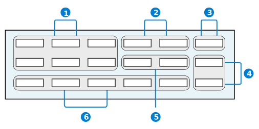
These different regions place fields in certain locations on the header depending on what kind of information they capture for the record.
Use this region to place:
| Region | Description | Examples |
|---|---|---|
| Fields that capture basic background information about the record. | Name, Type, and Description |
| Fields that capture status information. These fields are not workflow related and are primarily list lookups. | TaskPriority |
| Fields that capture the organizational unit of a record. | OrganizationalUnit |
| Fields that capture location information about the record. | PrimaryAddress and BirthCountry |
| Fields that have default values. These are fields that require numbers generated from other field values or IDs generated from the creation of records. | ContactID and TransactionAmount | |
| Fields that are check boxes. | Inactive or CustomerOnHold | |
| Fields that capture date and time information about the record. | SentDate and BirthDate |
| Fields that capture additional information that does not fit into the other regions. | Notes |
Application actions best practices
These best practices ensure that application actions are configured consistently throught Nextworld.
Build action events in the Logic Builder in the Logic Block Builder application, and then apply them in the Actions page of the Application Builder application.
Logic blocks run in the order they appear in the Event Actions subtable on the Actions page in Application Builder. Multiple logic blocks can be associated with the same events and are bundled to make only one call to the server.
If you need to fetch all detail rows, do not have two logic blocks on Row Exited fetching all detail rows. To prevent the logic block from fetching and refetching all detail rows whenever you exit or change a row, use the current row option to fetch the details instead.
On Form is Initialized logic blocks, defaulting field values should be conditioned to only default if the value is blank, so it does not override the value that was entered or overridden.
Logic blocks ran on Field Value Changed, Field Entered or Field Exited need to consider if the value is likely to be defaulted via an application setting. In this case, the logic must also reside on Form is Initialized .
Use a Row Changed event and Field Value Changed events instead of Row Exited and Field Exited. Field Exited and Row Exited always call a logic block on the event in which the logic block always runs regardless if the value has changed or not. Using Row Changed and Field Value Changed events instead prevents the logic block from running when a value didn't change. For these events to trigger, a user must enter and exit the row or field and the value must be different from when the user entered the row or field. If a logic block changes the value, this does not trigger a change event.
Application links
For application links with data mappings, map the nwId as the Source Related Field for table lookup fields. This enhances performance, while using the table Primary Search Field field hinders performance. The nwId value does not display in the column header when mapping nwId.
To reduce the number of records fetched, use Exact Match as the Filter Prefix when possible.
If Form or Row action are hidden via a logic block. Run the Logic block in both the detail form and list form for consistency.
Multi row select in advanced list applications best practices
These best practices ensure that the Datatable True/False Click (With Multiple Selection) action is used consistently and correctly throughout advanced list applications in Nextworld.
Don't use the Datatable True/False Click (With Multi-Select) action when there is logic configured to run for individual records. That is, don't use this action if logic blocks would run after each record changes, and have to finish running before the next record is updated. Running a lot of logic all at once causes performance issues.
For example, in the advanced list form of an application you can display 15 records on a page. If all of the records on the page have actions configured such as Row Entered, Row Exited, Row Changed or Field Value Changed, those actions would all be triggered when the Datatable True/False Click (With Multi-Select) action is used. This means that the user would have to wait for 15 logic blocks to run before they can do anything else.
Best practices by application type
Some application types have their own best practices. If you are using an application of one of these types, follow the best practices for that type.
Relationship application best practices
There are two relationship application types, which have their own best practices. If you are using a relationship application of one of these types, follow the best practices for that type.
Advanced list application UI best practices
These best practices ensure that advanced list applications are configured consistently throughout Nextworld.
When to use
Use an advanced list application when you have data that you want to maintain quickly on a single page and where each row is treated independently. This also is considered a single maintenance application pattern. Each row can be edited immediately, or a set of rows can be grouped together and then edited.
For more on advanced list application form flow and configuration, see Advanced list application.
UI design
If you are setting up an application with fewer than ten fields, then the application should be developed as an advanced list application.
Only fields that are used for one of the following purposes should be placed in an advanced list header:
- Required search fields.
- Fields used to propagate data during the create. For example, the advanced list application Work Areas has the field
OrganizationalUnitin the header where you can filter the rows for a specific organizational unit. - Work fields used to control processing. For example, the advanced list application Bills of Material Integration has the Purge Processed checkbox in the header. If Purge Processed is selected when creating a new record, then successfully processed integration records are automatically purged.
- Used to create a form action, or map a field to a logic block or another application. For example, the advanced list application Bills of Material Integration sends the run numbers to a logic block when you select Process.
If you are filtering fields that don't follow the purposes of header fields, you should configure them in the column header filters. The filter capabilities in the column headers are more straightforward compared to filtering in the header.
Module settings application UI best practices
These best practices ensure that module settings applications are configured consistently throughout Nextworld.
When to use
Use a module settings application when settings must be configured for all applications in a module.
List form
Display from left to right the GlobalSetting checkbox, the OrganizationalUnit field, the OrganizationalUnitType, and the Directory followed by the list of settings from the detail page in the order that they appear on the detail page.
Detail form
- When configuring the headings in that display in the detail form:
- Display the
GlobalSettingcheckbox to the far left for the global settings header. - Configure the organizational unit header to display five columns with the
OrganizationalUnitfield as column one and theOrganizationalUnitTypefield as column two andDirectoryas column three. - Hide the row separator above the header row in the Pages and Rows page.
- Display the
- When configuring the rows that display in the detail form:
- Configure the detail form to display three columns.
- Show the row separator below the header and between detail rows.
- Word the help text for the settings table data items consistently.
- When configuring a field that will traverse the company structure, determine if you want to provide the customer flexibility to avoid traversing for the No Value option.
- For example, the Receipt Routings field in Inventory Settings has the following options:
In-Transit,On-Dock, andStock. If this field is left empty, it means receipt routings are not used. However, since this field will traverse the company structure (Do Not Traverse = false), it could pick up the Receipt Routings value from a higher level in the company structure. If you want to provide the flexibility that allows them to have the field traverse for some Organizational Units but not others, you should provide an option in the list lookup calledNo Receipt Routing.
- For example, the Receipt Routings field in Inventory Settings has the following options:
- When configuring the help text for a data item that uses a Lookup Name, make sure that the formatting for all the possible list lookup selections are formatted in the same manner. They should be written and formatted in the following way:
This indicates <explanation>
- Value1 - Explanation of what it does
- Value2 - Explanation of what it does
If <field> is empty, explanation of what happens.
Best practices for applications released to production
These best practices ensure that, once applications have been released to production, you are not making changes that will be disruptive to customers. Changing applications configurations may negatively affect the purpose of the application.
Once applications have been developed and delivered, they are considered active in a production environment. Additional considerations apply.
Do not make the following changes:
- Do not make module settings applications more restrictive. For example, a setting that is configured at an org unit level should not be changed to a company level setting because it invalidates the org unit setup.
- Do not delete an application. Remember, the customer may have their own menu option with this application or may have customized the application.
- Do not force user to enter new required fields.
- Do not force new functionality to be used.
Consider
- If the change to the application will cause re-training of employees.
- Even moving fields in the application may disrupt the user as they know the key strokes to do heads down entry.
- Removing or renaming row actions may confuse the user.
- Partners may have extended your application.
- Customers may have customized your application.
Backwards compatibility strategy:
- Utilize opt in methodologies. See the Best practices for adding a new feature topic.
- Default value for new required field (in application and in a trigger/action block).
User interface best practices
These best practices ensure that the user can view and navigate the optimal version of an application user interface on any device.
Best practices
Keep the design of objects consistent throughout the entire user interface for easier navigation throughout different applications.
Consider the approach for the same functionality across all applications. If other applications have similar behavior, make sure the application handles the process in the same manner. End users want consistency and assume taking the same action in one application should be done in the same manner as any other application.
Consider using Application layouts. Not every field is used or even necessary. Using an alternate layouts can help streamline the user interface.
Consider notifying an end user when a process has been completed. End users want to know when an action they have taken is complete. Some options include using a status, workflow, or a notification.
Consider whether you show/hide fields rather than enable/disable fields. Make it easy for an end user to understand why a field is disabled and what actions need to be taken for it to be enabled. All help text for fields should be clear and specific.
Consider using a row action or a field action. Row actions tend to get buried and they take the end user away from what they were doing. If the action is tied to a specific field, perhaps a field action should be used instead.
Consider the performance of the application and keep the number of clicks to process a transaction to a minimum.
Avoid scrolling the best you can. Vertical scrolling is generally acceptable, but avoid horizontal scrolling. Horizontal scrolling on list view are acceptable, but avoid it in the detail view if possible.
Consider user navigation when designing your user interface. Spend enough time on your user interface design to minimize:
- Unnecessary scrolling.
- Excessive clicking.
Consider the tabbing order when configuring an application. Nextworld tabbing navigates the user from left to right and from top to bottom through rows. Organize fields that should be navigated:
- From left to right into the same row across multiple columns.
- From top to bottom into the same row under one column.
- Think about the field sequence from an end user's point of view as they tab through the application.
Design applications so that users can view them on multiple devices. The field positions must not change when viewing applications on different screen resolutions. Optimize applications for:
- Desktop view. For example, 1366 x 768px.
- Tablet view. For example, 768 x 1024px.
- Mobile view. For example, 375 x 667px.
UI guidelines by application type
Some application types have their own best practices. If you are using an application of one of these types, follow the best practices for that type.
Application settings
Application settings allow you to create variations of the application's user interface for different audiences through use of preconfigured filters, layouts, and buttons. Users can have different experiences with the application based on their roles.
Application settings allow you to control specific aspects of how an application is displayed, such as:
- Defaulting values into fields when the application is open.
- Hiding or disabling individual objects. For example, a field.
- Hiding or disabling control actions.
- Automatically moving empty columns to the end of a row in the detail form.
Application settings can also change the composition of an application based on the user. For example, accounting staff and account managers use different components of the Customer Invoices application. Application settings are used to open different versions of the application for each role. Accounting staff use the read-only Customer Invoices for Billing version, while account managers use the Customer Invoice Payment Information version. These applications also have the Create button disabled since they do not need to create new invoices.
The diagram below illustrates an application that has multiple application settings applied for different user roles.
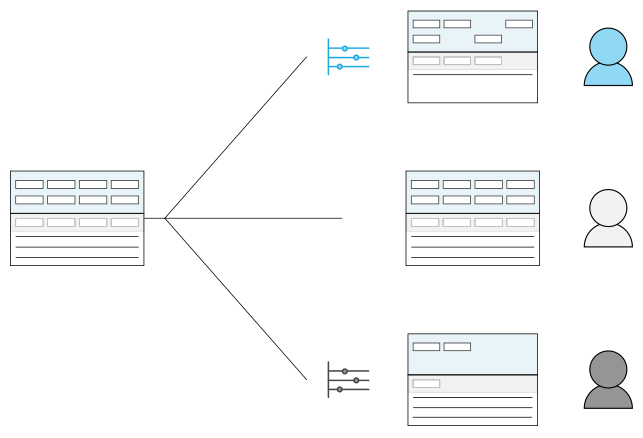
Application settings are a way to customize the user experience of an application. They should not be used to change the design, or logic, of an application. For example. if you create a directory application which uses a contact role grouping field to group users based on their role within the directory. The value in the field is populated by a logic block based on the value in the Contact Role field. You could use an application setting or logic block to hide or disable that field once a value is added, but this field could confuse users so it would be better to just hide it completely on the application configuration.
Sequence
In addition to using application settings, there are other configurations that control the application behavior. Because of this, configuration settings are applied in a sequence. The final item in the sequence takes precedence over all previous settings. When applying a default value, the sequence is:
- Data item configuration
- Application settings
- Field mapping
- Logic blocks
For example, if an application setting defaults a value into a field, then a field mapping defaults a different value, the value from the field mapping would persist. Then, if a logic block changes the value of that field, the value from the logic block takes precedence over all previous values.
When applying a default value into a filter, the data item configuration is not considered in the sequence.
See the following topics for more information:
- Secure menu entries with application settings
Add additional layers of security to menu entries by requiring users to have permission for the application setting in order to see and open the application from the menu.
- Frozen filter configuration
Configure a frozen filter with the Application Setting Definitions and Application Builder applications to create a filter value which users are unable to change.
- Application Setting Definitions application
Application developers use the Application Setting Definitions application to create and modify application settings, such as hiding or disabling fields, creating settings for buttons, or setting filters.
Frozen filter configuration
Configure a frozen filter with the Application Setting Definitions and Application Builder applications to create a filter value which users are unable to change.
Application Setting Definitions
On the Layout page of the Application Setting Definitions application you must:
- Enter the fields you want frozen in Field Options.
- Set the
FormtoList. - Either disable or hide the fields by selecting one of the checkboxes.
Configure data mapping
You can configure the filter data mapping in one of the following ways:
- In the Application Setting Definitions application, on the Fields page, using the Data Mappings. Learn more in Data mapper.
- In the Application Builder application, in the Configuration panel in either the Search Actions or Application Linkssection. Link to an application and application setting.
- If the application setting does not have a filter data mapping applied, use the Data Mapping mini app to configure the filter.
- If the application setting does have a filter data mapping applied, you do not need to create another filter data mapping.
Application Setting Definitions application
Application developers use the Application Setting Definitions application to create and modify application settings, such as hiding or disabling fields, creating settings for buttons, or setting filters.
Use this application when creating a layer of customization that modifies the application experience depending on certain user factors. The layer of customization creates a different flavor, or version, of an application. These different application flavors are used to customize the user experience so that factors such as entry points, user roles, and so on determine the flavor of application the user interacts with.
The defining information of an application setting including the application setting's name, menu title name, the application the setting is attached to and so on is stored in the Application Settings application header.
After the header information is entered, you can further specify an application settings definition by using the application's pages. These pages can be configured based on what kind of application setting you want to configure.
See the Application settings section for more information on configuring application settings.
Fields page
Create field defaults through use of advanced and frozen filters with the Data Mappings subtable.
Learn more about the data mapper in the Data mapper topic.
Layout page
Apply settings to adjust what is accessible or seen on your application's rows, pages, or fields.
In the Rows subtable, you can hide and disable rows, or use the floating column feature to move empty columns to the end of the row.
In the Field Options subtable, you can hide and disable fields.
In the Pages subtable, you can hide and disable pages. You must specify the exact Title of the page.
If you create an application layout for the setting, specify the parent application in the Name field and the application layout in the Application Layout field. Application layouts are alternate versions of an application with a modified field placement or style. Learn more in Application layouts.
Actions page
Create settings for clickable buttons such as form actions, row actions, save buttons, close buttons, and so on.
Filter and Sort page
Create pinned filters, or designate a sort profile.
Use pinned filters to create optimized filters over fields that are delivered as part of an application. Pinned filters can be accessed through the Filters menu are at the top of the list form.
Sort profiles override any sorts configured in the application.
Visualization page
Select a default visualization to display in the list form of the application. User can override the default by selecting a different visualization. Changes made by a user are persisted automatically by their user settings.
Calendars
Calendars are configured in the Calendar Definitions application and can be used in internal applications and dashboard cards to plan and schedule events.
Calendars are useful in many different processes. For example:
- Resource scheduling—Using dashboard calendars to assign qualified resources, such as employees or machines, to events that need to be completed within a scheduled timeframe, such as projects or work orders. Learn more in the Resource scheduling configuration overview topic.
- Available and unavailable time—Using calendars set up with work hours and holidays to help estimate things like bank transfers. This time can lapse days, for example from 10:00pm—4:00am.
- Scheduling conflict resolution—Using logic blocks to help with scheduling conflicts, such as find free time slot or aggregate time slots. Logic blocks can help find free time slots across multiple calendars or can aggregate busy time slots if there are multiple meetings or events scheduled in a row.
You can also associate logic blocks to trigger upon event creation, deletion, or updates. Learn more in the Calendar configuration topic.
Events for calendars can be created from the Calendar Definitions application, the Calendar Event Definitions application, or on the calendar itself if it isn't set to Read Only. Read Only calendars are rendered with a  icon in the calendar name. These events can be configured to send out reminder emails, have records attached to them, or to recur at different intervals. Learn more in the Calendar Event Definition application topic.
Calendar configuration
Configure calendars using the Calendar Definitions application, Data Item Definitions application, and the applications you want the calendar to show in.
Calendar Definitions
In the Calendar Definitions application, create your calendar. There are many optional configurations, such as:
- On the Settings page, you can:
- Subscribe your calendar to other calendars. This allows the calendar to see events from multiple calendars in one location.
- Reference a table which holds auxiliary event data for events in the calendar.
- In the Triggers section, associate logic blocks to activate upon event creation, deletion, or update.
Data Item Definitions
In the Data Item Definitions application, you must create a Calendar type data item. This data item holds the calendar once data mappings, application settings, logic blocks, or Field Dependencies in the application tell the Calendar data item which calendar to display.
On the Settings page, select the display options for your calendar.
Table Definitions
In the Table Definitions application, add your Calendar data item to the table your application is built over.
Application Builder
In the Application Builder, add your Calendar data item where you want the calendar placed in the application.
Optionally, in the Field Dependencies section of the Configuration panel, you can change default data item settings like the calendar start date, or select which calendar you want shown in the Calendar data item. To select the calendar you want displayed with field dependencies, you must:
- Select the name of the calendar definition or a table lookup on the calendar definition in the Controlling Field.
- Select the
Calendardata item in the Dependent Field. This populate the user interface for the calendar. This data item must be created before you can show the calendar in an application.
Optionally, in the Events Action section of the Configuration panel, you can configure an even action to update the application's business records when calendar events are changed. Learn more in Attach logic to calendar event changes.
Events
You can add events to your calendar in multiple ways, such as:
- In the Calendar Event Definitions application, create a new record.
- In the Calendar Definitions application, on the Viewer page.
- In the application, on the calendar.
Learn more in the Calendars topic and Calendar Event Definition application topic.
Attach logic to calendar event changes
Use logic blocks and events actions in the Application Builder to update business records when changes are made to calendar events.
Prerequisites
You must already have a Calendar data item created and added to your application, and the data item must point to your calendar definition. Learn more in Calendar configuration.
Logic Block Builder
In the Logic Block Builder, configure a logic block with your required business logic.
If the event action you configure in the Application Builder is a calendar event, the logic block must be built over the CalendarEventDefinitions table.
If the event action is any other type of event, such as a Field Value Changed, the logic block must be built over the table your application is built over.
Application Builder
In the Application Builder, in the Configuration panel, in the Event Actions section, you must:
- Create an event action. The type of event you select determines what data source is passed to your logic block, such as:
- Calendar events—Your logic block is initiated by user interaction with the calendar, and can review specific details of the event. For example, the data source for a
Calendar Event Updatedevent would be a calendar event record which holds information such as the time slot, event name, and description. - Other events—Your logic block is initiated by user interaction with the business record, including with the calendar, but does not contain details of the calendar event. For example, the data source for a
Field Value Changedevent would be the business record which doesn't hold any information about the calendar events.
- Calendar events—Your logic block is initiated by user interaction with the calendar, and can review specific details of the event. For example, the data source for a
- In the EventActions.EventDetail field, enter the name of your
Calendardata item. - In the EventActions.LogicBlock field, enter the name of your logic block.
Learn more in Logic blocks and event actions.
Exclude dates in Date Time calculations
Exclude dates in your date time calculations with the Calendar Event Definitions and the Logic Block Builder applications.
Prerequisites
You must already have your calendar definition configured. Learn more in the Calendar configuration topic.
Calendar Event Definitions
In the Calendar Event Definitions application, create event records which define the dates you want to exclude. The event definition is tied to the calendar record which allows you to use it as an input in your logic block.
Logic Block Builder
In the Logic Block Builder, you must:
- Create a logic block record. Often, this is a logic block of type
Transactionbuilt over the same table as the application which holds the calendar. - Select the Find Date action.
- In the action, specify the calendar name and the start and end dates for the calendar.
- Use the Excluded Days section to specify if you want specific days, such as weekends, excluded.
- Use the Excluded Dates sections to specify the calendar event definition as an input. This allows you to exclude the dates you configured in the event definition.
Calendar Definitions application
Use the Calendar Definitions application to create, modify, and view calendars, or to access the calendar view to schedule events.
Calendars may be configured and associated with any application in Nextworld, or integrated with outside applications.
Learn more in the Calendar configuration topic and the Calendars topic.
General page
You must define your product module and family. You can also include specification information about the purpose of the calendar.
Settings
On the Settings page, you can:
- Define calendars you want your calendar to subscribe to. Calendars which subscribe to other calendars show all events created on those calendars in addition to their own events.
- Reference auxiliary event data.
- Define triggers for calendars. These logic blocks can be set up to activate upon an event creation, deletion, or update. There are several uses for this, such as:
- Alerts—Logic blocks can send out emails to recipients.
- Integration with external applications—Logic blocks can make external callouts to outside applications, like Outlook, to sync those calendars with Nextworld calendars.
- Linking other data—Logic blocks can create records associated with the event. For example, if an event is created on a work order calendar, a work order record can be automatically created and associated with the event.
Learn more in the [link: 'NextworldTutorialsAdvancedLogicBlocksTableTriggers'] topic.
Viewer page
Use to preview the calendar and events. This can also be done in the Calendars application.
Calendar Event Definition application
Use the Calendar Event Definition application to create and modify events for calendars.
There are multiple types of events, such as:
To-Do—Schedules an event on the specified day without a time slot designated.Event—Schedules an event on the specified day with a time slot designated.Available Time—Schedules a time block where events can be placed. These time blocks can lapse days, for example from 10pm-4am. They can also recur.Unavailable Time—Schedules an unavailable time slot where events can't be placed. Unavailable time also automatically fills in areas outside of available time slots for either the rest of the day, or until the next available time is scheduled.
Details page
Define details of the event, such as start date, time zone, or associated records. You can also select the Busy checkbox, notifying logic blocks and users not to schedule during that event time.
Recurrence page
Configure events to recur. There are a multitude of recurrence options available. For example, you could create a recurrent event on the third Tuesday of every second month, or could set an event to recur daily for twelve days.
Properties page
Define extended properties for the event, such as associating a data item for color.